

The Househunter
The Househunter
Taking a virtual stroll round a property on the market, to see how it might inspire our own places and spaces.

This week we’re off to a very elegant house in Maidenhead, Berkshire, which is firmly in the affluent commuter belt for those who aren’t familiar with these parts. It’s a house that wouldn’t look out of place in the south of France and I can’t decide if that would be uplifting when you came home, or annoying!
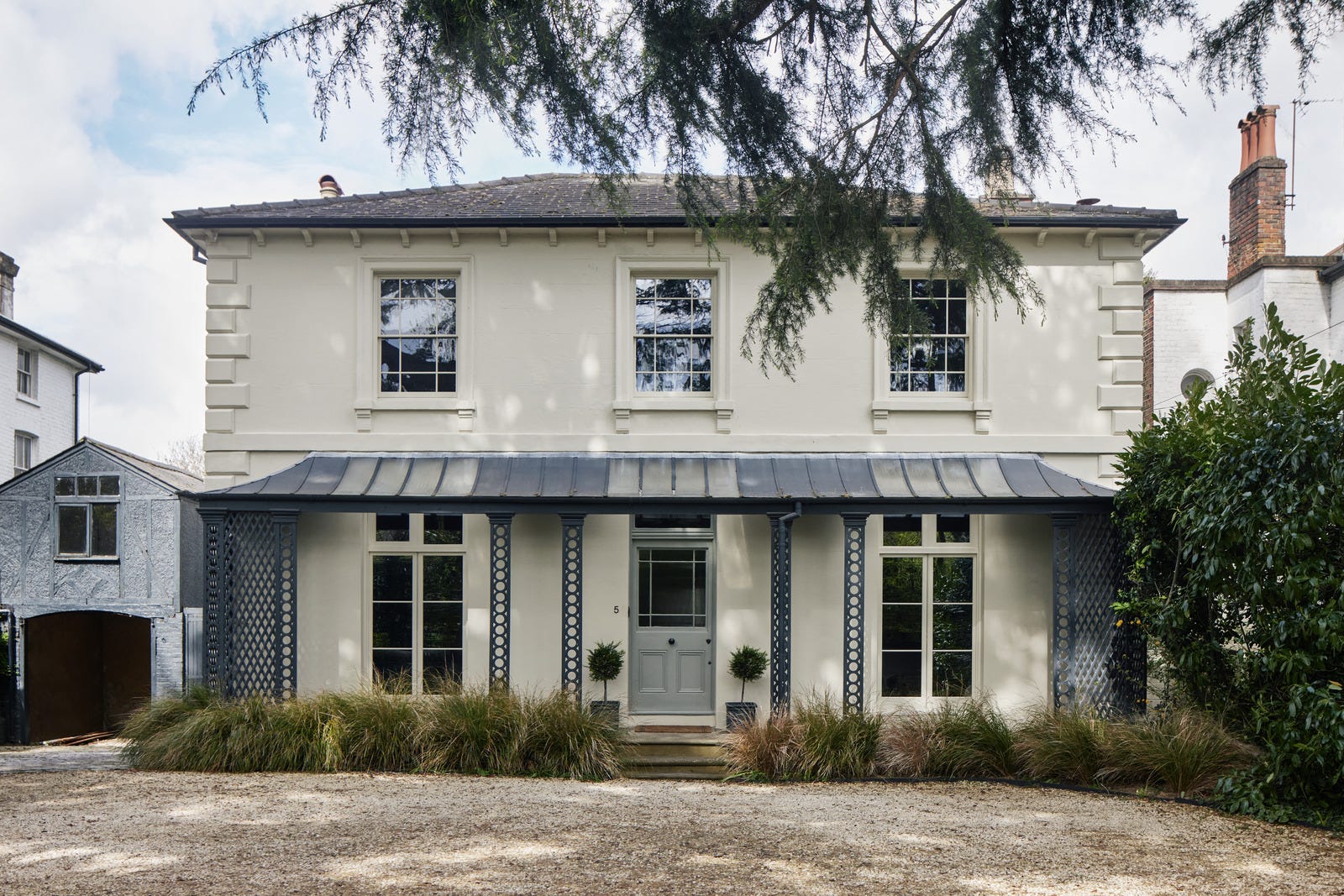
A reminder that we’re not here for the price (£2,500,000 - well you might be, in which case let us know when you’re unpacking and we’ll be round for tea) but for the inspiration. It’s a big, expensive house, but that doesn’t mean it hasn’t got issues that won’t relate to the rest of us. Even large houses have small rooms, and it can be as hard to arrange a huge space to flow well as a small one (new post on that coming soon). If you didn’t catch my recent post on how to make a small room look bigger, it’s here.
One of the reasons I choose to analyse houses for sale is that they are real. It’s not in the vendors’ interest to airbrush out light switches and sockets, and while they might not show you all the bad angles, there is usually a floor plan so you can judge sizes and proportions for yourself. A home photographed for a magazine just doesn’t show you the bad bits – the pile of stuff behind the camera or the stain on the ceiling where the shower leaked. (Paid subscribers you can read my post on Behind the scenes at an interiors shoot here.)
That said, I appreciate this house is pretty lovely – and the loveliness starts as soon as you open the front door, with these floor tiles,

This style of tile is called Minton, they are extremely hard-wearing and found in many Victorian homes. The colours are usually black, terracotta and cream, with the odd flash of cobalt blue. Many people find them hard to scheme around, so they remove or cover them. These aren’t labelled as original so I suspect the designer chose a series of colours that pleased the owners and laid them in that style. I’m not usually a fan of yellow and green together but this is great and sets the tone for the rest of the house. And I have written previously about how important the hall is when it comes to decorating.
Styling notes: the yellow book speaks to the yellow in the tiles, the dark green console is unusual and just dark enough not to feel matchy-matchy. Even the very pale yellow curtain at the end draws the eye through the space.
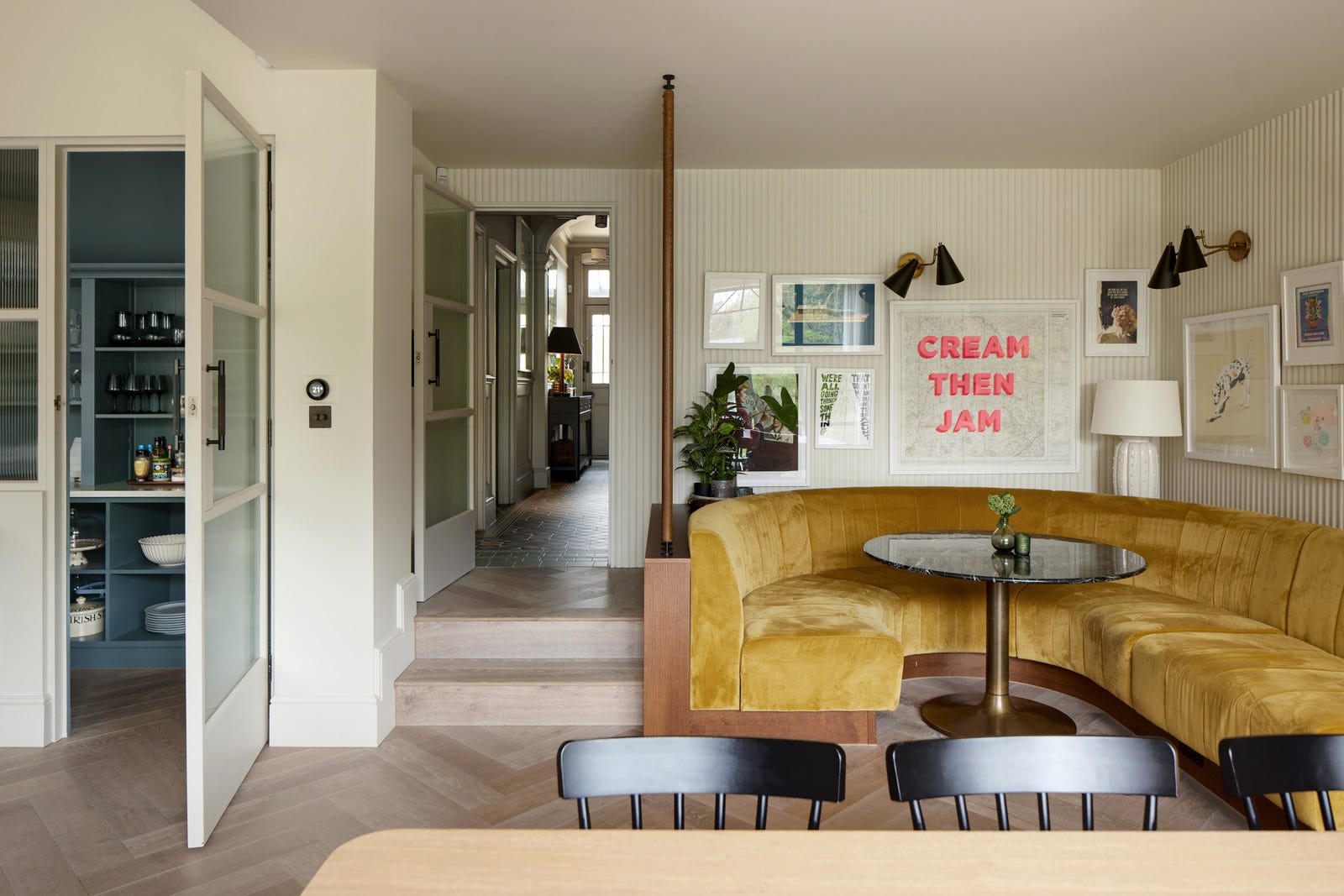
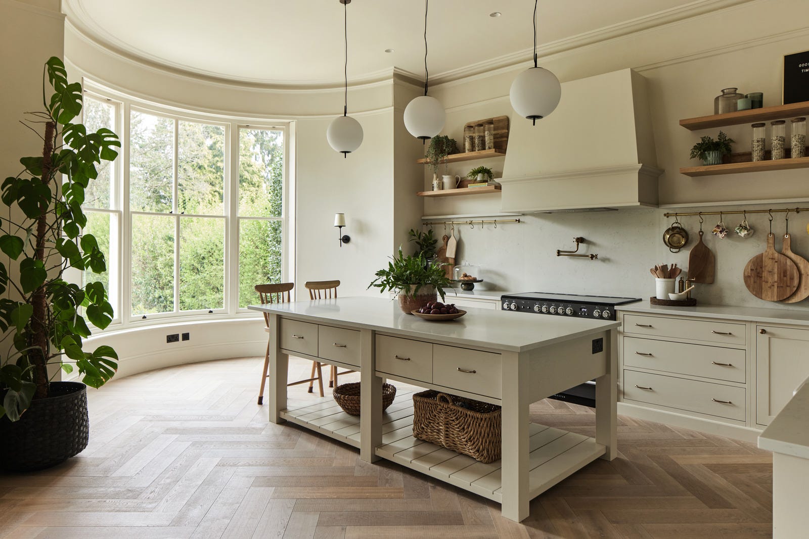
From the hall you arrive in a large open-plan kitchen-diner, where the yellow is repeated on this velvet banquette. And it’s worth a quick look at the floor plan here, so you can see how the curved bay window in the kitchen has been echoed by the seating. Clearly a more expensive option than a standard rectangle, but it’s a fabulous detail that really elevates the space.
An open island like this – also known as a butler’s table or a drapery console – won’t work for everyone; you need to have enough space elsewhere for the oven or the sink, but if you move the storage here the open style will allow the light to flow and add to the sense of space.
In my last house we had an island made from several base units bunched together, with two ovens and a built-in hob set into it. It was practical and offered lots of storage, but sitting flat to the floor it did rather look like a giant tanker had landed in the middle of the room. Even adding short legs would have helped.
Anyone who reads interiors magazines will be aware of the fashion for pantries at the moment. Twenty years ago the height of aspiration in the UK was an en suite bathroom. Such facilities were not common here and they brought a sense of hotel luxury to small period properties. Now that many people have them, the fashion has moved to pantries. This is easier as lots of houses have a utility room already so it’s simply a question of rebranding, which is exactly what I did with mine.
I digress.
If you are redoing the floor plan or moving any walls in this part of the house, you can create a pantry by walling off a narrow space and filling it with storage, a washing machine, freezer and stashing all those worktop appliances like mixers and blenders than can take up valuable space in the main kitchen.
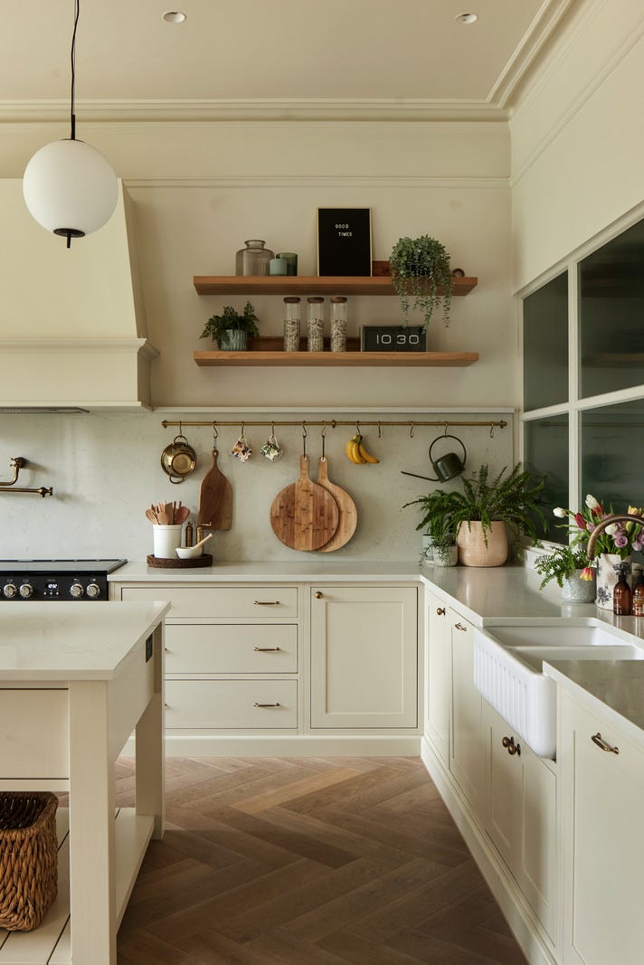
Here it has been achieved with an internal glass wall to bring light into the pantry but, since the glass is fluted, it means you aren’t actually looking at piles of stuff when you’re in the kitchen. You can see the door to it in the first kitchen image, and above, the glass wall behind the units that masks it. If I was doing a classic side return extension, I would be very tempted to use it to create a fabulous pantry, rather than sticking an island and sofa in my newly enlarged kitchen – which so often renders the actual sitting room redundant. You imagine your teenagers will hang out in there while you drink sofa wine in the kitchen, but they won’t. They will be in their bedrooms.

We’ll drop by the sitting room, where the green from the hall is carried through. This is a partial colour drench but in such a dark colour it would be a bit much to take it across the ceiling as well. Particularly as the double doors lead to the garden. Instead, the floor has been kept light to talk to the ceiling – and note the reflective qualities of the marble fireplace, the eggshell paint (which has a slight sheen) and even the TV are all bouncing the light around.
The sofa and ottoman are on legs, allowing the light to pass through and under, which also brings a sense of space.
A word on the “big light” – an object of much derision on Tik-Tok. It’s complicated. If you want to be able to flick on immediate light then why not? It can be practical, although lamps are better for atmosphere in the evening. Plus, floors are full, ceilings are empty – so why not add a decorative element to bring the eye up to the empty space?
On the other hand, this one is fitted in the dead centre of the ceiling - standard - but that means it’s basically shining over a patch of floor between the coffee table and the sofa. If moving it isn’t practical, then I’d go with the old go big or go home tactic. Pick a big lamp. Huge. Make a statement of it. Just ensure you have one of those diffuser plates at the bottom to hide the bulb and soften the light. Bear in mind that it needs to look as good when it’s turned off as when it’s on so shape and/or size is important here.
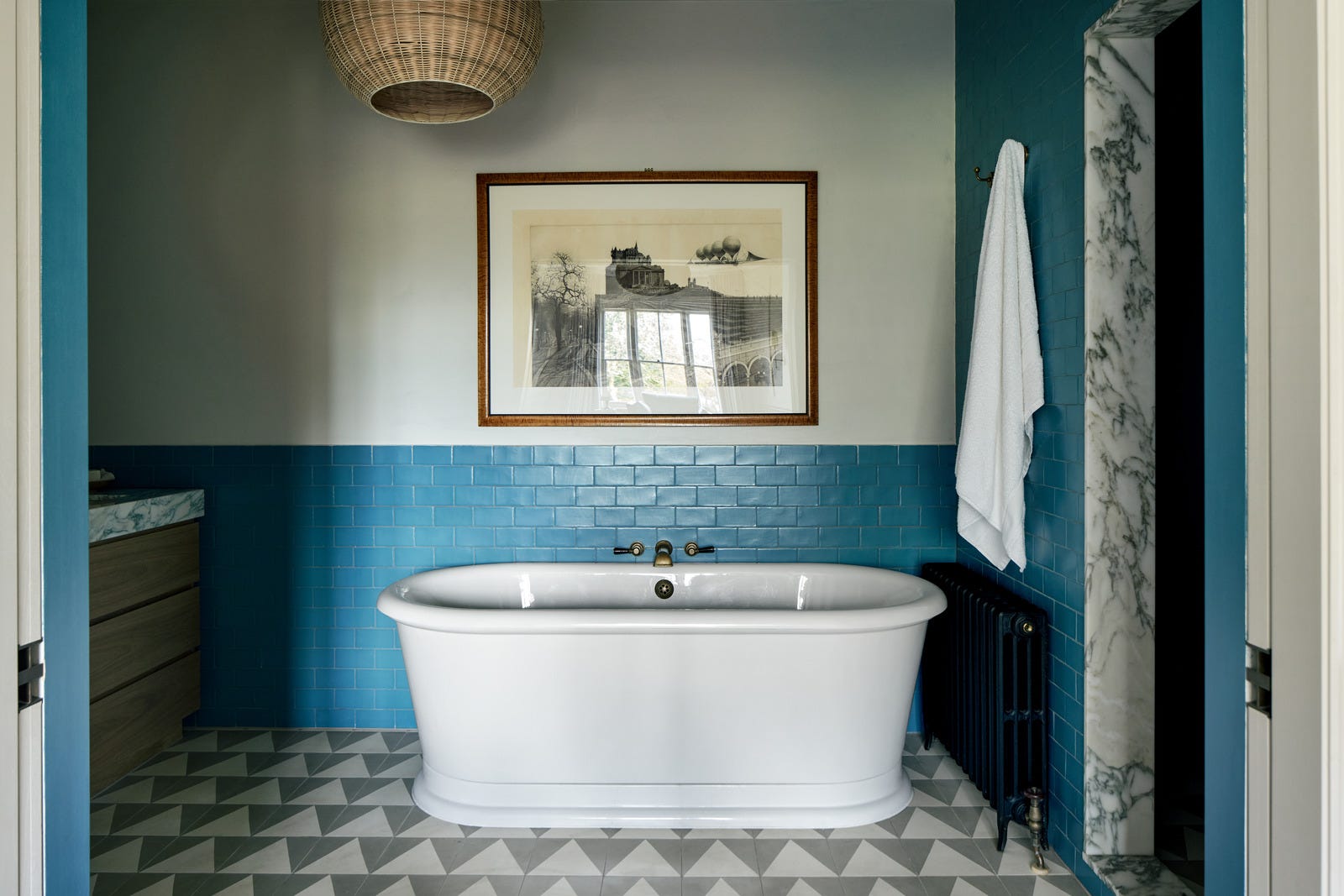
Heading upstairs now, and I love a good bathroom. This soft blue is gorgeous and this is a perfect example of the current fashion (long may it last) for decorating the bathroom to look like any other room in the house. By which I mean choose colours you love, not just shiny white tiles. Add a picture – with good ventilation it will be fine, although I wouldn’t necessarily recommend putting your Picasso over the tub. Here, conversely, the off-centre ceiling light (probably placed to comply with rules governing water and electricity) looks so much better than it would over the middle. In short, if you replaced the bath with a sofa and the tiles with plain paint, this would be a great sitting room. You get the idea.
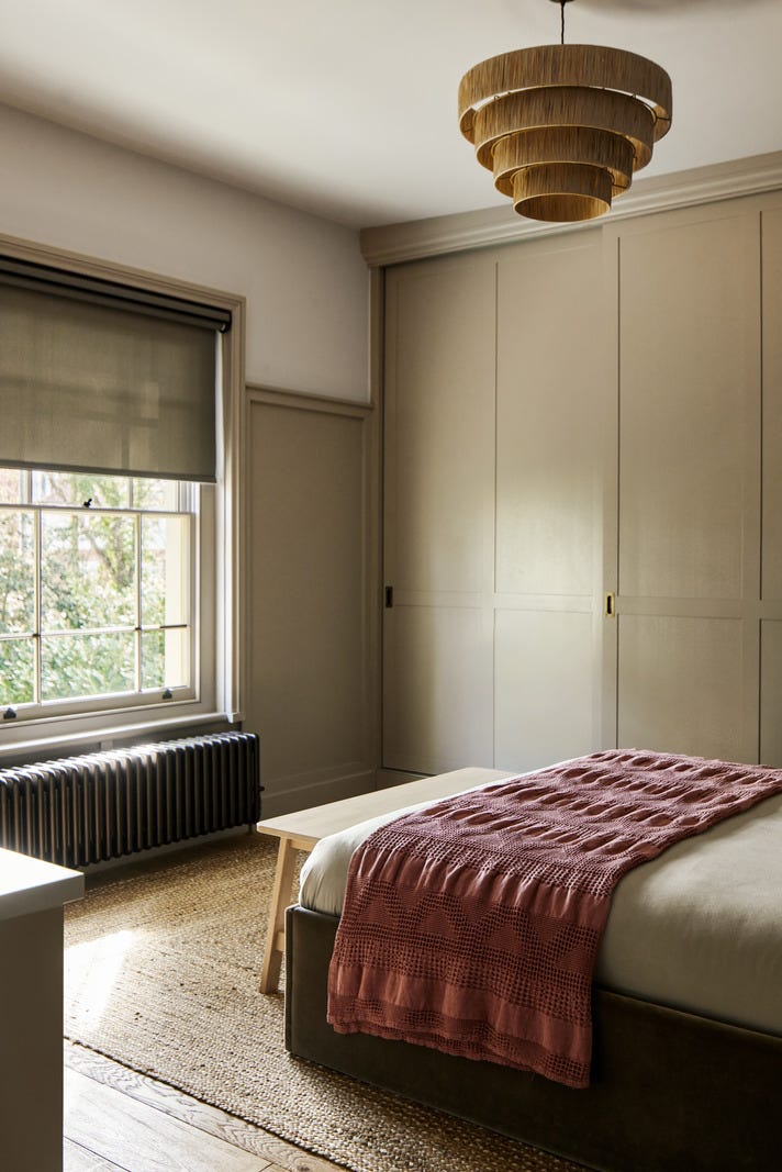
I’m including this final image as it’s a great example of how to make a small room look bigger. Or, even if the room isn’t small, how to make the storage disappear. It’s floor to ceiling, flat fronted, matches the walls, and has minimal handles. All of which means it’s not shouting for attention – which leaves the eye free to look at the view, admire the feature radiator or even the bed which is, after all, the primary function of the space.
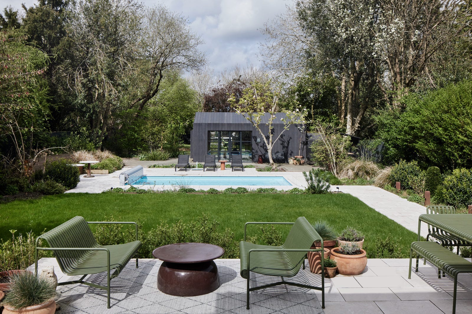
There are more pictures over on the Inigo site, where this house is listed. It’s been beautifully done in a palette of soft yellow, forest greens, soft blues, creams and a hint of pink. It reflects the semi-rural nature of its location and you could dial the shades up or down depending on your own taste. The blue is a bit of a disrupter, although it appears in the pantry, and perhaps draws the eye to the swimming pool in the garden. Unexpected red? Not so much – but you can read my thoughts on that here.
This is one of two free posts a month. If you like this and want to read more of my interior design advice and musings, then do consider upgrading to paid membership. For £6 a month or £65 a year you will receive a weekly post and the chance to attend my live drop-in design clinic, where we chat about design dilemmas for an hour on the last Wednesday of the month. The session is recorded and emailed out for those who are unable to make the time.
Beautiful house. There is a house in the same victorian villa style near me in Stoke Newington which is my absolute dream house!
I'm not sure I love the dark blue/green in the pantry. Its already a room with no natural light but I personally wouldn't have amped that up - I don't think a pantry needs to feel "cosy", I just thought how difficult it looked to see anything in there
Love the blue tiles in the bathroom
I was wondering if anyone was actually living there, it says recently refurbished (indeed I recognise new-ish soho home furniture in the master bedroom!) And seems maybe a little too perfect for it to be lived in - or at least, lived in for any period of time...
Lots of fabulous details in the super home👌