


Your Decorating Dilemmas Solved #4
What to do when the grey has sunk into your psyche, how to furnish bay windows and create fitted wardrobes – plus thoughts on kitchen lighting and feature walls.

This bumper post is for you. It’s huge so get the coffee on and settle in. It’s a round-up of some of the questions I have been asked by readers recently, with solutions, ideas and inspiration for everyone. I have answered eight questions here but they are big ones (!) so there is a lot of information and hopefully lots that’s useful you.
This is a paid post, as the questions have come from subscribers who submitted questions for my live Drop-in Design Clinic. However, I have left the first couple free to read and if you want to sign up to learn more, the link, as always, is here:
This first question comes from Kate Kuhlman, who wants to know about decorating hallways.
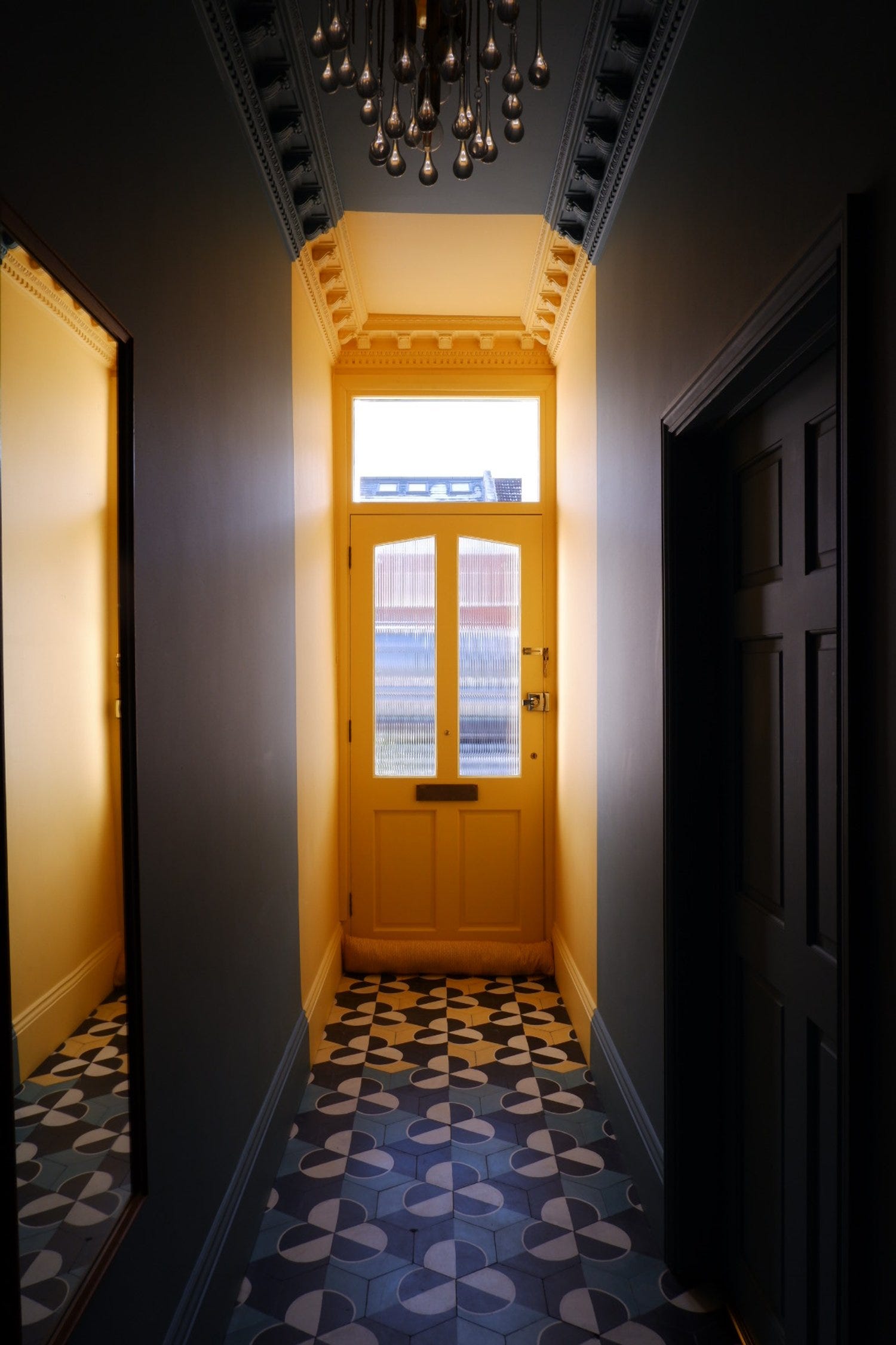
“After two years of living with an inherited hallway, painted and carpeted in shades of grey, we’re finally repainting the walls and re-carpeting the stairs and landing. But the dark and dreary grey has sunk so deeply into my psyche that I’m finding myself in a quandary. I DON’T want white walls, but I also don’t want to find myself hating a colour I love by overwhelming everything in a single colour. Originally I wanted to drown it in yellow, but after living with all-grey I fear that ‘all-anything’ will have me yearning for a change too quickly. For reference, it’s a classic Victorian terrace with a hallway that sees little natural light - the ceiling is definitely staying white.”
I think the grey has sunk into all our psyches – particularly at this time of year (I write from the northern hemisphere) – and I understand the desire to go all-out in yellow for a sunshine feel. The problem with yellow, or as Kate fears, any strong colour, is that it can overwhelm in the opposite direction, and while you want your hall to welcome you, you also want to feel that you can come home feeling tired and cross and it will embrace you rather than shouting at you to buck up and get on with it.
And that is where a colour scheme starts: by understanding what mood a colour puts you in. Now a hallway needs to feel like home (whatever that means to you) but it also needs to welcome and hug, to sympathise and support. I don’t think it’s the place to inspire a creative burst of energy so, sticking, with Kate’s beloved yellow, I would go for a pale creamy buttery shade (I wrote about good yellows last week) that will feel warm in winter and introduce you to the sun beyond the front door in summer. As regular readers know, I would always avoid a white ceiling: take your pale yellow (maybe Hay or Lute) over the ceiling as well. These yellows are so pale it won’t feel too bright or scary.
However, I would paint the inside of the front door in a strong yellow (you mentioned using Giallo upstairs, so that will tie in) as you will see this when you come downstairs in the morning and feel joy (given that yellow is your colour - the rest of us can swap for whatever shade gives us a burst of happiness) but you don’t really see it that much the rest of the time.
Then you can have a neutral floor (tiles or dark floorboards), paint the banisters in chocolate, and perhaps even the stairs. Your carpet could be a warm sisal or neutral and the whole effect will be one of warmth and calm that references your favourite colour without being overwhelming.
My final point is that you don’t tend to linger in a hall, so you can be a little bolder with the decor than you might be in a sitting room or bedroom. For that reason, although Kate has ruled out painting the ceiling in anything other than white, I would say to the rest of you - it’s actually the ‘fifth wall’ and works perfectly as a feature, because it’s on a different plane to the others. Paint it in a bold gloss, or wallpaper in an abstract pattern that works in any direction.
The takeaway here is that you must never choose a colour without taking time to analyse how you feel when you see it. Does the feeling match the mood you want in that particular space?
Next, a question from Christine Giles on feature walls – which also features yellow.
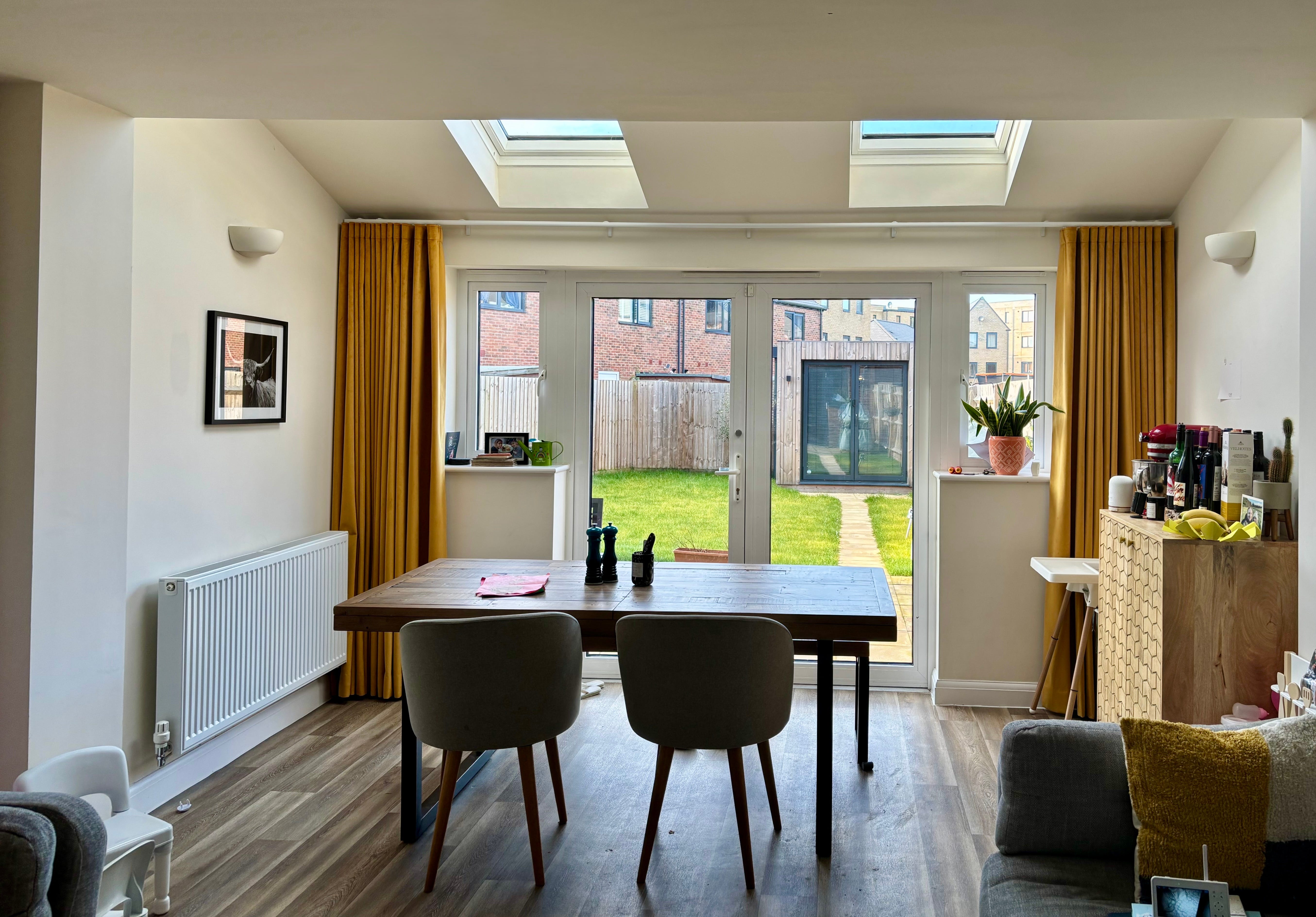
“We moved into a new-build two years ago, and our family room/kitchen is the last room we need to tackle. It's the space we spend the most time in, but I’m finding it tricky to design exactly how I want because of the toys and kid-friendly needs (I have a 1-year-old and a 3-year-old).
“It’s a long room, with the kitchen (east-facing) at one end, the sofas, TV, and toys in the middle, and the dining area at the far end. So far, we’ve put up yellow velvet curtains on the French doors, but I’m planning to add navy blue vertical tiles in the kitchen (Hoxton Ocean Gloss from Mandarin Stone), and I want to paint the walls with a very soft white with a hint of pink (Downtime by Coat).
“My main question is about the possibility of wallpapering the two walls either side of the dining table. Do you think this could work, or would it be odd to have wallpaper there?”
The short answer is that this is a great idea. Here’s why (the longer answer). Firstly when you have a long narrow room you want to make it seem shorter and wider. Adding a block of strong colour at one end will do that, as it will draw the eye.
Secondly, you need to zone the space. The layout of the room means the dining area naturally sits beyond some structural pillars so that gives you a start and end point for some wallpaper and means, crucially, that papering those two walls which are separated by a window doesn’t feel random.
Now, details:
When you have chosen your paper, paint the radiator either in yellow or in one of the colours in the paper so it blends rather than stands out. Ideally paint the window frames, too, so they aren’t white. If you can face adding a bit of paper over the top of the doors then do that. If you can’t, then paint it to match the curtain so you are reducing the number of different colours and creating a more seamless joined-together look.

Those storage units – again – paint yellow to match the curtains, or perhaps wallpaper the sides facing the table so it brings the wallpaper round and joins everything together. Of course the skirting boards are yellow.

That may sound like a lot of yellow, but it’s basically just replacing the white and creating a more cohesive look. Your wallpaper may have only the tiniest element of yellow in it. Just a nod. Or you may want to go for something that’s blue and white/cream. I’m not going to presume to choose your paper, so the above are just a couple of examples for the colour.
When that room is done, you would paint the sitting room in the neutral shade from the wallpaper – and chuck a yellowish cushion in there to keep the scheme going.
One other thing you can do which can be fun is to paint the vertical frames round the skylights to add a splash of colour and an extra detail.
The takeaway is that as long as you join the colours and elements together it will work. Don’t just add a single blocks of different colours with nothing joining them. This is why a patterned wallpaper is a great idea, as it can unify a space.
The rest of this post which looks at kitchen lighting, bathroom design and built-in wardrobes is for paid subscribers only. It’s £7 a month or £75 for the year, which reduces it to £6.25 a month or around £1.40 a week.