Design Decoded
Looking around someone else's beautiful house is not only good for the soul but can help us understand how to design our own homes.
I have been looking around other people’s houses on a professional basis for nearly 20 years now and I never, ever, tire of it. When I first started writing about interior design the postman would bring armfuls of glossy sales brochures every week for me to peruse. Gradually, the estate agents went online and it became easier for both of us - me in terms of the number of properties I could see, and him for his back!
The reason I like to discuss both houses for sale and, as you are about to discover, those made available as locations, is that the agents need to present fairly realistic representations of what’s there. This differs from a magazine shoot, which might be deliberately pitched in a more aspirational way and also might only show you a corner of a room, airbrush out electrical sockets, or exclude cluttered corners which don’t fit the story.
Now don’t get me wrong, I’m also very happy to feature those as well - indeed my own projects have been featured in several heavily styled magazine articles - paid subscribers can read this piece from my archive about what goes on behind the scenes of an interiors shoot – but sometimes we need to put aside the inspiration in favour of a dose of information.
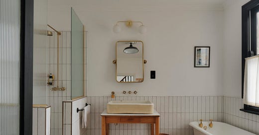
So this week we are going to take a walk around a fabulous location house that is on with Shoot Factory and understand the design details, big and small, that have helped make it work so well and look so great.


