

DESIGN DECODED: A three-bed maisonette in north London
This gorgeous property is a masterclass in creating a cohesive scheme in muted colours with quirky details. Come and discover the secrets of the red thread.

This three-bed house has been beautifully restored, and if you love a soft colour palette and want to know how to create the all important red thread - a way to link each room of your home without simply repeating the same colours over and over -then accompany me to look around this one. It’s on the market with Inigo.
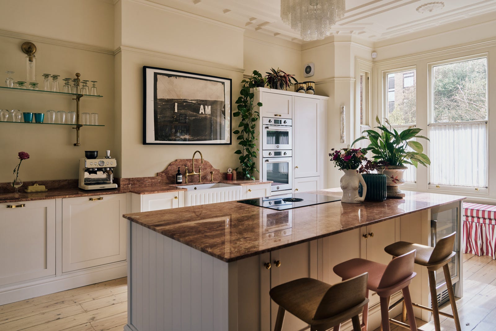
We’ll start in the kitchen (a very good place to start) as it immediately sets the tone for the rest of the house. The colours are soft, the materials are luxurious (that marble worktop) and there’s the odd quirky detail (the red and white striped window seat) that adds a point of view and some personality. This detail is the key to success by the way.
Otherwise you get too much of what Lucinda Chambers famously calls “ghastly good taste”. Here the stripes are not in bad taste, but they are adding a bit of zing, which is crucial.
Diana Vreeland, the late former editor of US Vogue, said: “A little bad taste is like a nice splash of paprika. We all need a splash of bad taste - it's hearty, it's healthy, it's physical. I think we could use more of it. No taste is what I'm against.”
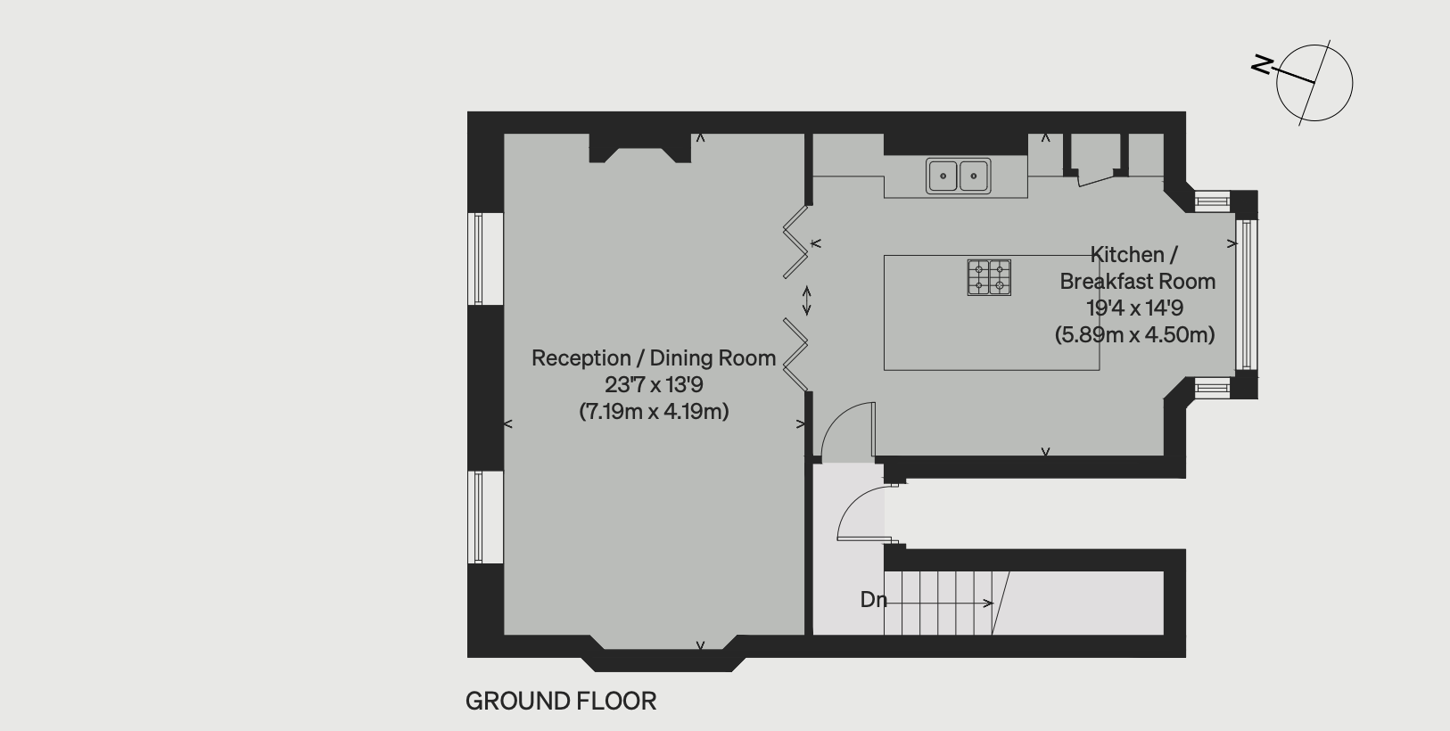
Now, of course, the owners of this house are working with good bones; the panelling was restored, the ceilings are high and the proportions generous. But it’s worth looking at the floorplan, as that reveals a useful idea.
Most of us tend to leave rooms in the same place we found them when we buy a property. Traditionally, in a city terrace, that means the kitchen at the back, with the sitting room at the front and, often, a dark middle room that was originally for dining. But these days many of us prefer an eat-in kitchen, or we want a bigger sitting room, so we take down the wall between the two spaces and end up with a sitting room of two halves: one with the sofas and TV crammed in, and one that is a sort of through passage to the kitchen that no-one knows what to do with.
Here the owners have changed things around and put the kitchen at the front. In a classic house that would mean the reception rooms lead to the garden, but this is a maisonette so, in this case, the bedrooms are on the lower ground floor with direct access to the outdoors, but park that for the moment. This is about the kitchen, and the theory isn’t just for Victorian terraces. Even detached country houses and city apartments might not have the rooms in the right places for you and the way you live. The point is that you can change this.
And an increasing number of people are choosing to do so - the food writer Skye McAlpine has done it, and the interiors writer Bianca Hall is about to. The front room of a terraced house will often receive the most light during the day - which means those of us who use it as a sitting room tend to go in there only when it’s already dark outside, and instead we spend our daytime hours in the darker kitchen space at the back.
By flipping the layout you can make the most of a larger, lighter space, and when you do go to the sitting room you can have direct access to, or a view of the garden. Plus it’s probably quieter.
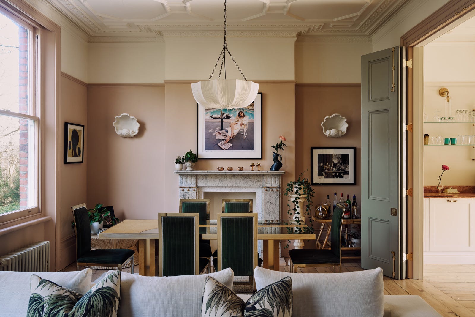
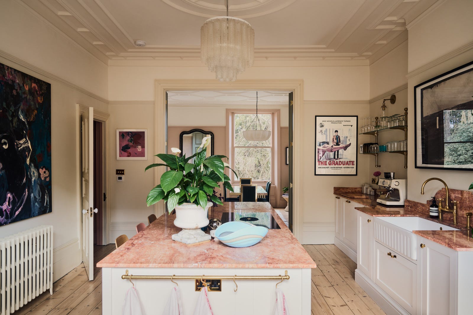
In this case you can see that the dining area has been placed behind the kitchen, so it creates the impression of a single room. The sofas have been placed in the other half of the rear space, with their back of one facing the table, so you can feel as if you are in a completely different room, even though there is no wall between each zone.
Lt’s look at the design details in, er, more detail.
The rest of this post is for my wonderful paid subs – and has all the info on colour scheming, room planning and, crucially, how to create something similarly cohesive and lovely in your own home. You can subscribe here if you fancy it: