

DESIGN: when styling goes wrong
Usually these posts focus on what has been done well – but today, after seeing a dire new homewares ad on TV, we get to look at what happens when it's done badly. And learn how to put it right.

This is a free post. To learn more about design – including tips on finding your style, working out your colour palette, my homewares address book and access to my monthly Drop-in Design Clinic – you can become a paid subscriber for £7 a month or £75 for the year. Founding members (£350) also get a 60-minute one-on-one design consultation.
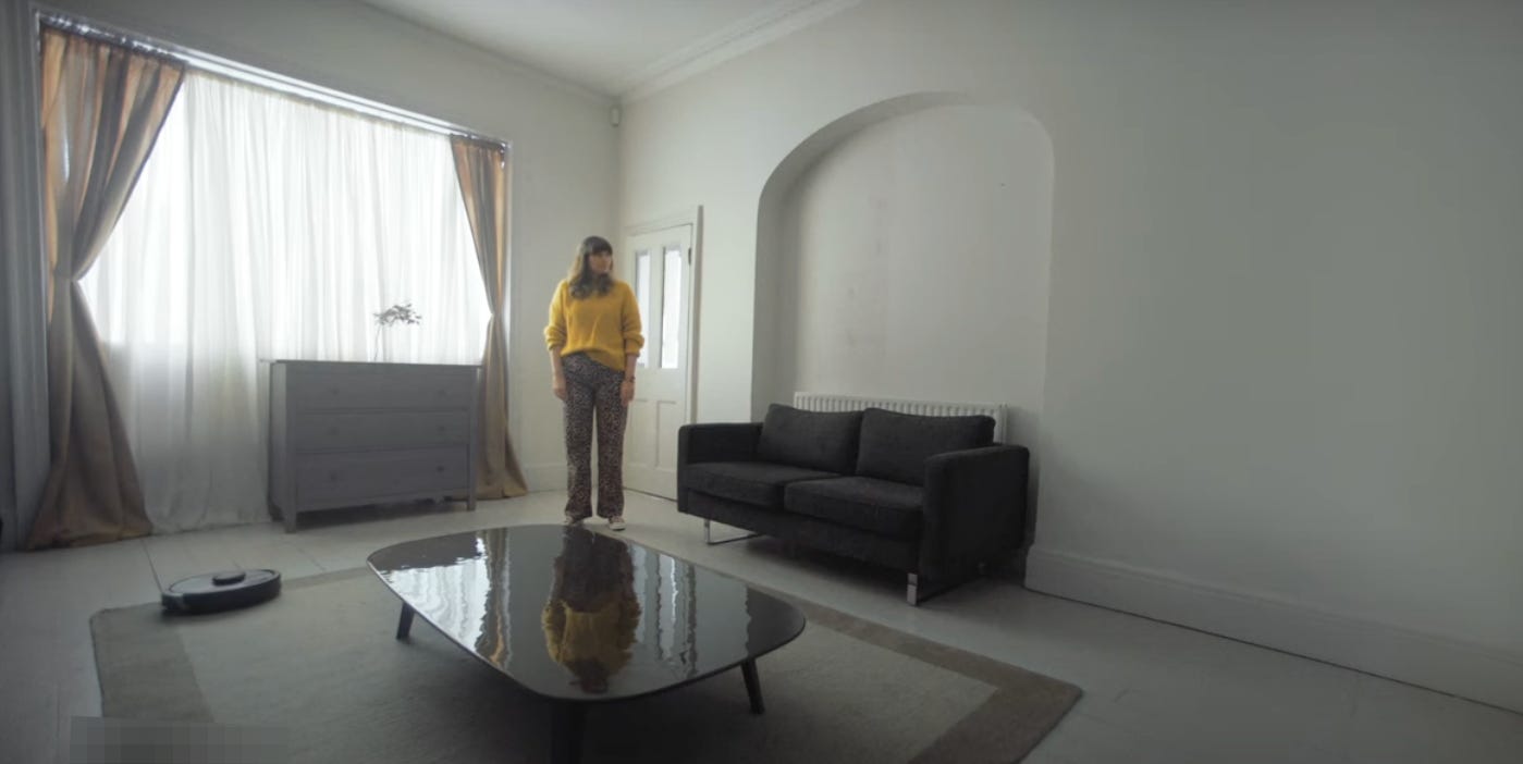
This advertising campaign stopped me in my tracks. There was I was sitting on the sofa, sipping my drink, waiting for the programme to resume (Grand Designs, since you ask) when it aired. An ad for a brand called FY, and titled: “Less Bland, More You”.
I had to pause the TV and run it again. I was so gobsmacked by the room created to sell FY’s products that I quite forgot to sympathise with Jim and Fiona five minutes later when their glazing didn’t fit. (If it wasn’t Jim and Fiona, it might have been Bob and Sue; the point is that the glazing never fits on Grand Designs, whatever your name is.)
Anyway, as an exercise in brand awareness this advertising may work. As a showcase of the sheer number of products it sells, likewise. But surely – surely – you want to show said products in the best light, to encourage people to buy them? Isn’t that the point of a TV ad, which will have cost tens of thousands to make and tens more thousands to air? This looked like someone had come into a big room with a big box full of stuff, unpacked it all so they could see what was there, with a view to arranging it later, and then gone off for lunch and forgotten to come back afterwards. As you do.
I can’t stop thinking about it. I have lost sleep over it. So for that you can add a layer of fury that comes on top of my bafflement.
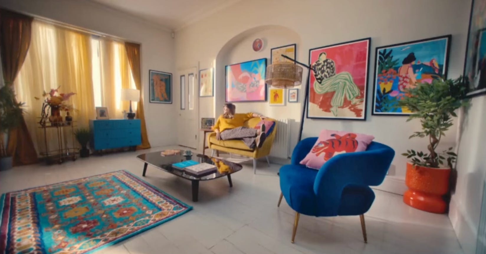
This is the finished room. It’s a bit of a dark screen shot but actually, rather than apologise for that, I’m going to suggest I’m doing your eyes a favour.
Someone (Mary Pat) asked me the other day to post pictures of design mistakes, as it would be easier to understand how to get things right when you can see how things have been done wrong. I replied that it was hard for me to do that, as I wouldn’t want to be rude about someone else’s house – particularly when they haven’t asked for advice and may love things just the way they are, as they are entitled to do. These Design Decoded posts are for those who want to get some insights into things that might not be working in their own homes and to learn some techniques to better understand their own style and how to make their spaces work for them.
When I write Design Decoded, I analyse real rooms by looking at what works, so you can see examples of good styling and clever ideas that, hopefully, inspire you in your own places and spaces. I see no point in being negative.
But this is an advert – styled, I assume, by a professional and designed to sell products that people might want to put in their homes. Now it might do that (there’s nothing wrong with the pieces themselves) and yet the room is wrong on so many levels. I appreciate FY wanted to show off a lot of product, but surely to God there was a better way of doing it.
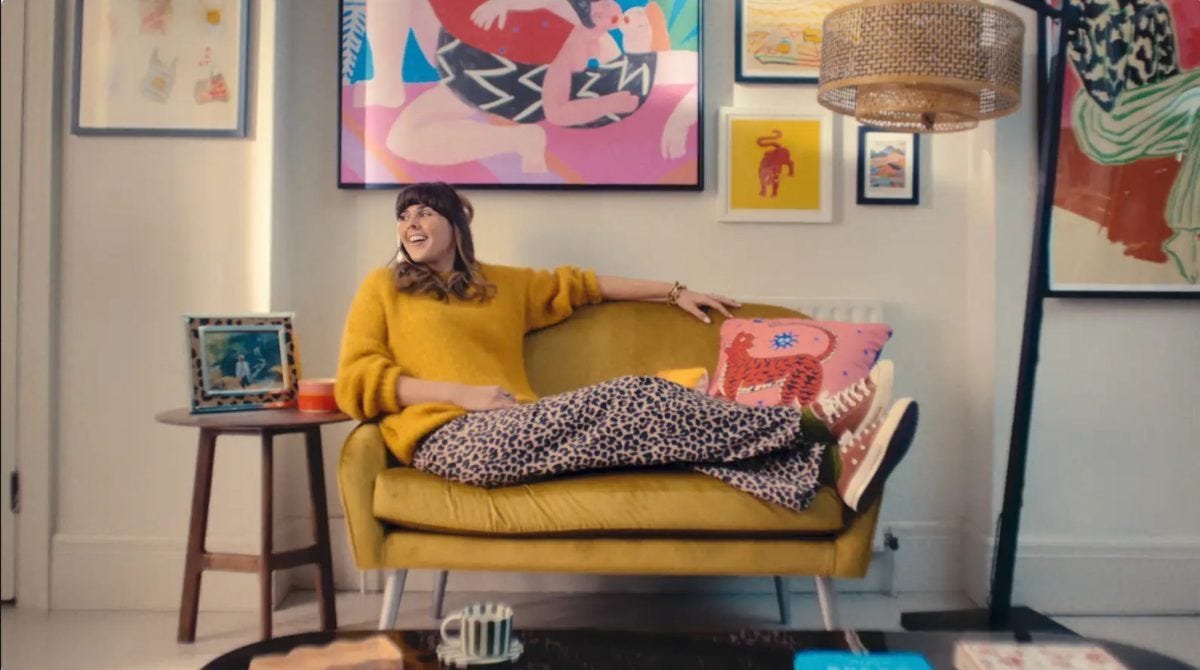
The ad was created by creative studio Ourselves and features a woman surveying her dull and somewhat empty sitting room. She uses the FY platform to liven it up, purchasing pictures, rugs, curtains, and cushions.
By the end of it she’s sitting on her… well, is it a chair? Is it a sofa? At this point I’d definitely say she needs the help of Superman, but she seems thrilled nonetheless.
So let’s, as I say, decode the design and see where it’s gone wrong. Long-term readers will no doubt already have a list. To save you scrolling up and down, here’s the finished room again:
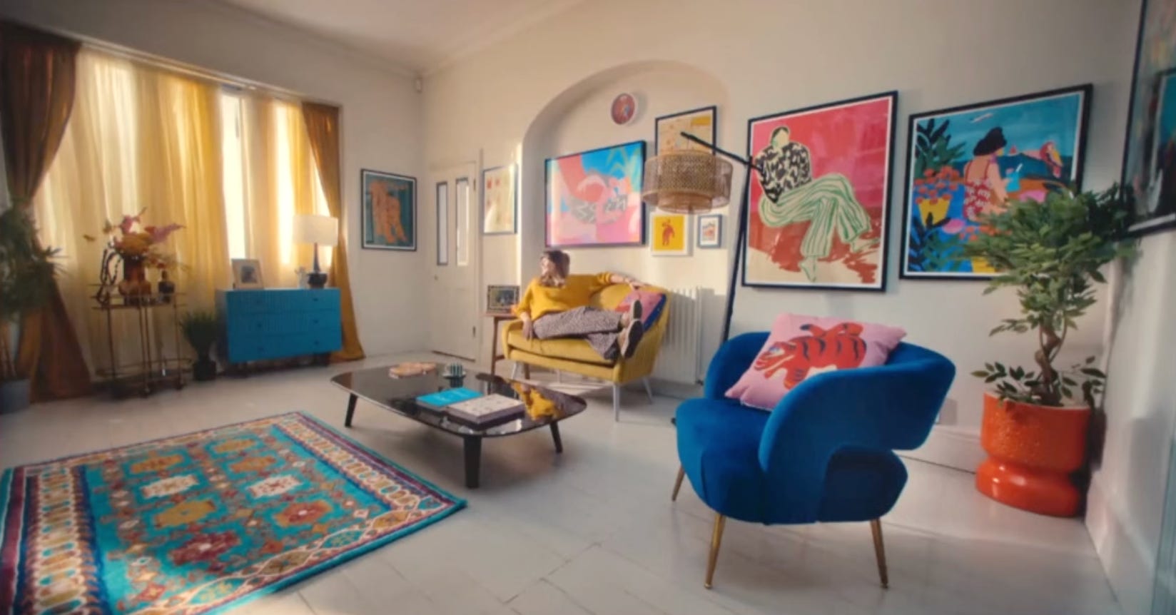
Right, so here’s the list of things you want to avoid when designing your own rooms. It’s hard to know what order to tackle it in, so I’ll just go with as I saw them rather than a hierarchical list.
Problem: Rug is too small
For the life of me I will never understand why it couldn’t sit under the coffee table. For the millisecond that it’s on screen you would still have been able to see it.
I mean, it would still have been too small, but at least this room wouldn’t have resembled an archipelago in Floorboard Sea. Nothing in this room is related to anything else. I can only assume they wanted to set up for a game of The Floor is Lava and forgot to put it back afterwards.
Solution: Always buy the biggest rug you can afford. If you don’t have one big enough for the furniture to sit on in its entirety, then sit the coffee table in the middle of it and make sure the front legs of the sofa sit just on the edge. This brings the room together and makes it feel like a home and not a collection of stuff in a space.
Problem: Coffee table is too big
This piece of furniture didn’t change at all. I don’t know why, since FY does sell coffee tables. Maybe it was designed to show how to integrate your existing stuff with the new. Except it doesn’t, does it? Cos it’s too big.
Solution: A coffee table should be about two-thirds the length of the sofa. But if it is bigger than the sofa/chair then add another chair to balance it out. We can see that here she’s bought another chair – it’s blue and it’s clearly a chair – but it’s bigger than the yellow thing, which may or may not be a tiny sofa. Is it a “love seat”? 🤮
Problem: The colours are all individual blocks that bear no relation to each other
I have said before that I lean towards tonal colour schemes by preference (that suits how I live – mostly writing by myself) but I have absolutely no issue with stronger shades that contrast. You, as this newsletter exists to show, should do you. However, if you want to create a cohesive colour palette as part of room that works, you need to ensure that everyone is friends. A well-designed room is a conversation and everyone needs to be chatting, in groups, in pairs or as a whole. Meanwhile this room looks like a kindergarten play area.
Solution: The colours are all in there; the rug and the artwork are talking to each other. In theory, pulling out two of the colours in the three largest piece of furniture – chair, love seat (🤮) and plant pot – is the right thing to do. BUT, because nothing is touching or joined up or even related, the effect is of a room of strangers in a train station waiting room. No-one is chatting. Everyone is basically scrolling their own screen oblivious to everyone else. As the host owner of this room it’s up to you to make the introductions, find out what everyone has in common and get that party/soirée started.
Problem: Artwork is bigger than the furniture
I love a big picture, but when it’s the same size as your chair, the scale is off. I also love a gallery wall when done well, but here we have a series of pictures slung up in a line, with no thought given to how to arrange them inside the arch, or consideration about how they fit together.
Solution: If you are fortunate enough to have an architectural feature like this, create a display within that. Then look at another section of wall. Don’t just plonk large pieces next to each other, unless they are a pair. Try to vary the heights so you fill the wall. It’s perfectly acceptable to come down to skirting board height if there’s no furniture in the way.
Problem: Floor lamp is lighting a bare patch of floor
Once again there is a problem of scale and we’ll come to that at the end, but you can’t just stick a lamp in a room and hope for the best. Remember: you are creating a space that has purpose.
Solution: A lamp needs to be close enough to the seating so that you could see to read, chat, or watch TV, and its size should be relative.
Problem: Why is there a chest of drawers next to a bar cart – and both of them are miles from the seating area?
This just feels like an exercise in showing off all the FY collections. The chest of drawers may be the same one she started with, but it has somehow acquired a coat of blue paint. Then there’s a round brass table next to it with a plant on the floor between. The effect is just one of stuff brought in and dumped in the first available space.
Solution: Move the chest of drawers to the middle of the window and lose the bar cart. There would be nothing wrong with putting a small round table next to the blue chair, but that one’s too tall.
So, the two core issues in this room are scale and purpose.
It’s fine to play with sizes but it has to make sense. A tiny chair/sofa/loveseat (🤮) will look even smaller next to a giant lamp. This is a big room, so be generous with your main piece of furniture.
Likewise with the rug. Use it to fill the room and it will define the space. And in instances where you might not have quite enough furniture, a large rug providing colour and pattern can also hide the fact.
Then you can add a big lamp or a more delicate side table.
Think about why you are buying a piece of furniture. Do you need the storage? Do you just love it? In which case, give it somewhere to stand where it can show off and look lovely.
Every room needs a focal point. This doesn’t have one. You don’t know where to look as there are so many things that jump out at you. Your eye should be led around the room, travelling from one spot to another as you discover a space. But this room puts the eye on a pogo stick, leapfrogs it round the room and then gives it a poke for good measure.
I hope I have provided a few useful pointers in how to bring a room together (or not!).
Coming up later this week for paid subs is a classic Design Decoded (this was the opposite!) where we look at a house that is on the market and analyse the rooms to see what has worked and how we might take inspiration for our own places and spaces.
On Friday, my new monthly Design Shopper post will offer advice from a special guest interior designer sharing her styling tips, sources and best practice. This time it’s Leanne Kilroy (The Good Bones Life and @goodboneslondon), so don’t miss it.
You can subscribe here if you want to be part of the conversation.

I think they would have been better to run the ad like the old Generation Game conveyor belt - and get as many of their products to scroll past on the screen!
Very very funny 👏 and also packed with useful tips! Huge living room for max two people to sit?! So many questions