Design Postcard from Mexico City
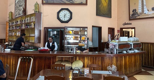
Join me at the famous Café La Habana, where Fidel Castro and Che Guevara are said to have plotted the Cuban Revolution over coffee and chilaquiles.
Design Postcards are free to read, but paid subscribers have access to so much more – coming up this month, three houses in Mexico City, an interview with Beata Heuman, my live Drop-in Design Clinic, where you can ask me your own decorating dilemmas, as well as the whole archive full of design ideas, how-tos and inspiration for all homes, budgets and tastes.
Free subscribers: check your inboxes for an amazing special offer sent on Sunday 6 April.
Opened in 1852, this café was not just for revolutionaries – Gabriel Garcia Marquez (have you watched the brilliant 100 Years of Solitude on Netflix yet?) is said to have written part of his most famous novel here while Octavio Paz (poet and diplomat) and Roberto Bolaño (Chilean novelist) all hung out here. Bolaño immortalised La Habana under the name Café Quito in his 1998 novel The Savage Detectives, and Patti Smith later performed there in his honour. Such is its fame in the city that apparently Mexican politicians come here when they want to be photographed in a positive light.
It’s easy to walk by without really noticing it, but once you enter, the high ceilings and old-style decor look like nothing has changed in decades. I imagine it was a lot smokier in the Fifties, but the noise and hubbub against a background of Cuban music and large families eating lunch make it feel like a real place and not just one that has become a tourist attraction, although it is undoubtedly that too.
We strolled in on a Sunday lunch and my son (who is doing a five-month internship with the sculptor Pedro Reyes) immediately began trying to identify the music via Shazam, but the parallel soundtrack of cutlery and plates and general chit-chat made it impossible.
As a decor scheme it’s perfect. The floor is laid with tiles – small ones put together to create a large checkerboard – it’s a huge room, but you can create your own size according to the space you have. I realised that the chocolate and cream colour scheme is similar to the lino floor that Lucinda Chambers has in her west London kitchen.
Back to Mexico, and note the glossy wood of the bar and the front panelling. That could perfectly be translated to a kitchen. I had a press release from Architectural Digest the other day about the return of the wooden kitchen (paying subscribers will soon receive a post on the pink and wood kitchen of Luis Barragan that is all over Pinterest).
Now to the wall colour, and it’s a soft peachy pink. This is where you might want to pay attention according to your own climate. Plaster pink is one of those colours that soaks up the sun and can go anything from full peach to soft coral during the so-called golden hour. That might be what you are looking for, or it might be too much.
In a south-facing room you’ll get added gold from the warmth of the sun, whereas in a north-facing one the light will be steadier and bluer, so a cold pink will become cooler which if you are after the look of a revolutionary café may not be the desired effect.
As always, paint a large piece of card or paper and move it around the room at different times of day to see what suits, taking special care to look in both dark corners and those areas in direct light. A few suggestions to shortcut:
Mylands Threadneedle (UK only) is a cool pink with violet undertones – gorgeous in both north and south-facing spaces, where it will become warm but not peach.
Little Greene Masquerade (US, UK, EU) comes in mid, light and dark. Can be “quite pink” in strong light, but it’s a lovely shade.
Farrow & Ball Setting Plaster, Templeton and Smoked Trout (UK,US, EU) are all variations of a brownish warmish pink. Your room will tell you which one it wants.
Benjamin Moore Rose Tone (UK, US, Australia) is another earthy pink.
I wasn’t tall enough to get a good shot of the black and white photo above the door but you can see the place hasn’t changed since it was taken.
If you want to read more, this is a good round up of the history – and below is a video in case you want to hear a short and rather muffled snapshot of the music. Enticing I know! I should have tried harder but truth be told we were all slightly suffering having visited the Teotihuacan pyramids in the heat of the midday sun (mad dogs and Englishmen) the day before, and while being determined not to miss this venue, none of us felt much like eating or drinking. My son took his food to go and I stared at a cup of coffee for 20 minutes. Let’s just say we were in no mood to either plot a revolution or write one of the greatest novels of the 20th Century. But the decor definitely inspired me, so you never know what may come out of it.
I hope you enjoyed this design postcard from Mexico City. Do search for the others, which have come from (so far) Copenhagen, Venice, London, Turin and Iceland. They are always free to read. Paid subscribers will soon be given a peek inside the three houses we visited while we were there – two private houses – a glorious pink modernist home designed by Luis Barragan, the modern concrete studio and atelier of Pedro Reyes - and La Casa Azul, the blue house lived in by Frida Kahlo and her husband Diego Rivera, which is now a museum. You can upgrade for access to that and many other posts here:
Don’t forget that special offer: the first 25 to upgrade from free to paid will receive a free 30-minute 1:1 zoom design consultation with me.
Thank you all so much for being here – free and paid. I’m so grateful for your support and the chance to keep writing and sharing interior design ideas in a way that is, I hope, both accessible and affordable for all.
What a beautiful space, and the advice about neutral pinks is timely for me, as I am currently painting things in different shades and looking at them in different (mainly rainy) lights.
So clever, the big checkered tiles that are made up of smaller tiles. Genius!