Eye on Design
This month's news from the interiors world, including Stockholm Design Week, a visit to the William Morris Archive – and Beata Heuman's paint launch.
It might feel like there’s not much happening at this time of year, other than watching the days drizzle by while we wait for Spring, but the design world is busy and there’s been lots going on.
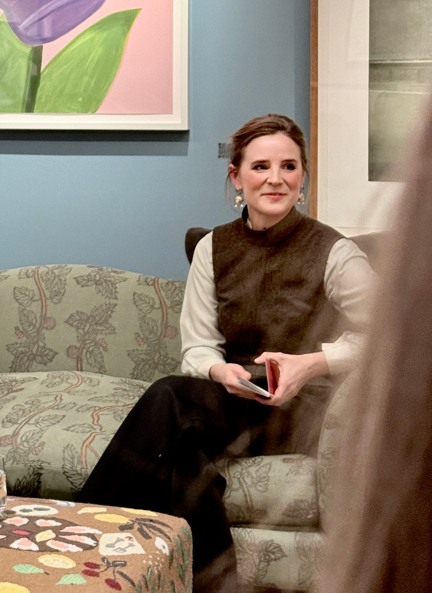
The most recent of which is the hotly anticipated paint collection by Beata Heuman and Mylands, Britains’ oldest family owned and run paint manufacturer. There was a launch party in Bond Street at which Beata spoke about her collection of 24 shades called The Dependables. My very good friends at Irving & Co (who designed my most recent book) also created the beautiful paint card. I love that it has space for notes.
At the event Beata spoke about how colour is democratic: “It’s there for everyone to use however they wish”, and reminded us that paint is the backdrop. It doesn’t need to say everything in the room, she added.
She also talked about the importance of creating a complete colour scheme: “I get irritated when people ask me what single colour I have used on a wall in a room, because one colour is not the answer. You need a palette.”
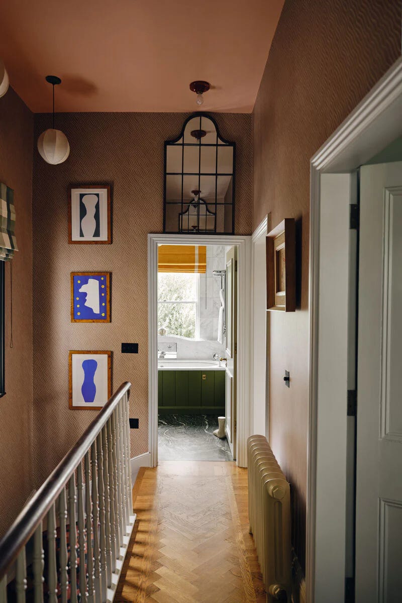
To that end her colours will all go together, however you wish to use them. Beata is a fan of a neutral wall and saves the strong colours for pieces of furniture or perhaps the odd ceiling. She recently painted the ceiling on her staircase in Mormor Zaza (Swedish for Grandma Zaza) and says not only did no one in her house notice, but that it also casts a lovely warm glow down the stairs. Thereby proving, once and for all, that a) nobody is agonising about it as much as you, and b) you should just pick the paint and move on.
Beata’s was not the only paint collection launched this month: Paint & Paper Library has released Jewels, eight colours based on naturally occurring precious and semi-precious minerals, with names such as Malachite, Atlas, Rose Cluster and Midelt Sage.
I was invited to the launch last year, where we were shown samples of the crystals that had inspired the collection. The colours are extraordinary and while some are too bright for me, the muddy Midelt Sage and Rose Cluster make a joyful pairing.
At the l(a)unch the P&P team reported that our collective colour confidence has been on the rise since the dreary grey lockdowns of 2020 and told us about these incredible colours which are all found in nature. Midelt Sage comes from a mining village in Morocco, while Blue Tiger is found in only two places in the world – one of which is Oregon in the US (and I forgot to write down the other). Malachite, you may already know, forms in copper mines along with Purple Azurite, which was apparently used by Vermeer in his painting The Girl with the Red Hat (it has become greener over time).
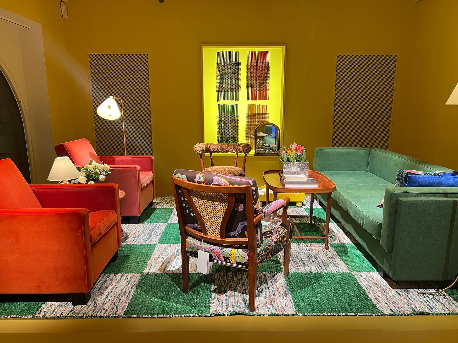
Moving on from paint, the design year starts with Paris Deco Off, during which the streets of St Germain are filled with colourful lampshades and the stores are swathed in fabric as the design houses launch their new textile collections. This is followed by Stockholm Design Week. Last year I attended both, this year neither, due to other commitments, so I asked Katrina Burroughs, of The Times, to report back to me with her highlights from Stockholm. She chose three rugs, one of which was created by weavers in western Ukraine.
Frank in the Loom was inspired by traditional Swedish rag rugs. These limited-edition carpets were made using remnants from Josef Frank’s famous printed linens.
If you ever go to Stockholm, you must make time to visit Svenskt Tenn, which has a café too, so you can’t go wrong.
Elsewhere at the show, Tekla Evelina Severin (known as Teklan) showed her work at three stands for what Kat described as a “mood-boosting highlight”.
She also visited one of my favourite rug brands, Layered, which is celebrating its 10th anniversary with a collection filled with colour and pattern.
One day I will have this one:
Sticking with textiles, I was also delighted to be invited to visit Voysey House in Chiswick, the home of the Sanderson Design Group, which also owns William Morris and Harlequin. The company was set up by Arthur Sanderson in 1860 (and was recently awarded the Royal Warrant by King Charles III) and this was the only non-residential building created by CFA Voysey, who was noted for his domestic architecture. It was left to rack and ruin for many years, then mucked about with in the Eighties, before the company finally came back to its roots and restored it, bringing an archive of some 75,000 pieces. I was allowed in, but had to leave bag and camera at the door as there are so many copycat firms who will scan images and reproduce the designs for the mass market, so sadly I can’t show you.

That said, the building is open by appointment for designers and if you are researching a specific period or design, you can write and ask for permission to view the archive. I loved this huge screen print which shows you all the different colours and layers that go to make up a William Morris print. From one side it’s a jumble of shapes, but walk round to the other and you can see how the pattern jumps out.
And here, from the other side you can see how the pattern takes shape once all the colours have been layered on.
In addition to not taking any pictures of the archive, I also had to sign not one but TWO NDAs (non-disclosure agreements) before I was allowed upstairs to see what they are working on, so I can’t say anything – other than keep an eye on them later in the year, particularly William Morris. I’m sorry to be annoying but it would be quite inconvenient to be sued, as I’m sure you will agree.
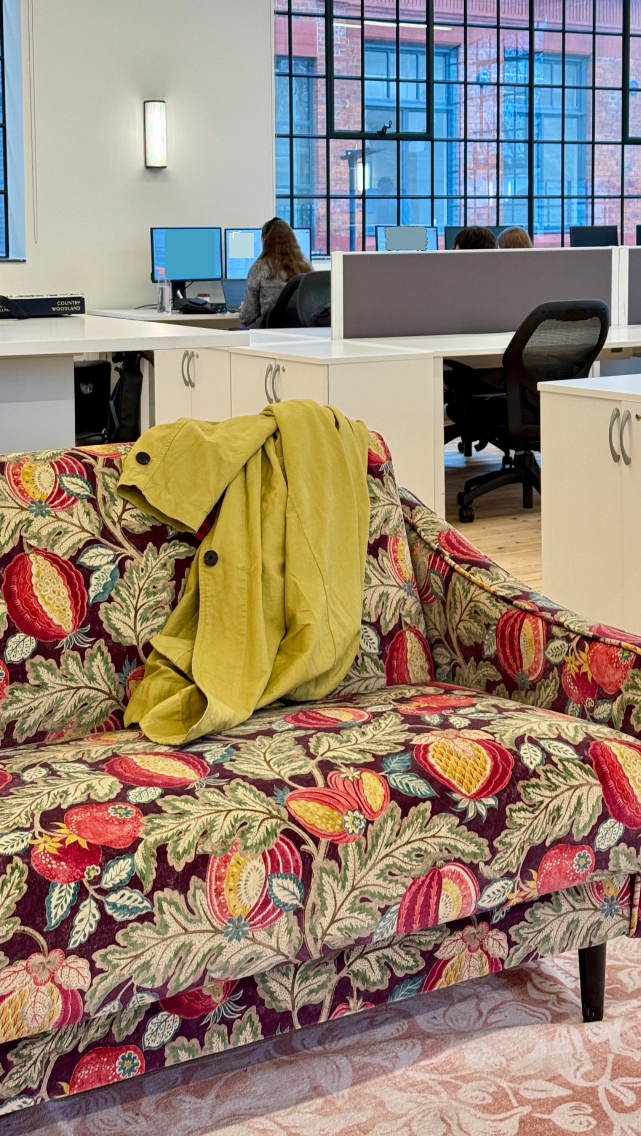
I grabbed this picture from the design floor and you can see how even the staff dress like the decoration they are working on. That’s dedication:
My final outing of the month was to a dinner with Next, who have just launched N.Premium - the clue’s in the name - a small collection of sumptuous and timeless neutrals that’s meant to be kept for ever, rather than trend-led, and built up over time.
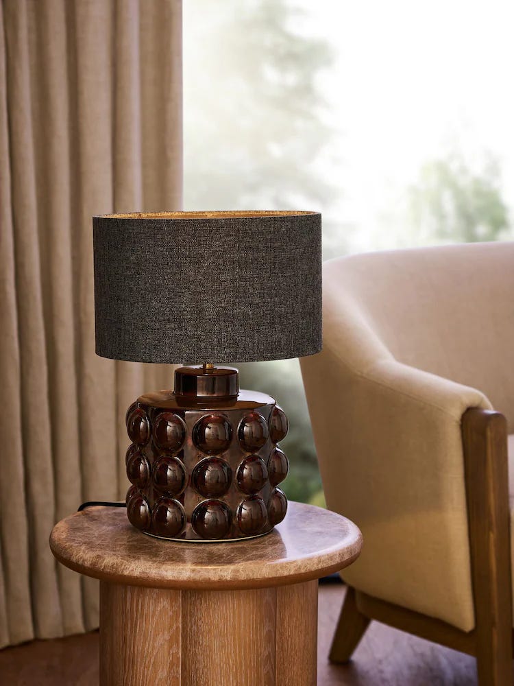
The drops are small, to reduce overstock and waste, and I can tell you that the 600 thread-count bedding and cashmere throws are divine. I also loved the lamps.
Now some design news from my inbox. I was interested to hear about EarthKind, the only company that takes used feather & down duvets and repurposes them to create new ones. (The filling goes through a really thorough cleaning process so they are like new, assures the press release). I have been asked if I want to try a sample and perhaps, as it’s a new company, it might be worth me doing so and reporting back to you?
This post is usually paywalled, as it includes shopping recommendations and sourcing ideas – but since there was so much news this month I have kept it open for everyone. If you want to see what I recommend from the new launches in store now, you can upgrade to paid.
Finally, a bit of shopping. The Times wrote a piece a couple of weeks ago about how great the high street is at the moment, and it’s hard to disagree. Whatever your position on fast fashion (and I know we all agree it’s a bad thing) it can be hard to find or, crucially, afford stuff that is made in a more thoughtful and sustainable way when it comes to clothes and homewares.
The key, then, is to really understand your taste and style as well as your needs, so that when you do buy something you know you will keep it and love it forever. After all, if you need a chair and don’t want to sit on the floor for several years while you save for the perfectly crafted sustainable version, you need to buy something now.
On that note, for paid subscribers, here are some fabulous pieces. I have only included things I would actually buy given a limitless budget and elastic walls. If I wouldn’t have it, I won’t show it to you.


