

Eye on Design
A monthly round-up of design news, trends, and selected products – with places to source them.

Substack is filled with posts on what people have bought and want to buy and probably will buy, and while I’m an avid reader of such pieces (it’s FOMO research) it’s fair to say that I buy only a fraction of the things I see. Of course, there’s also a general trend towards buying less, so this month (and from now on) these posts will try to focus more on news from the interior design world, with sources for those who wish to shop. That way you will still feel up to date, with your eye fully on the design (as it were) but I can provide something a little bit more informative than just “here’s a nice lamp, now buy it”. Although there’s that, too!
So, let’s dive into a round-up of what the media have been talking up as trends for 2025 from the colours, accessories and styles you might want to know about or incorporate this year, as well as my own hot tips and discoveries.
First up this month is the colour yellow that seems to be everywhere.
GOOD YELLOW HUNTING
Every trend piece I’ve read this year is talking about yellow, so if you are thinking of taking the plunge then here is my pick of the best yellows to choose. Be warned though, there will be no primrose, daffodil or acid. Those shades are, for me, cold, uninviting and spell danger.

Offer me, on the other hand, a rich buttery shade or a warm, yet pale hay and even a strong dose of mustardy ochre and I’m all-in. Actually that’s not true. I’m not ALL-in, because even if you love this sunshine colour you still need to tread with care as it can overwhelm.
If you want to paint a whole room, look for the paler buttermilk shades that give a feeling of gentle warmth rather than midday in the desert. Try Hay by Farrow & Ball or Lute from Edward Bulmer.
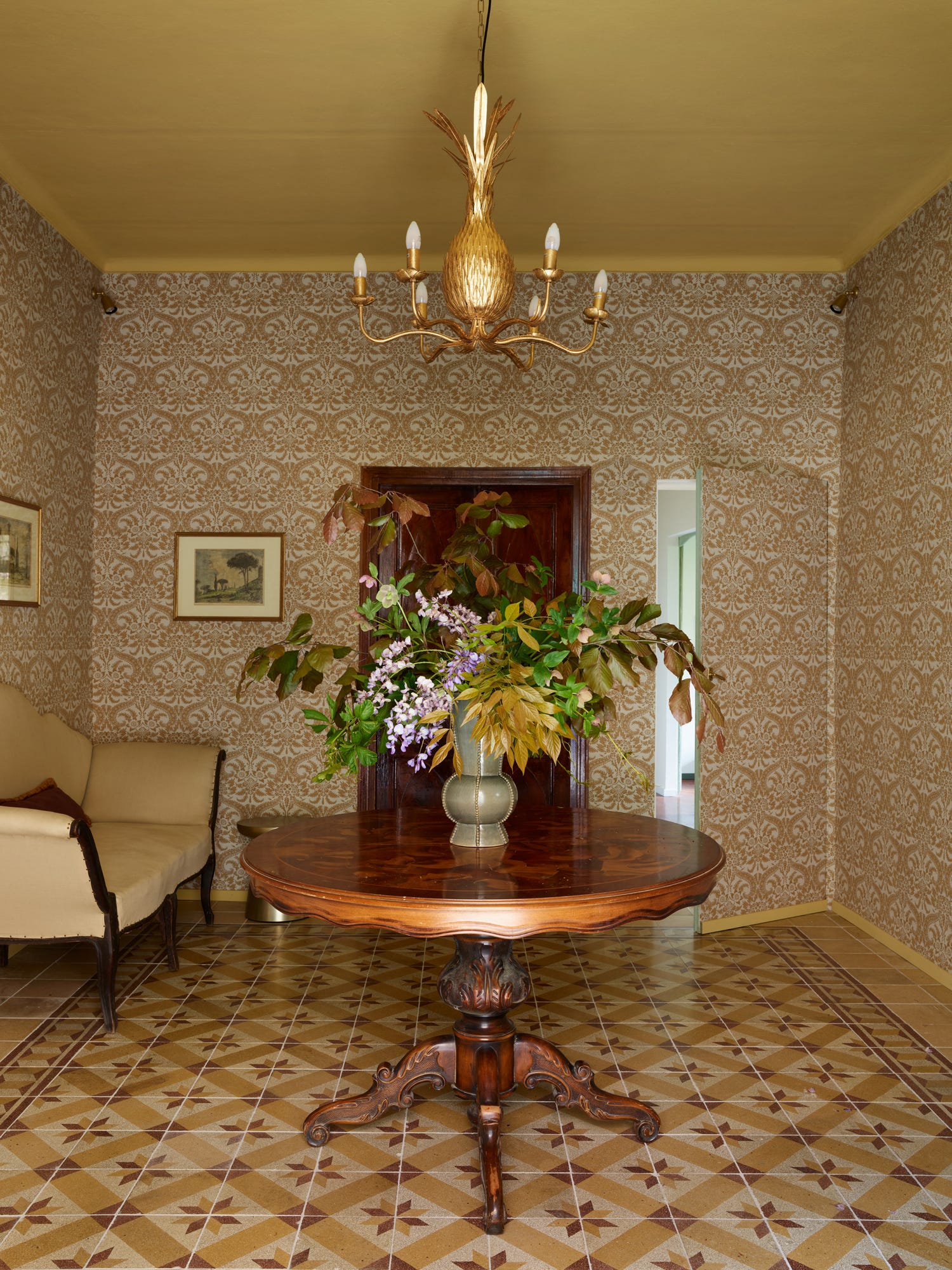
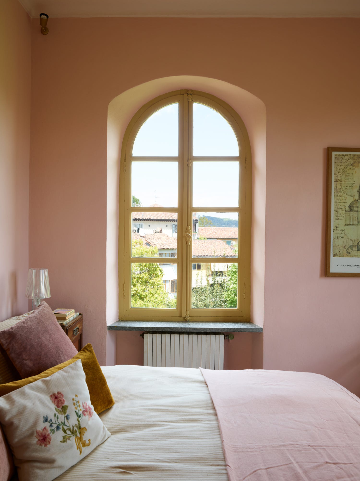
For an uplifting accent, leave the walls alone and focus either on the ceiling (which I did in the hall in Italy using my own Sole colour) or the window sills so it feels like the sun is pouring in, even when it’s actually raining.
In smaller doses like this you can use a stronger colour, since it won’t overwhelm and should just provide a shot of joy.
What to put with it? Well it loves pink for starters and will flex well alongside shades of bitter chocolate. You can play around with greens, but be careful your room doesn’t look like a flower. You won’t go wrong with warm cream, but you might want to add a dark grey or deep brown to cut through and provide some definition.
The best way to work with yellow is to have a single block of it – walls or ceiling – and then add in lots of patterns that include shades of yellow. That way you don’t have too much of one thing and it breaks it all up a bit and makes it easier on the eye.
Good yellows include:
Mine (!) which is Sole by Graphenstone
Sudbury Yellow by Farrow & Ball
Giallo by Little Greene
Trumpington by Edward Bulmer (as seen in Nigel Slater’s hallway above)
Ziggy’s Yellow by Coat Paints
GOOD PLACES FOR GREAT VINTAGE
Upgrade to discover the best places to buy vintage, great places to shop for fabric – and get access to next week’s live Design Clinic.