


House Notes #10
A round-up of things that inspired me this month – from screenshots and galleries to press shows and shopping. Read on for gorgeous colour palettes, great trainers and the best TV stands I've seen.

Like many of us who are dependent on our smartphones I use the Notes app and the camera incessantly. It’s an ongoing to-do list (I love ticking off those little circles) and a reminder of things I have seen and want to remember, places I have been or want to visit. I also love the challenge of trying to take a great photo on my phone. I miss that about Instagram. Part of the joy of it for me, aside from the endless inspiration to be found by zooming in and examining other people’s room shots, was learning how to compose images and playing with the editing tools to improve the lighting and composition. Alas, that has all gone, and while I make no great claims for my skills, here is a round up of things that have caught my eye this month including, at the end, some links to great pieces I’ve read. I keep forgetting to do this, but there is so much wonderful stuff here now that I’ve finally managed to work out how to bookmark and share.
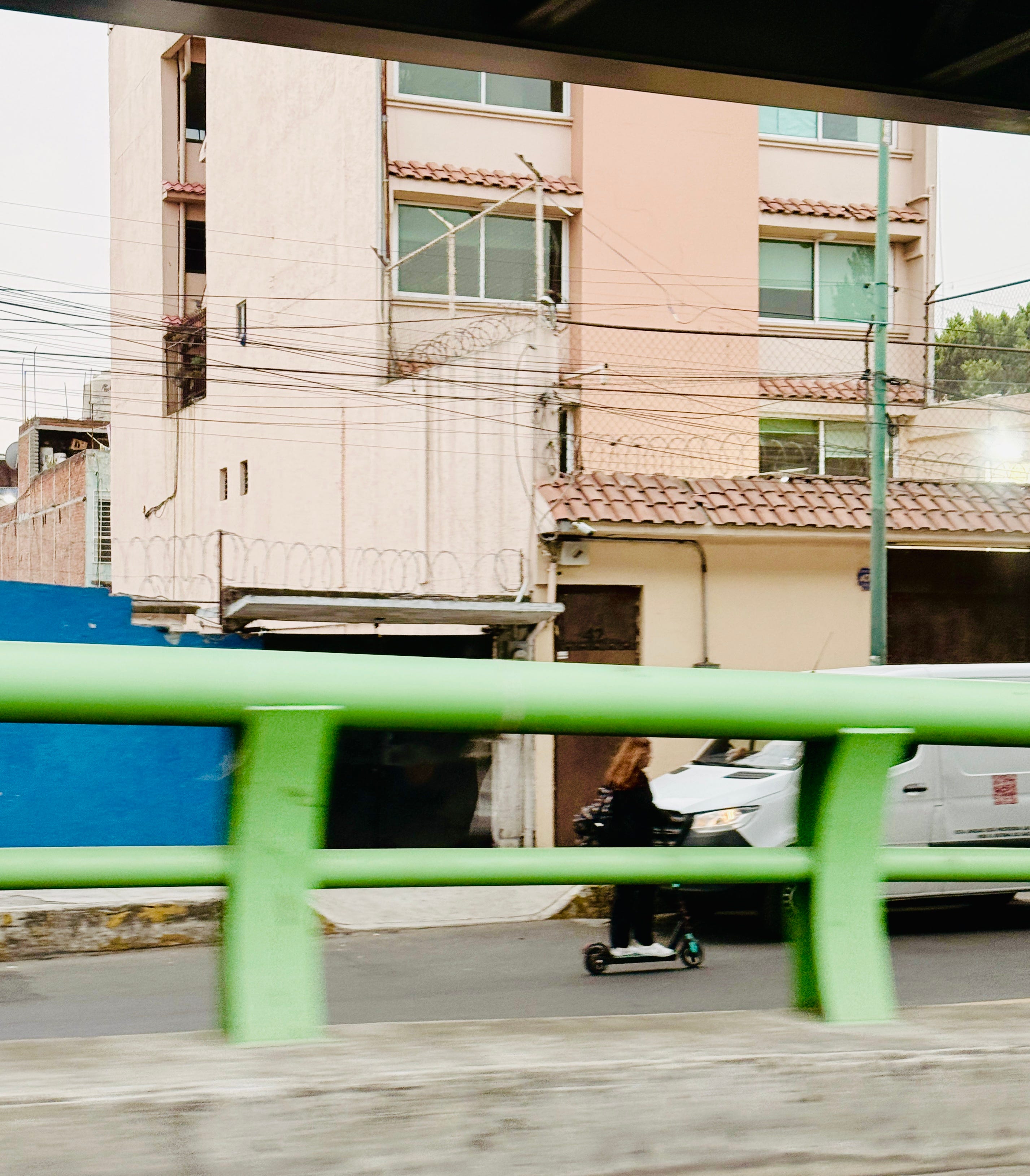
Cheating slightly we’re going to start with this picture snapped from a moving taxi on my way from Mexico City Airport to the hotel in April, because what a colour palette! I’m thinking walls and ceiling in two shades of pink, adding lots of dark wood and then woodwork in that fabulous green in the foreground.
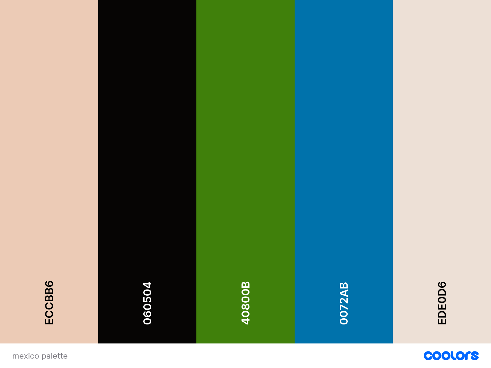
I used this site to create my scheme. I wrote recently about the Canva Palette Generator and how brilliant it is to help you put together a colour palette, but this one is also great and actually gives you more flexibility (read the post linked above to learn how to create a room scheme). It picks the colours, but there’s a slider mechanism which you can use to change the combinations and shades. This is brilliant if you already know you love the image and the colours in it, but aren’t sure which shades you want to use or in what combination. The numbers are Hex colours which you can search for and then finding a corresponding paint. I’m going to suggest that dark green below might be Farrow & Ball Danish Lawn, the plaster pink exists in any number of places and try Paint and Paper Library Copper Beach for the brown.
I took so many pictures of colour palettes in Mexico and it’s such a great way to think about creating a room from anywhere you are.
Staying with using images for paint colours I finally caught up with series one of White Lotus – I know, I know – and I had to keep pausing the TV to take screenshots as the palettes were so lovely.
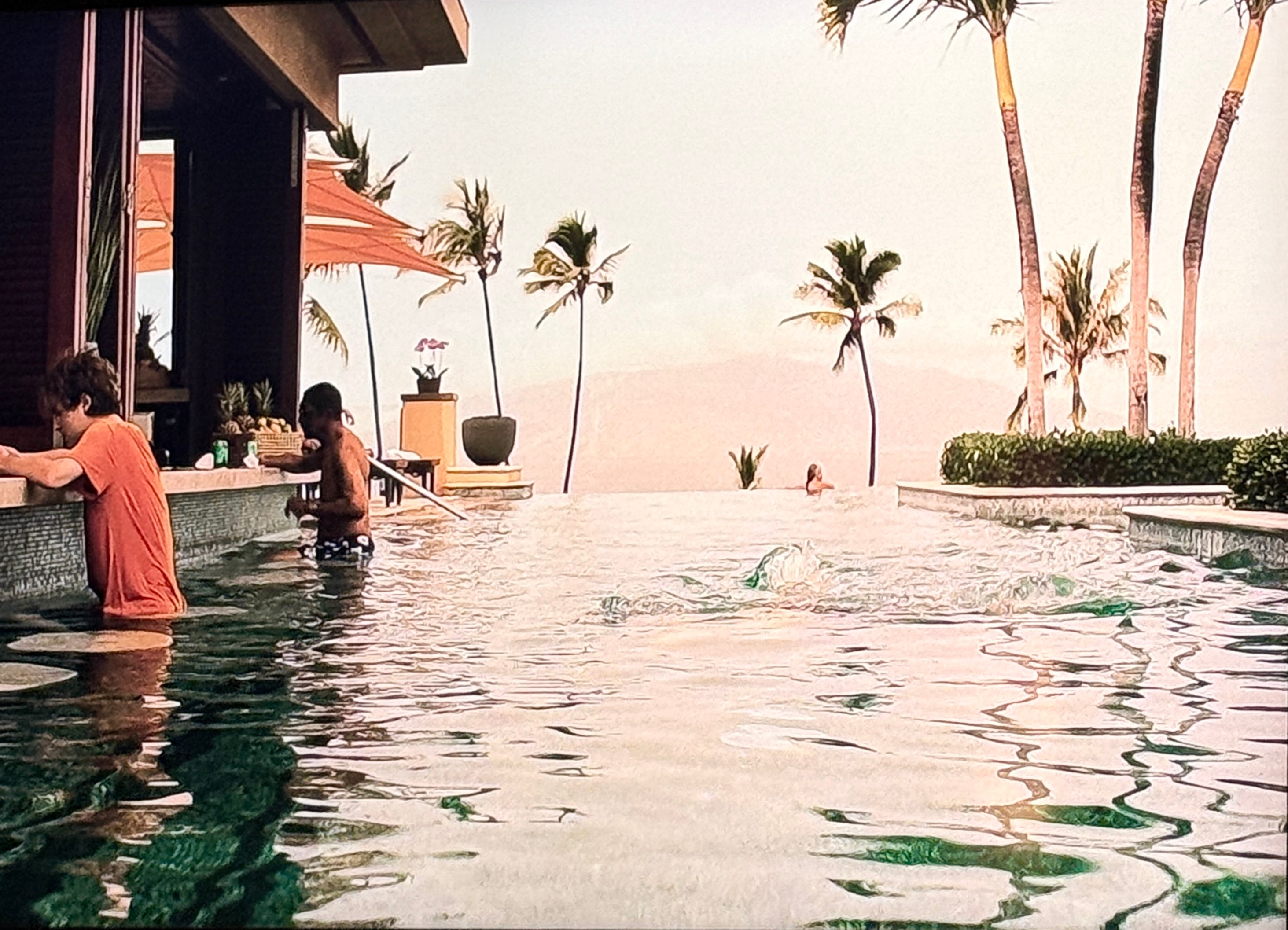
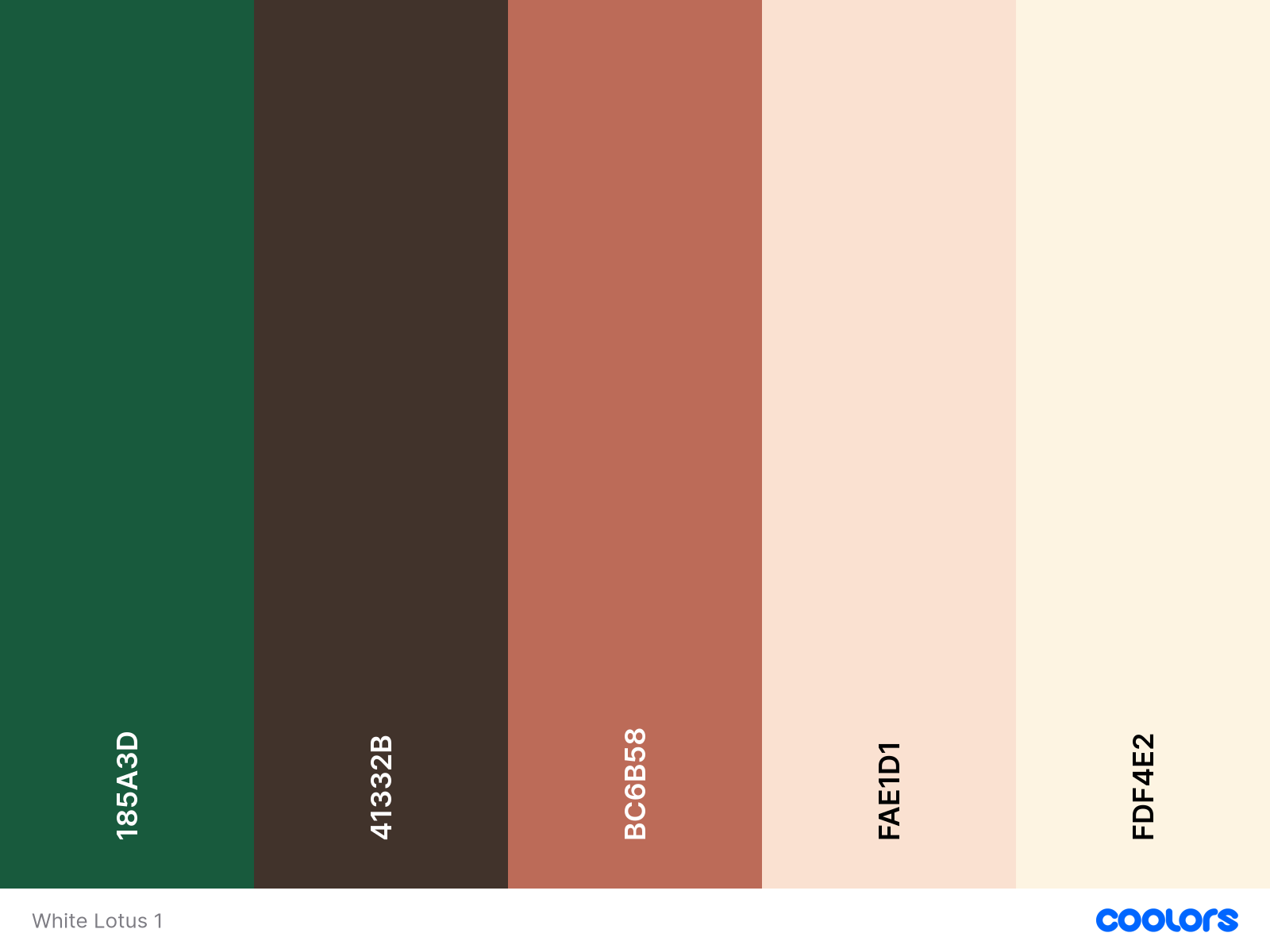
It’s completely addictive. I particularly love this very warm tonal scheme above but the flash of green just lifts it out of what Lucinda Chambers would call “ghastly good taste”. You can also move those dots around individually if you want to play with just one colour.

Staying with colour palettes but moving to restaurants, this time I went to one of my Turin favourites – Bistrot Caterina. This is one of the key destinations for the design retreats because, well, look!
Blue and red together is a bold move but it really works here. The colour is a little more blue and a touch less green in real life but I love the velvet banquette and the way there is a darker blue line along the top.
Next door is a bar and more informal lunch spot and I just love the bold use of the two shades of blue together with all the wooden furniture.
If this was your house, just could just throw in some stripes for the upholstery, either in matching tones or perhaps with a bit of orange for contrast, and you’re all set. Who needs white paint. I was going to add a question mark but I think actually I’m making a statement.
The rest of this post is for paid subscribers only, but do sign up here if you want to see more of my house in Italy, what I found at the vintage market, my picks from the Seletti pop-up at Selfridges and a really cool TV stand that also comes in pink as well as olive green.