


Not going to complain about the weather, but man it will be nice to be able to walk upstairs without breaking sweat, won’t it? At this stage of August we might be eking out the last of the summer days and not thinking about our interior design much, but there are hints of newness dropping into my inbox and I thought it would be nice to give you all a sneak preview of things that are coming up in the autumn.
Before we get to that I was sent an Indian dohar from Shades of Cool a few weeks ago and it has been a lifesaver in this heat. I don’t like sleeping with nothing on top of me and even less so when we have the fan on. A dohar is a lightweight, three-layer cotton quilt. It features a soft flannel or cotton sheet sandwiched between two breathable layers of fine muslin, finished with hand block-printed designs.
It’s super light - lighter even than my empty cotton duvet cover - and in winter you can apparently throw the duvet on top of it, creating an extra warm layer, although I can’t even imagine that right now.
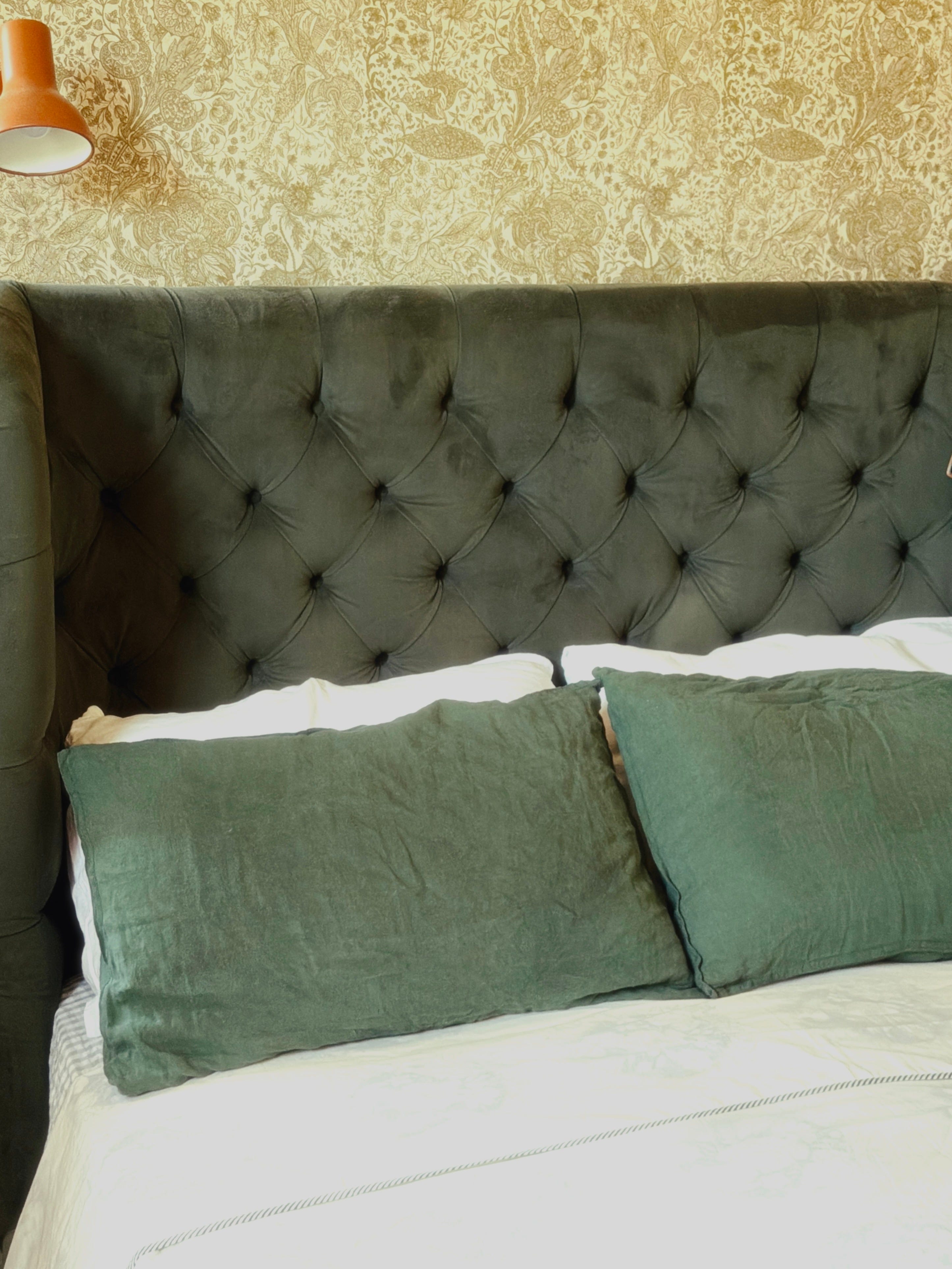
Now, new stuff - and the first thing that caught my eye is a collaboration between made.com (yes they’re back, although much less visible than they once were) and… The Barbican. I know, it struck me as an odd pairing, too.
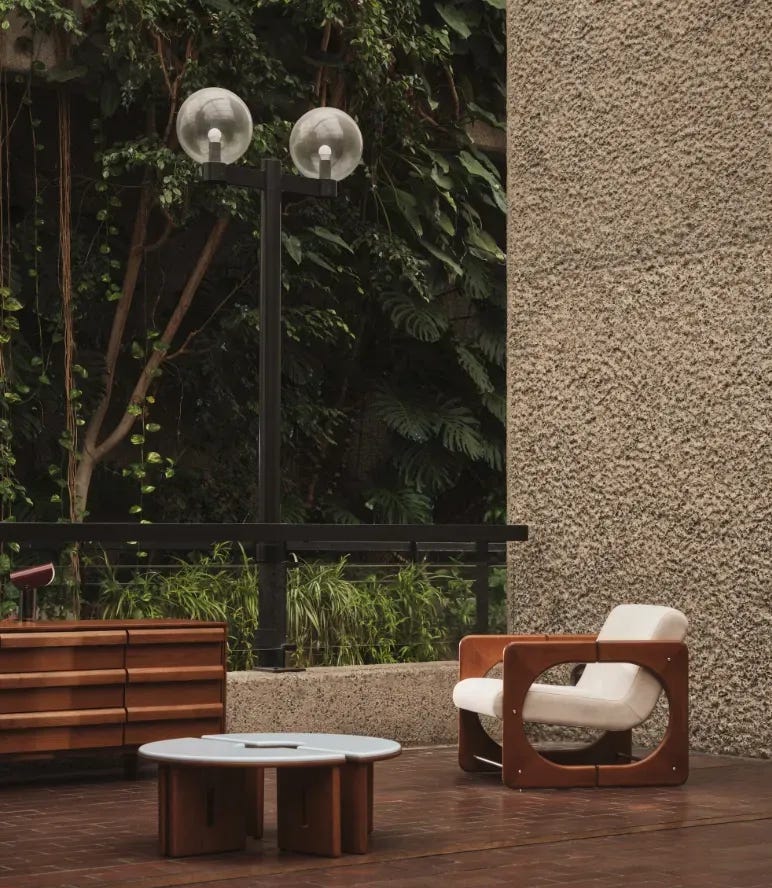
The 23-piece collection was revealed in Wallpaper* magazine; also not a natural partner for the furniture retailer which is now owned by Next, so kudos to the marketing team all round.
Made worked closely with the Barbican’s archives, including the pioneering work of designer Miriam Howitt, who created five show homes for the development in the late 1960s, according to the magazine.
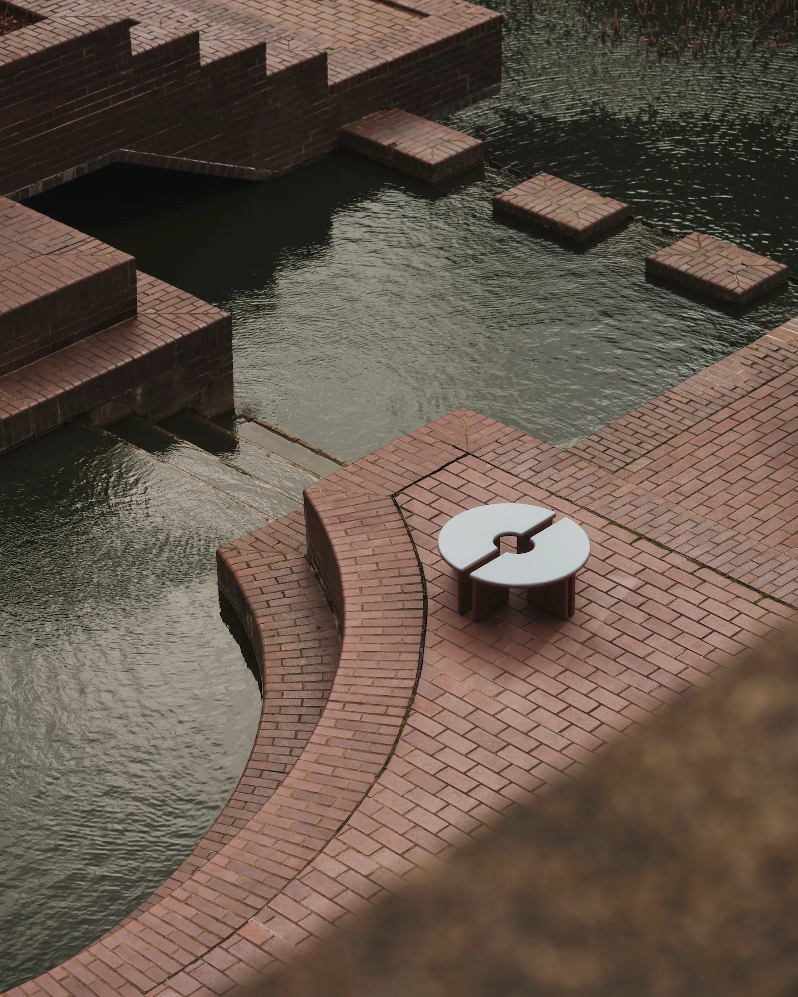
The ‘Dual’ accent chairs recall the estate’s concrete pillars, while the ‘Plinth’ coffee table is reminiscent of the sunken seating pods beside the Barbican lake. Elsewhere, the Concert Hall’s tubular acoustic panels echo the ‘Curve’ lamps, and the Barbican’s coffered ceilings appear in the rounded forms of Made’s ‘Coffer’ lights.
This September, Made will host an immersive installation at the Barbican for London Design Festival, offering a (free) look into the archives and the ideas behind the new pieces. I’m definitely going.
Talking of London Design Festival, I will be doing a takeover of the Bisazza flagship store on Sloane Avenue. I’m thrilled that I have been asked to redecorate this space for the famous Italian mosaic tile company, and I’ll be adding some relaxed seating to create a space for conversation and learning more about the historic, family-run business.
The store makeover project brings together Bisazza’s culture of mosaic with a contemporary perspective on the home, placing its beautiful collections within a domestic, lived-in setting.
Alessandro Bisazza, Chairman of Bisazza, said: “We want to create a dialogue between the culture of mosaic and the culture of living. During London Design Festival, our showroom will become a dynamic and open environment, creating new opportunities for experience, dialogue and exchange with a range of audiences.”
For me it’s an opportunity to experience Bisazza’s collections in a different context and bring them closer to the realities of everyday life, rather than the formal setting of a grand showroom.
Alongside the showroom takeover, Bisazza will present a curated programme of talks and events that extends the installation beyond the physical space, bringing together leading voices from architecture, interiors and design.
And this is where you come in. On the Friday evening I will be hosting a talk for 25 of my readers, so if you want to come along, then drop me a message or leave a comment at the end of this post and I’ll see the first 25 of you there.
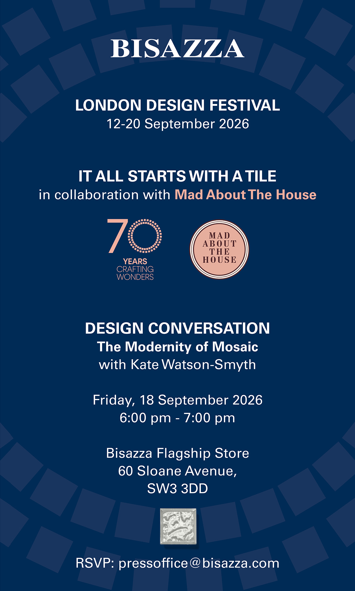
Bisazza was founded in 1956 and is one of Italy’s most internationally recognised names in the fields of design and mosaic. Throughout its history, the company has interpreted mosaic as a contemporary language of beauty, identity and spatial transformation, combining continuous design research with collaborations involving leading figures from international design, art and architecture.
Following London Design Festival (12-20 September) I will be turning my attention to Decorex (11-14 October) where I have been asked to design the Sustainability stage in collaboration with Haines Collection. Long-term readers will know I’m a huge fan of Jules and her mission to save fabric and wallpaper left over from interiors projects from going into landfill. She resells high end designer fabrics for up to 47% off, and crucially has no minimum order, so if your budget runs to a single metre for a fabulous Pierre Frey or Fermoie cushion, that’s the place to go. I have bought many designers from her over the years and also pointed numerous clients in her direction. I can’t wait to show you what we have come up with for this year’s stage design.
One of the great privileges of writing about interior design for so long is that I get sneak previews of forthcoming books, and occasionally I am asked to write something for the back cover. This autumn sees the publication of two books I have been honoured to endorse.
The first is The Nurturing Home: Living with Kotoisa, the Finnish Way to Happiness by Susanna Laiho Hawkin, aka SHNordic to her 1 million instagram followers. We’ve had Danish Hygge, we’ve had Swedish Lagom - and now it’s time for the Finnish Kotoisa.


The second book, House Proud, is by Kemide Lawson and it’s a fascinating and beautiful book - and one that shouldn’t be the first of its kind but somehow is. It’s one of the most page-turning books on interiors I have ever read. Get your pre-orders in for both.


Next, I wanted to share The Bronze House, created by Gemma Samuels’ studio Ankka. I met Gemma many years ago when we appeared on a panel together. Gemma’s background is in fashion, psychology and art direction, and she brings all of this to her work. The Bronze House was designed for a Nigerian couple who wanted their home to reflect their achievements and the life they are building together.
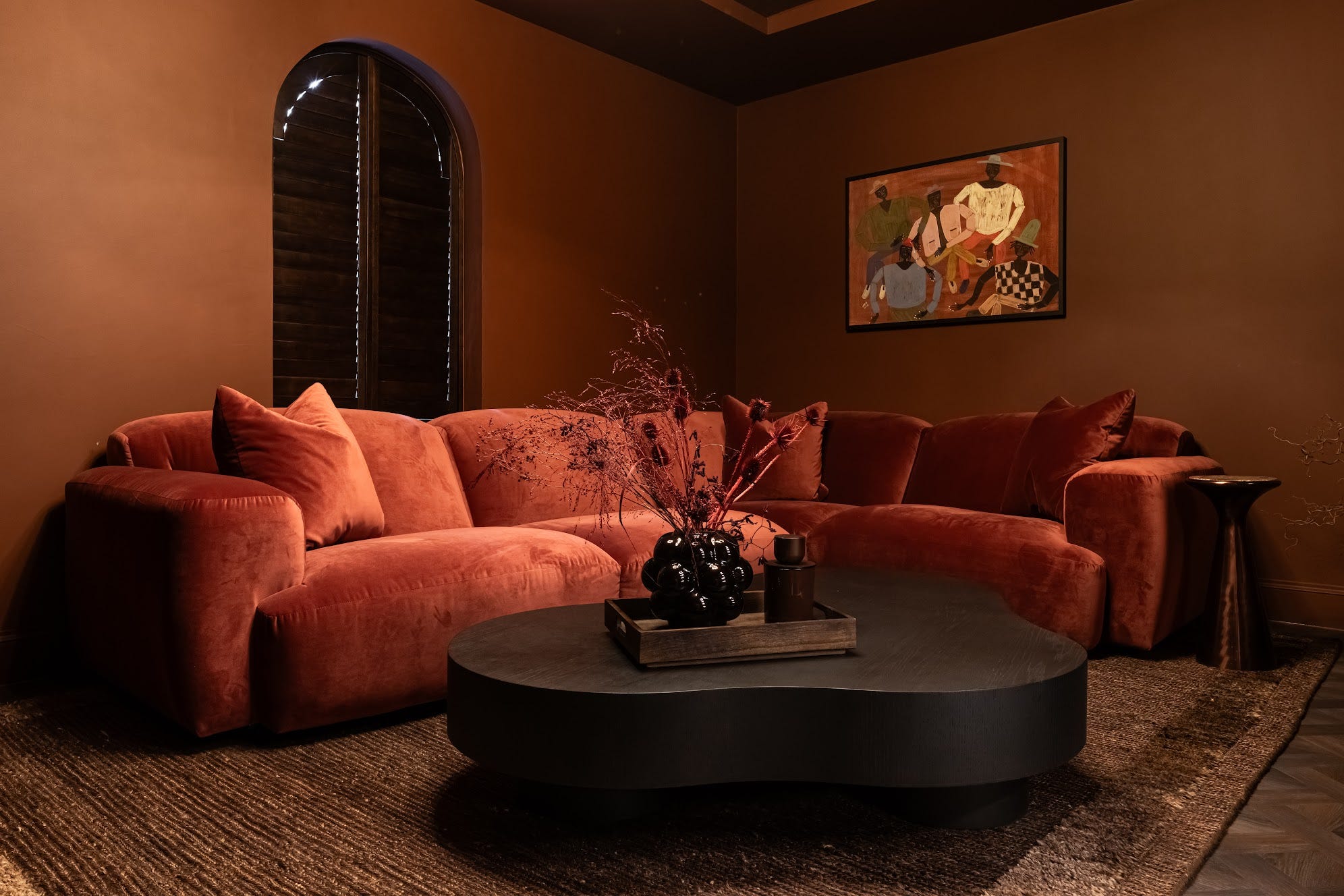
As a mother of three young daughters, Gemma understands this keenly since she is also renovating her own home, and has first-hand experience of finding that balance between aspiration and reality, in trying to create a home that reflects the life her family is building, rather than just an idealised version of it.
“I don’t believe in designing the same home twice. Every project starts with people, not Pinterest. My role isn’t to impose a style, but to uncover one, creating homes that feel authentic, deeply personal and impossible to imagine belonging to anyone else.”
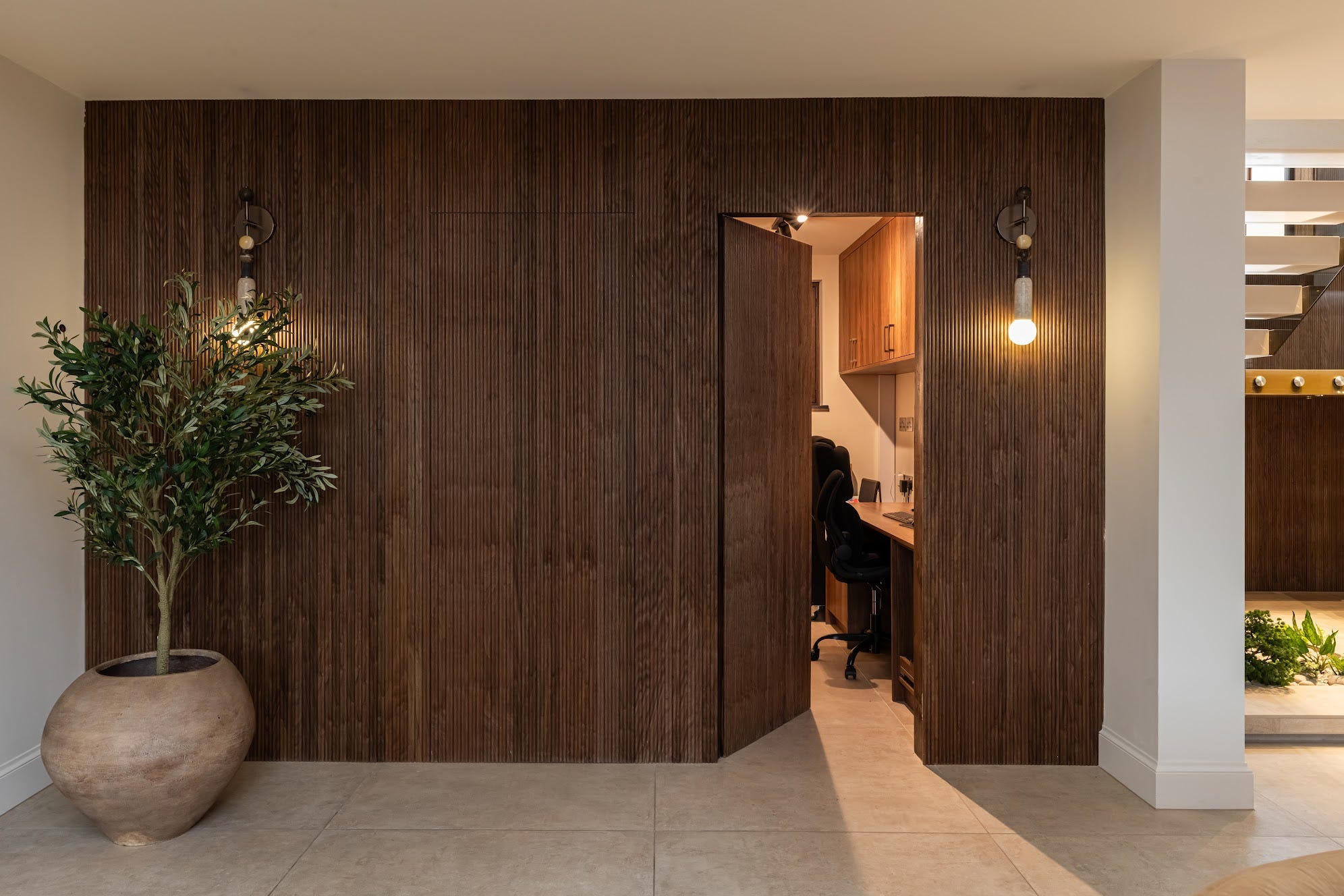
The Bronze House is full of soft neutral tones, with a bronze thread running throughout that links the rich velvets, walnut and burl wood and natural stone.
And finally, some of you who use the private chat - it’s available to all paid subscribers and it’s a great place to upload pictures and ask advice from other readers (many of whom are professional designers) - may remember a question from Lucy, who asked if anyone could suggest a paint that was the colour of sun shining through leaves.
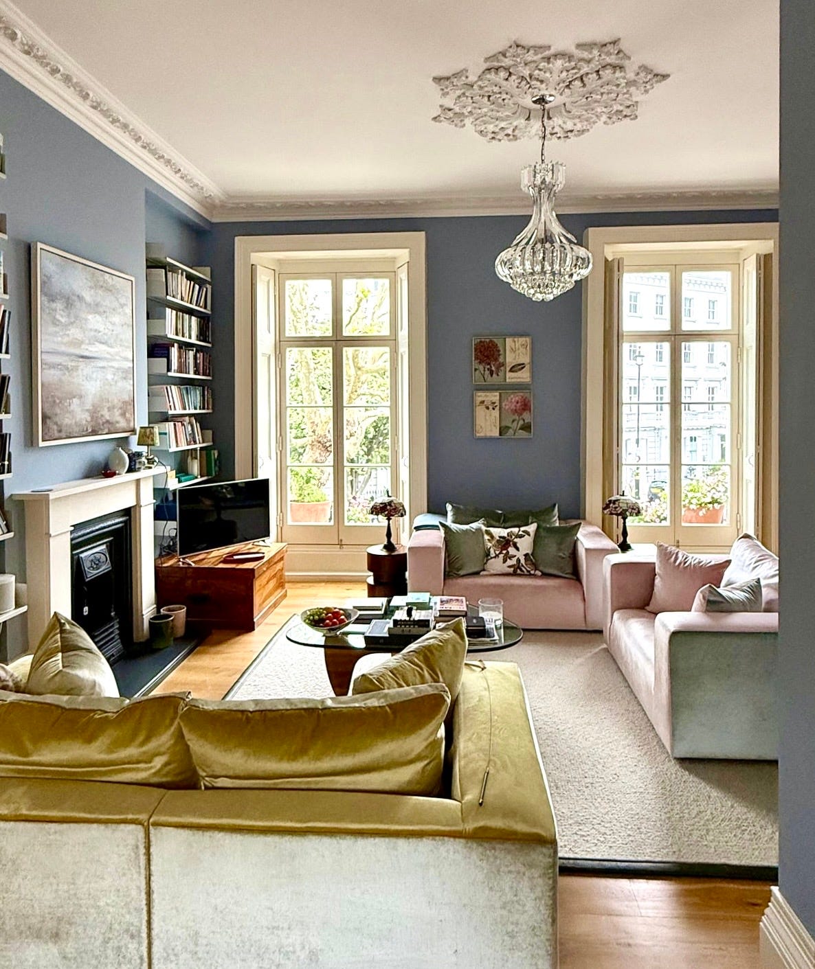
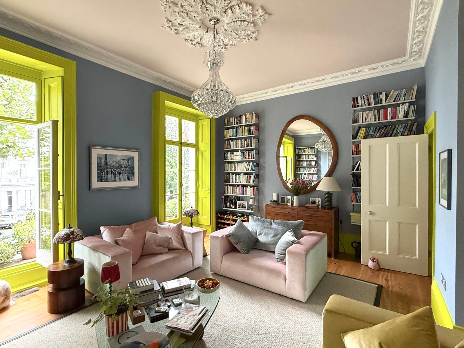
This, it turned out was quite a tall order. She first looked at all the designer paint brands, but their greens are very muted and grown-up, and none felt quite right for what she envisioned. This is the room she had in mind: the walls were to stay the same, but the woodwork - specifically the window frames and shutters were to become green.
Here is the back of the room with several testers lined up along the skirting board. At the risk of sounding like Goldilocks, once she had ruled out the ones that were too dull, there were some that were too yellow and some that were too green. She rang me up, and never one to pass up an opportunity to see a different house, I went round. It helps that she doesn’t live too far away from me - she’s also a previous guest at one of my Italy design retreats, and we all tend to stay in touch.
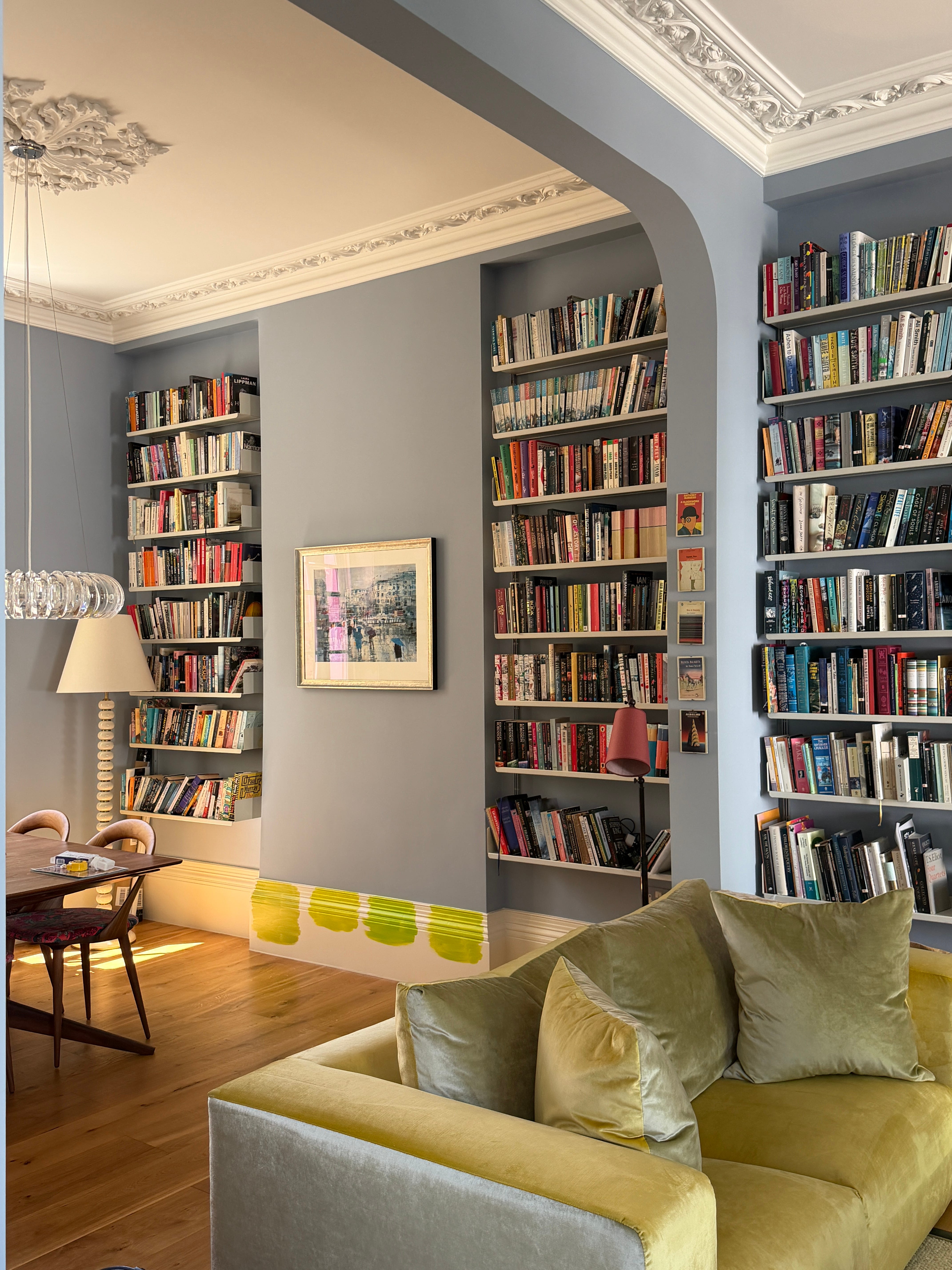
The winning colour, we decided, was Yew Green by Benjamin Moore. On its own it’s a vibrant shade of lime with yellow undertones, but paired with the soft blue of the walls (a Little Greene colour that I can’t now remember the name of) and Lucy’s soft pink and yellow velvet sofas, it brings the room to life in a joyous and unexpected way.
Lucy messaged me when the decorator left to say it was like walking through a bluebell wood and that she is newly enchanted by her living room. As am I. So the moral of the story is: paint, it’s transformative, it doesn’t have to be a designer brand - and you should never underestimate the effect it can have on a room and a mood.
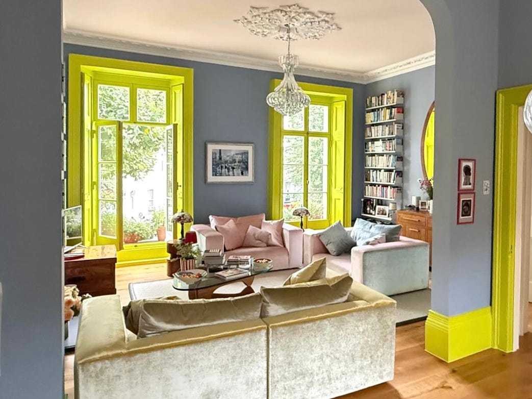
And I think you can agree it’s a pretty good match for the sun shining through the leaves outside as well.
Thank you so much for reading and subscribing to Mad About The House. It’s thanks to you that I am able to keep writing here, and I am always grateful for your support.

Lots to love about this post. The new Made collection looks fabulous and Lucy’s sofas are stunning: the fabric combo is so original. Do you have something similar or am I imagining?I’d love to come to your Bizazza talk Kate. Is this the best way to get on the list? And will it be dog friendly?? 😁
I'd love to come to the Bisazza talk!
I'm at rhonda_senior@hotmail.com and
@relishyourhome on insta 😊