


How to choose paint colours #1: white, cream and neutral
Join me for this new series on finding the right shades for your home to work with both natural light and the mood you want to create in each room.

It’s easy to think you’ll just slap a bit of white or neutral up and go to the pub, but getting this most basic of colours right is actually more difficult, as each shade will be made up of several different tones – all of which will react with their surroundings to slightly alter the finished effect. This means that what you see in the tin or on the chart isn’t necessarily what you will see on your walls.
So to help you out I’m starting this new series, which will look at basic colours in more depth before talking to an expert on each shade. For free subscribers there will be my advice gleaned from over 20 years of writing about interior design, advising clients on their own projects, and doing up six houses along the way. Paid subscribers will be able to join me and the expert guest below the paywall for their in-depth advice. For this first post on whites, creams and neutrals I spoke to the doyenne of colour creation, Joa Studholme, Creative Director of the global brand Farrow & Ball, whose quirky paint names have become shorthand for so many colours we use today (Downpipe and Dead Salmon, anyone?) If you want her words as well as mine, you can upgrade at the link here:
Now, back to the matter in hand; picking out those pesky whites and creams. I once had a client in France who lived deep in the countryside surrounded by trees. She had, inadvertently – because is that what happens to many of us – chosen a green-based white for her open-plan living space and the whole room had taken on a cool green tint which looked cold all the time.
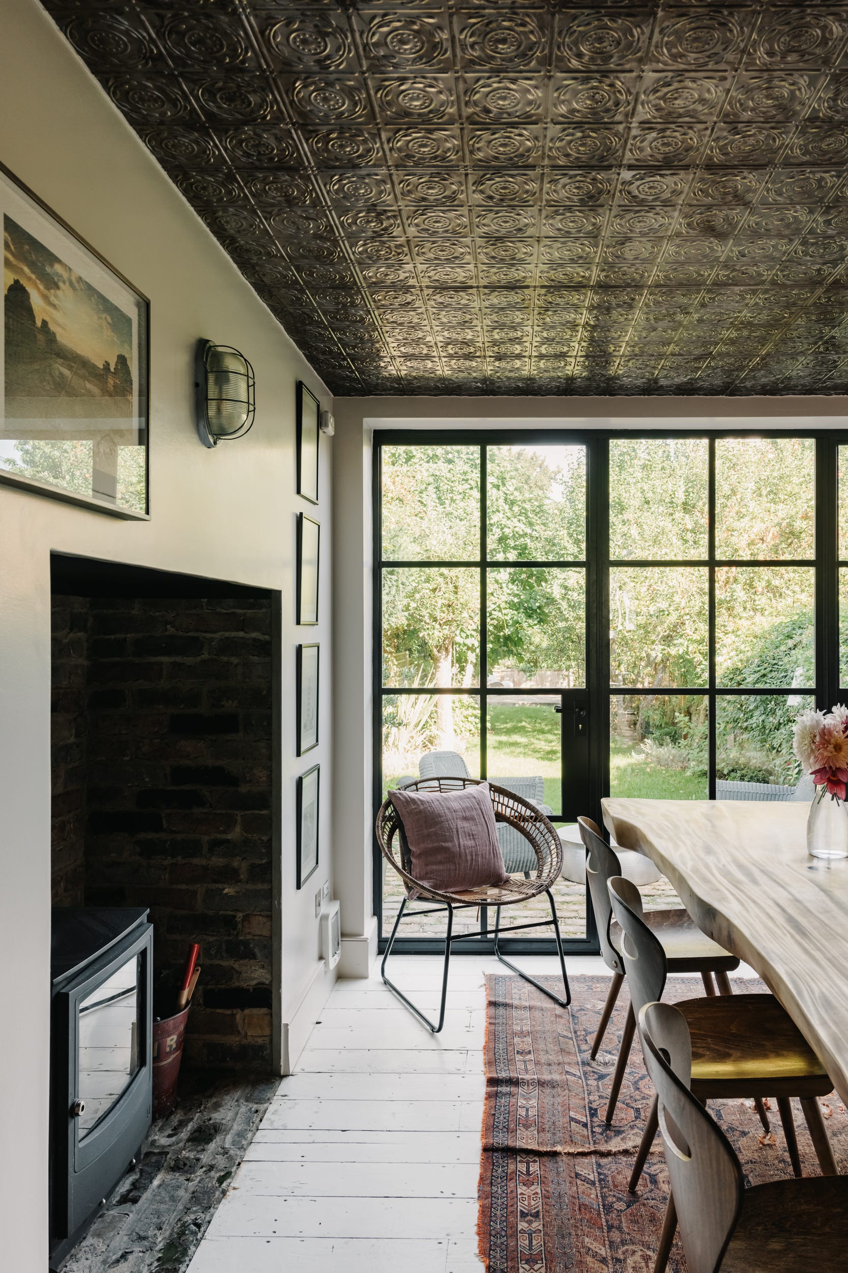
This is my old kitchen, but you can see how the green has come in from the garden on to these walls which were painted in Wimborne White – a very soft and warm white with no green. I didn’t mind it in here because I had a different ceiling (tin tiles) but it can feel a little overwhelming and the effect will also be very weather-dependent.
Understanding the effect the environment outside will have on the colour inside is key to finding the right neutral shade for your room. But don’t panic if that sounds hard. That is what this newsletter is for – and paid subscribers will always be able to reach into the archive to refer back to this series for help with whatever base colour they are choosing at the time.
Now listen carefully, because here comes the geography bit: a south-facing room may have direct sunlight pouring in. This light will be very yellow – hence the phrase ‘golden hour’, for when the sun is setting – and this will likely make everything in the room feel more orange. If you already have a strong cream or peach colour in there, it will appear orange at certain times.
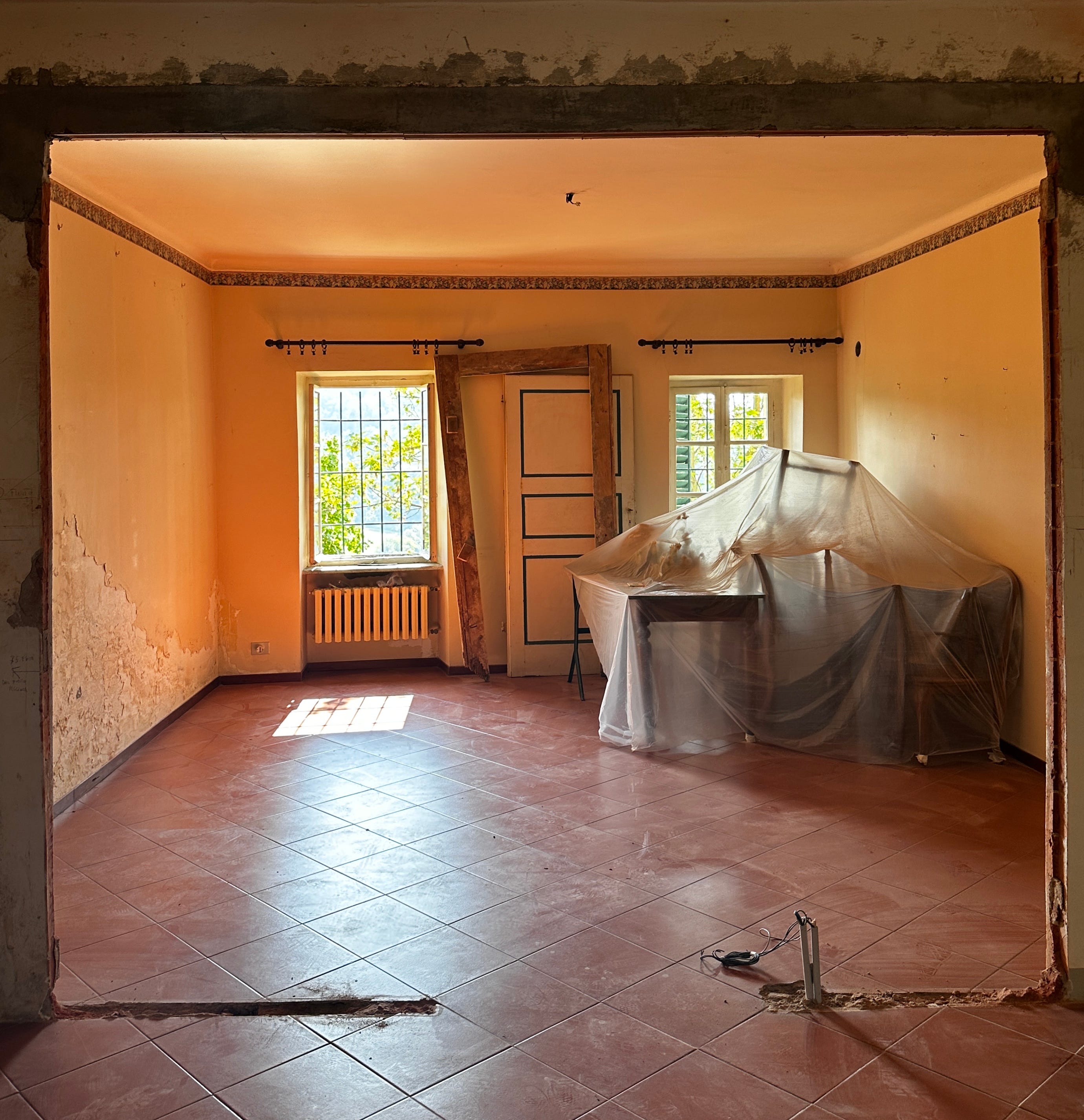
This is the white dining room of my house in Italy while the building work was going on. A completely unfiltered photograph with the sun shining in. Now the floor is terracotta which will have added to the effect, but you can see why you need to take your environment into account when choosing a colour. I had originally thought we might look for a warm pink in here but you can see how peach it would have been.
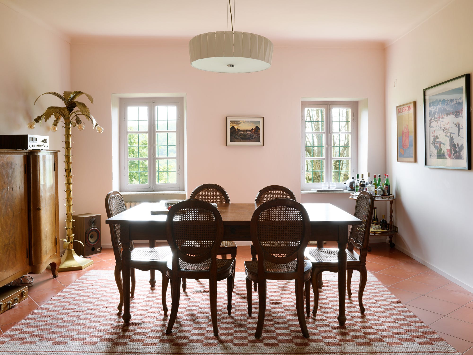
In the end we opted for a white with a hint of pink and you can see how the colour is exaggerated in the corners where the it reflects back on itself, but appears almost cream in the foreground despite the terracotta floor tiles.
Below is the same colour at the other end of the open-plan room.
A north-facing room, on the other hand, will have a more steady light with a bluer cast to it. A cool pale grey can go lilac in here and the room may always look cold even when it isn’t.
And on that point, studies have found that looking at a video of a flickering fire really does make people feel warmer simply from the visual cue. Turning on the radiators in a cool-looking north-facing room is not going to make it feel cosier.
East-facing rooms have lovely morning light and will be the best spot for an early Zoom call. Trinny Woodall, of Trinny London (where I used to model) told me she only buys houses with east-facing bathrooms, as it’s the best light to do make-up. So if you’ve got an early morning Teams after a late night, you know where you need to be.
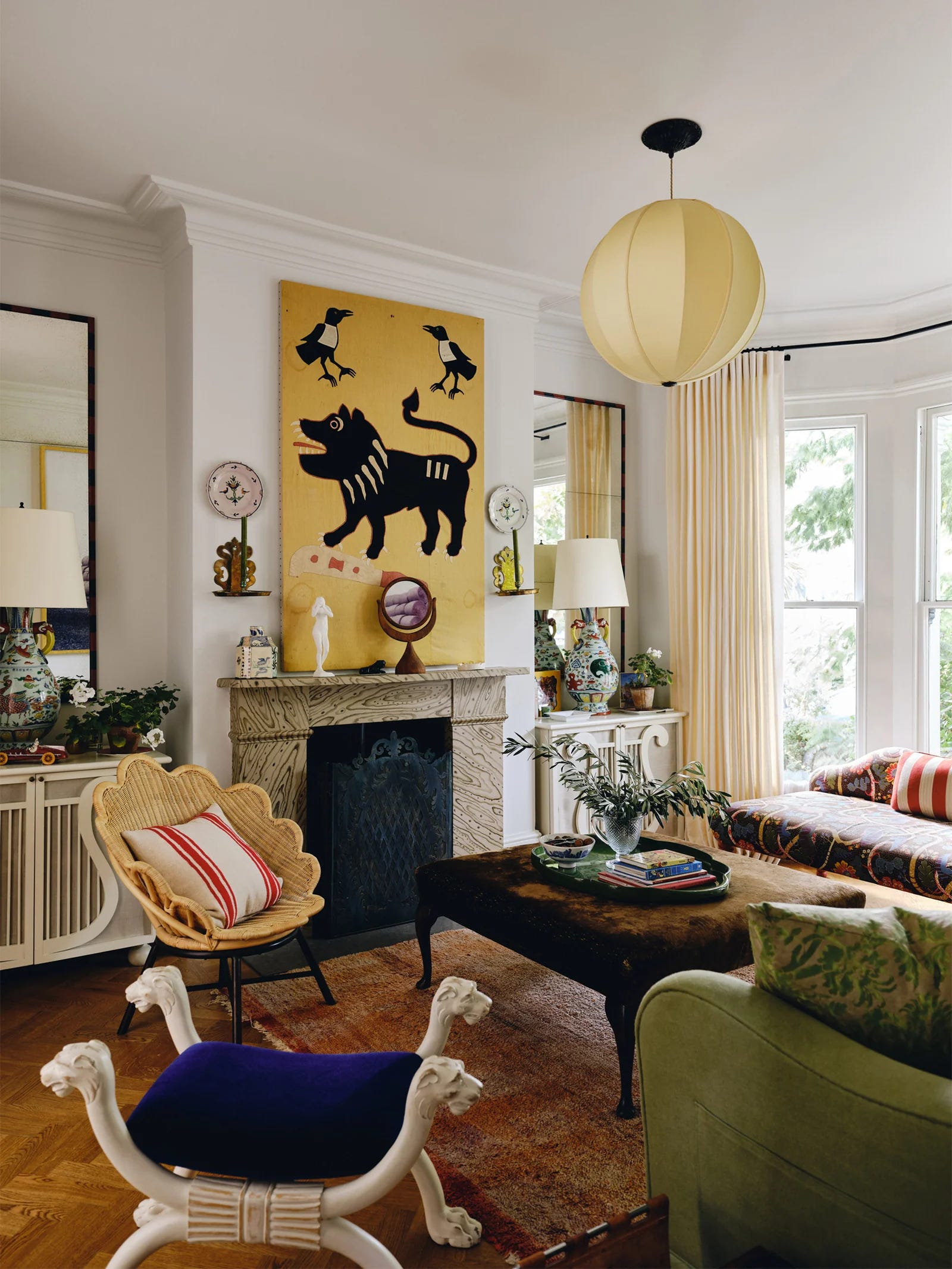
Next, you need to remember that no colour is seen in isolation which is why you can’t just choose from the manufacturer’s paint chart and hope for the best. All colours talk to and reflect the other elements around them, whether wallpaper, sofas, rugs or cushions. It all has to work together. This is why you can’t just stick a red-based white in a blue toned north-facing room with a yellow sofa and assume that will break the ice and they’ll all have a jolly party. They are far more likely to have a row. A cool white will love a marble worktop and a stone floor, but it may not look its best against a warm wooden floor and a travertine fireplace.

In the UK, with our dull skies, a bright white is rarely the right answer. White needs natural light to bounce off and reflect its brilliance back at itself (see the aptly named Narcissus - above - by House of Hackney) so in this country, and much of the northern hemisphere, during the long dark days of winter it will simply fade to grey.
But that’s exactly the reason it works in Palm Springs – think of that classic look that Jonathan Adler does so well – with its white walls and jewel colours to accessorise. There it can bounce off all the strong daylight flooding in and reflect back on itself to create a clean, bright space that shimmers in the sun.

The Swedish designer Beata Heuman also favours light walls and lots of colour but her palette is more muted, as befits the UK where she lives as well as her homeland. She works all over the world, of course, and it’s worth noting that while a muted palette works everywhere, the harder, brighter colours tend to look better under the strong glittering light of the southern hemisphere.
The other thing you need to consider is the lighting. Will the room be used mostly in daylight or under electric lamps? You need to see how your colour reacts in both situations and LEDs can be a nightmare to choose, as there are so many tonal variations. Broadly speaking you want a 2,700K bulb that is a warm white. Daylight is over 4,000K and is not what you want in the evening, while 1,500 is akin to candlelight and no good for a dark room in the daytime.
Now most of us want one white we can use everywhere as our chosen neutral, and there are a few that seem to work well in all directions and situations.
I did one house entirely in Farrow & Ball’s Pointing, which turned out to be too yellow for the next house, so I switched to Wimborne White. My current favourite is Schoolhouse White. Another favourite is Slate by Paint & Paper Library. The joy of that range is that they produce their neutrals in a sliding scale from dark to light. In some lights Slate will be quite grey, in others warmer – so you see, once for more those at the back, you can’t avoid a tester pot. Stone and Canvas are both good from PPL and I have used Powder in my own kitchen, which is categorised as a white in its palest version.
A quick point on tester pots: you must use them (or the stick-on colour samples which some brands are now using). You cannot choose a colour from your computer as it will not be a true shade calibration. You need to see a colour larger than the 2cm on a paint chart. You need to see it on different walls – by the window and in the darkest corner. You need to see it in daylight, candlelight and electric light. You need to see if it fancies your sofa and flirts with your rug. In short, you cannot choose a colour from the paint chart alone. I’m sorry, I don’t make the rules but I do, occasionally, have to enforce them.
Broadly speaking, the white/cream neutrals fall into four groups: red-based, green based, yellow-based and grey-based. The former will slide towards a pink tone, the green tints are brilliant in period buildings as they can look timeless, and the greys will give a more architectural feel. Watch out for the yellows in a south-facing room as the colour will intensify during the day. That said, it can be the easiest and most relaxing to live with.
So that’s the basics covered. For a real expert view, I spoke to Joa Studholme, Creative Director of Farrow & Ball which has roughly a million shades of white and cream and pale grey on its website. This does not make things easy. So here is Joa to untangle it all for you and tell you her forecast for what’s next with neutrals…
The rest of this post is for paying subscribers only. I have given you some general advice, but if you want more in-depth expertise, you can upgrade to read the rest here: