My new paint and tile collaborations
It's a dream come true to be able to launch a range of 12 heritage colours inspired by my house in Italy – alongside an exclusive collection of matching and co-ordinating ceramics.
I’m so excited to be able to share these two collections with you today – a set of 12 colours by Graphenstone – one of the most widely certified eco paint brands in the world – and a range of matching encaustic tiles, made using traditional methods by Maitland & Poate in Spain.
I wanted to be able to combine paint with tiles because there’s nothing more frustrating than spending time and money on samples and testers to try and complete a room and then having to settle for a combination that’s close, but not perfect. This way, if you fall in love with a tile, you know you can buy the coordinating paint and vice versa. So designing a kitchen, a bathroom or even a tiny downstairs loo just got easier. And more enjoyable.
All the colours in the paint collection were inspired by the house I have spent the past year renovating in Italy, but I have adapted them slightly so they will work well under the softer rain-washed skies of Britain - although it’s pretty rain-washed in Turin, too, at the moment. So while the colours are strong they are also slightly muted in tone.
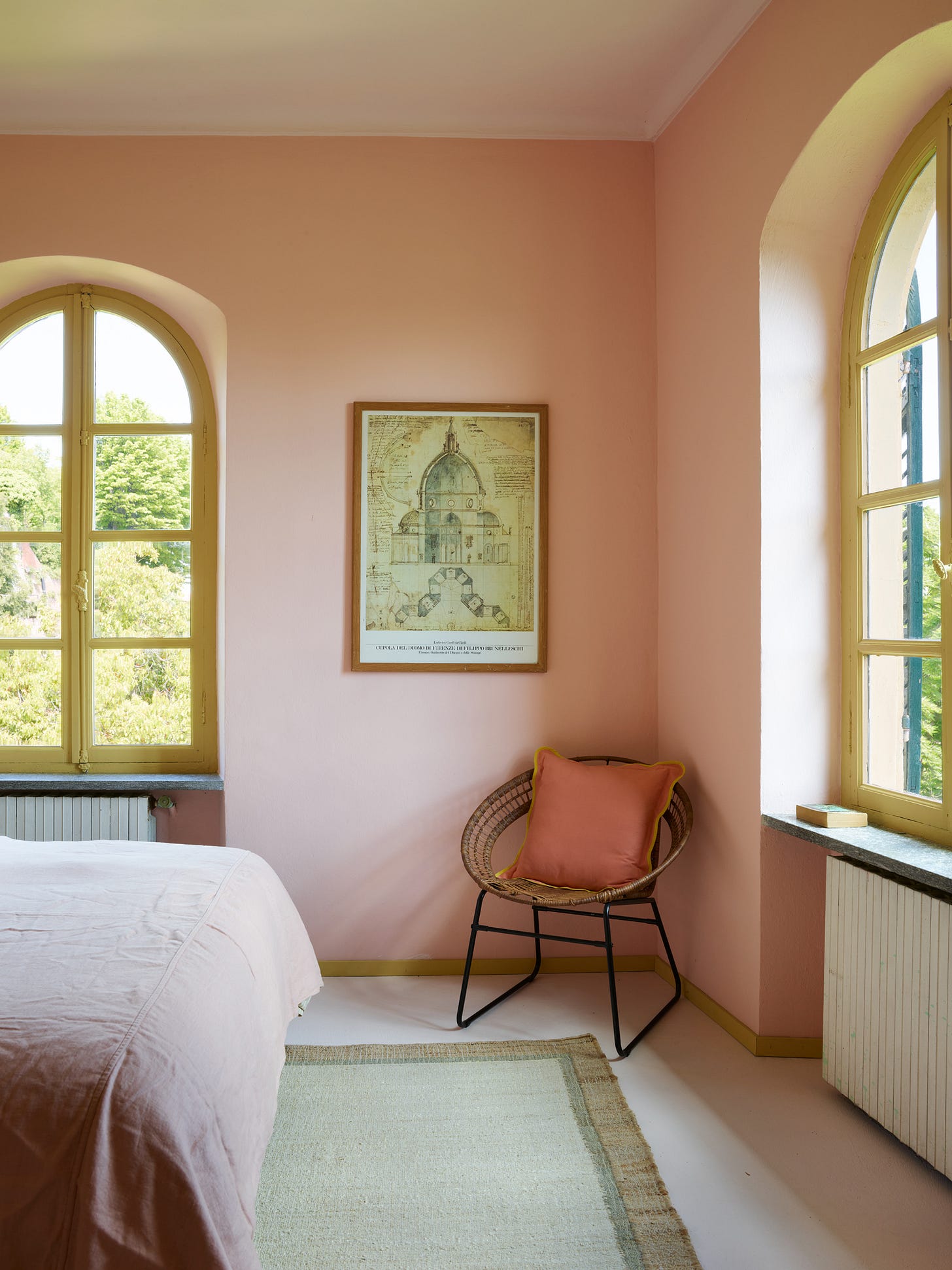
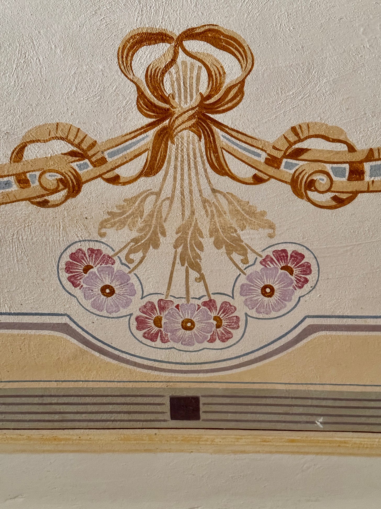
While every collection should start with a good neutral, I actually began mine with a yellow and a pink inspired by this door. Many of the doors in the house have this same leaf design and are painted in two colours. I suspect these doors were originally cream but have faded to a sort of soft pink and a dirty yellow.
The doors led to the creation of two colours – Gelato (ice cream) and Sole (sun) – and inspired the scheme for what might be my favourite bedroom in the house. Gelato is very soft during the day but deepens and intensifies when the sun shines directly through the window in the evening. With the windows painted in Sole, it feels like the sun is always present (although as I write, Piemonte is experiencing its wettest Spring for 70 years).
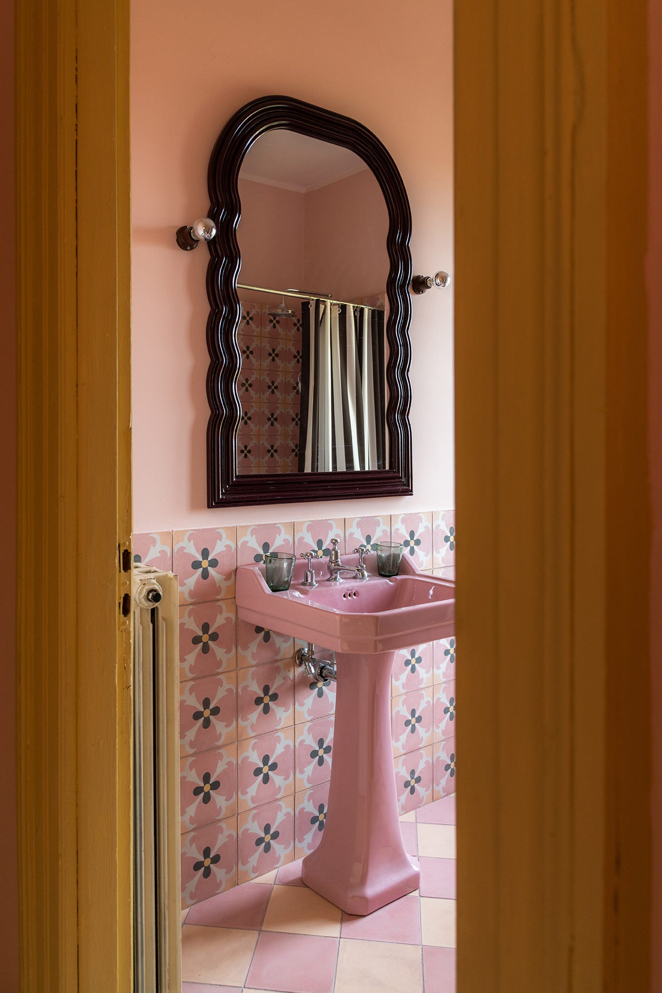
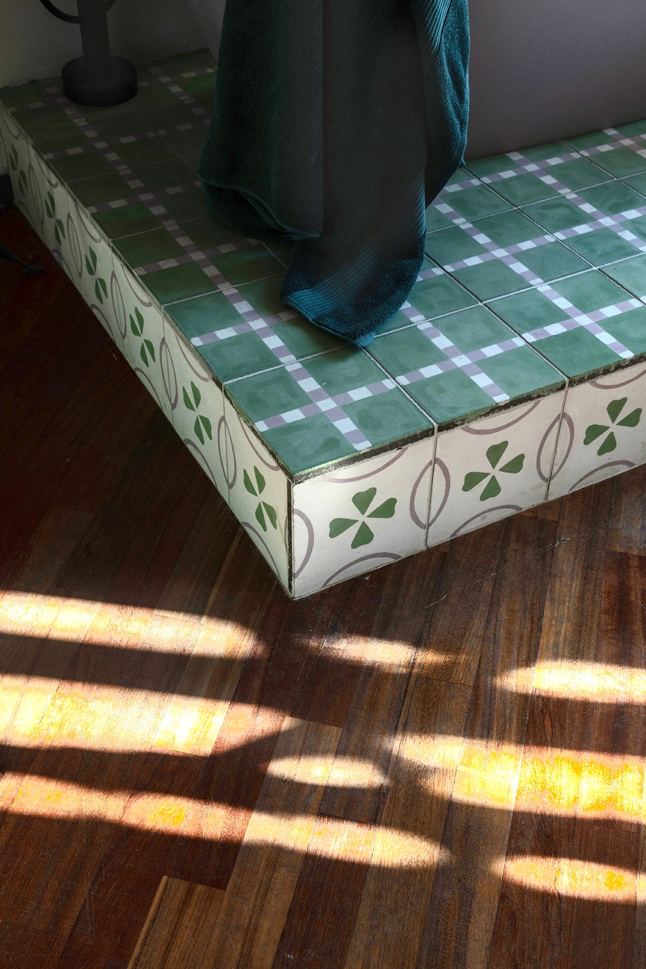
This colour scheme also led to the creation of a set of tiles for the bathroom next door. All the tiles are available in plain colours, so you can use them alone or in a checkerboard as we have done here, or in conjunction with a pattern. Here, the patterned tile - Gloria - named after the bedroom - is a reinterpretation of an antique design with a deep chocolate brown centre. (All the designs in the complete tile collection are available in the colours of each of the bathrooms, so if you like one pattern but want a different colour, there are three to choose from.)
The paint collection includes three shades of green. The darkest - Verde Torinese - is a version of the classic dark green shutters you see on so many Italian houses, as well as echoing the wooded valley which the house overlooks.
I fell in love with these arches when we first visited the house. The walls were covered in quite an intense pink floral wallpaper, but I knew instantly that I wanted to create a forest of arches and that this would be the perfect colour. We are gradually filling the walls with paintings.
The other two greens came from the doors on this floor of the house, which are all painted in two shades of green and which we haven’t changed.

Above is one of the doors and next to it is a wooden window shutter painted in Oliva. I also used Oliva on the ceiling of my office – reached via a small bridge over the stairs that is accessed through that same green door. The room above is the main bedroom suite, which has been papered in Colefax & Fowler’s Seraphina design, featuring wisteria. There is a 100-year-old wisteria tree in the garden which was the pride and joy of the previous owner, Claudia. As this room was used as her upstairs sitting room, it felt only right to use this paper – and to call the room and its corresponding tile after her.
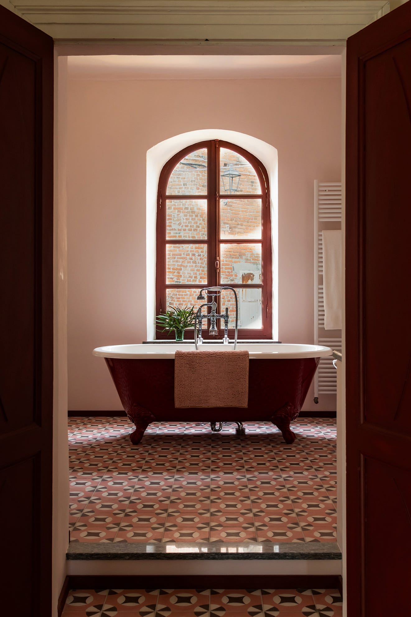
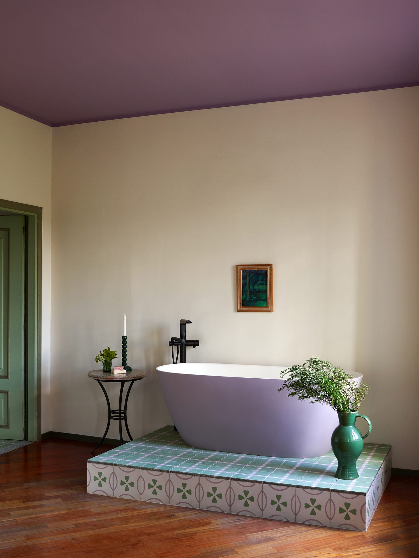
The wallpaper in turn led to the creation of Lavanda (the Italian for wisteria is Glicine and somehow that just isn’t a very pretty word for a paint colour) which has been used on the ceiling in the main bedroom as well as what is now a dressing room with platform bath (formerly Claudia’s bedroom), and the shower room next door.
The second of the greens in the collection is much softer and brighter and relates to the main colour of the original doors mentioned above. Both Lavanda and Giardino (garden) have been combined with Crema to create a modern tile, based on a vintage check pattern, that sits under the bathtub.
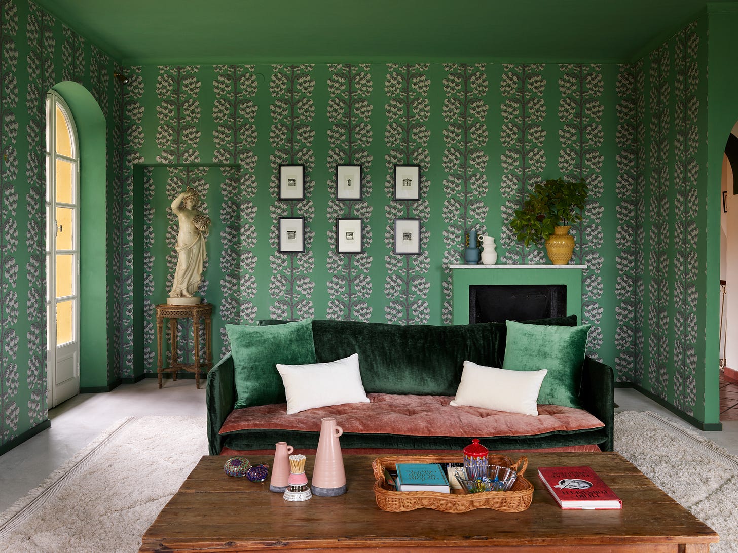
We also used Giardino on the ceiling of the corner sitting room on the top floor, which has five arched windows and is filled with sunlight. The wallpaper is Jade Berry Tree from Liberty and it was a joyous coincidence that it was a perfect match. The glorious statue was left by the previous owners. She is called Philomena and when the early morning light pours in, she appears to be shielding her eyes.
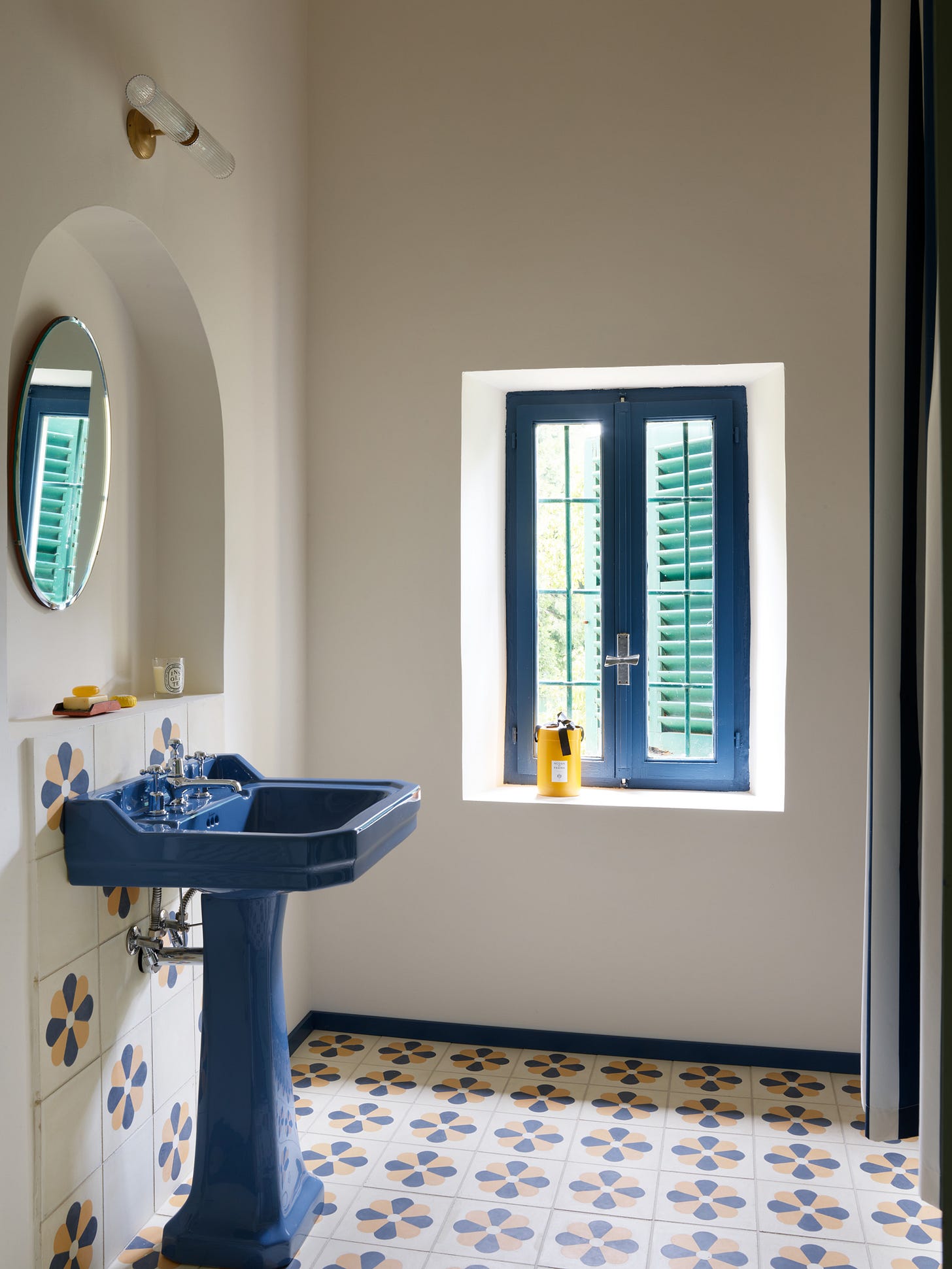
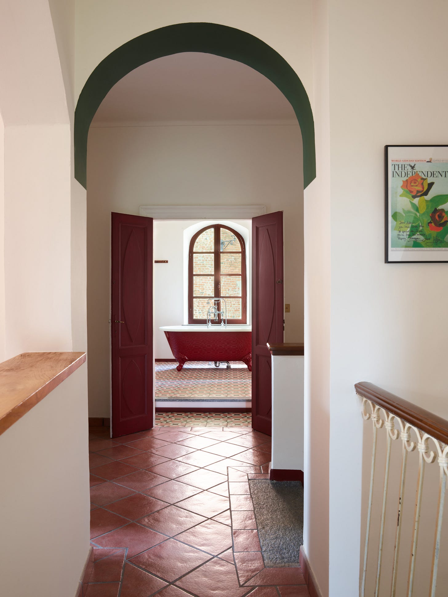
The arch motif continues on the top floor, and leads to the third bathroom - Lucrezia.
The tile design here was already part of the Maitland & Poate collection and is available in the other colourways used throughout the house. (Plus, in a few weeks’ time this particular colour combination will be ready across the other designs as well.) The double doors leading to this room (more visible at the top of this post) are painted in Barolo – named after Piemonte’s most famous wine – while the walls throughout this floor and the landings on first floor are in Crema, a soft and warm white that is perhaps a little like milk.

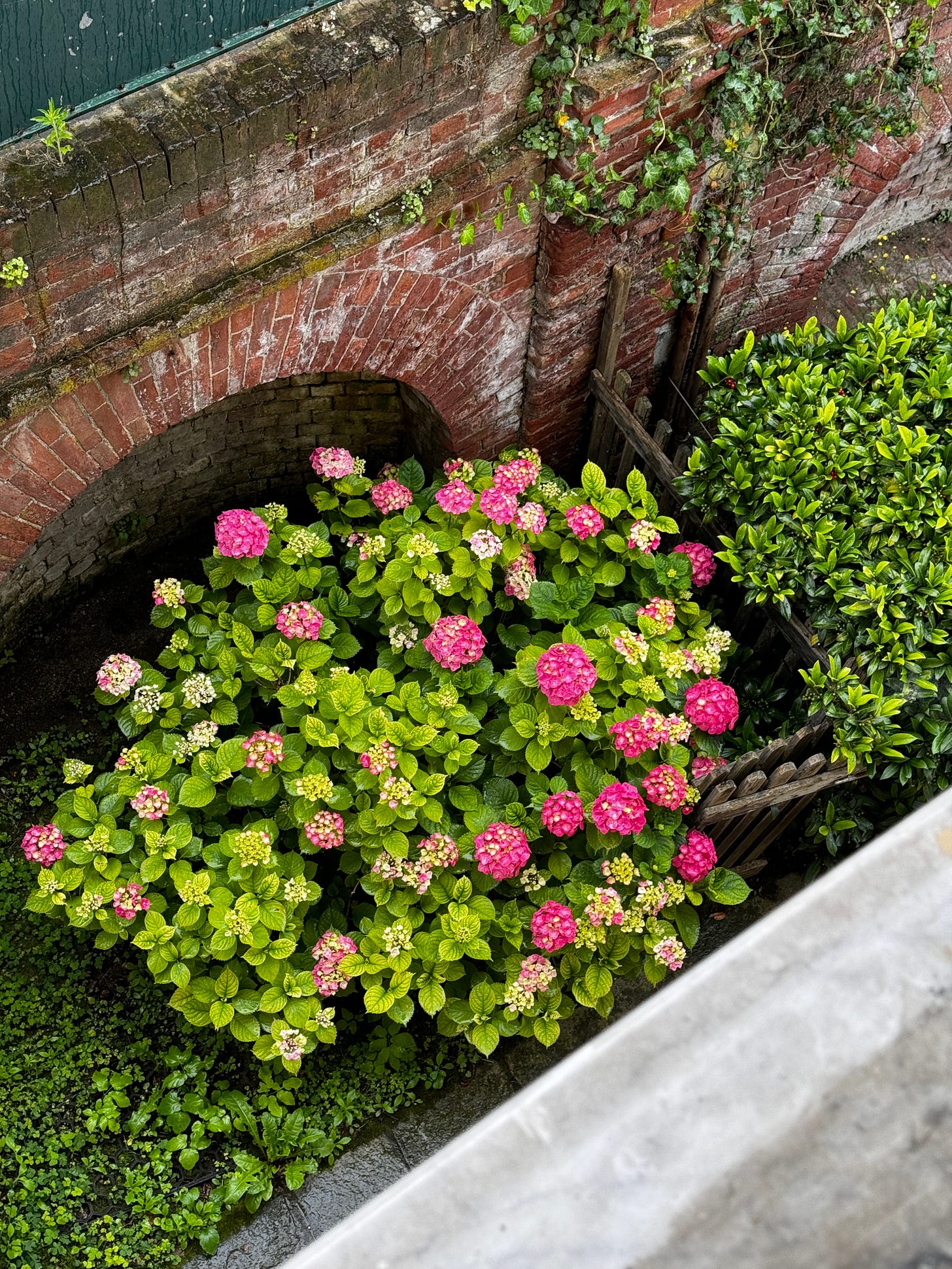
The walls of this bathroom are in Bianca Italia – my second neutral, and the palest of pinks, that in strong light looks like a soft white but in the evenings and early mornings takes on a rosier hue. It was also used on the walls of the Lucrezia bedroom next door, along with Barolo window frames and the most vibrant colour in the whole collection - Ortensia (Hydrangea).

I adore this colour. The architect and The Mad Husband are terrified of it, but it was created for these flowers which bloom directly outside the window. I find it a joyous and uplifting shade that lifts my spirits every time I come in. Plus, we are not always there at the same time as these glorious flowers are out, so it’s wonderful to have a year-round reminder.
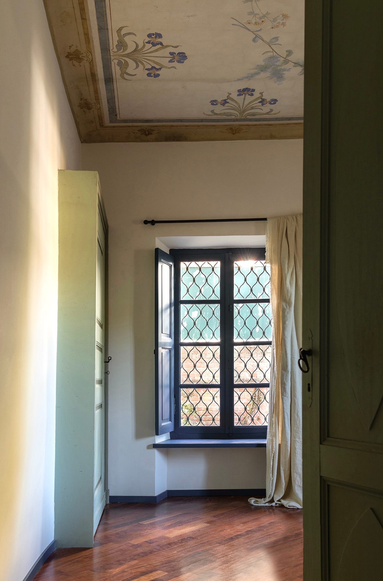
There remain just two colours now - Iris and Cielo (Sky) - both of which were found on the painted ceiling of one of the guest bedrooms in the oldest part of the house and which work together beautifully.
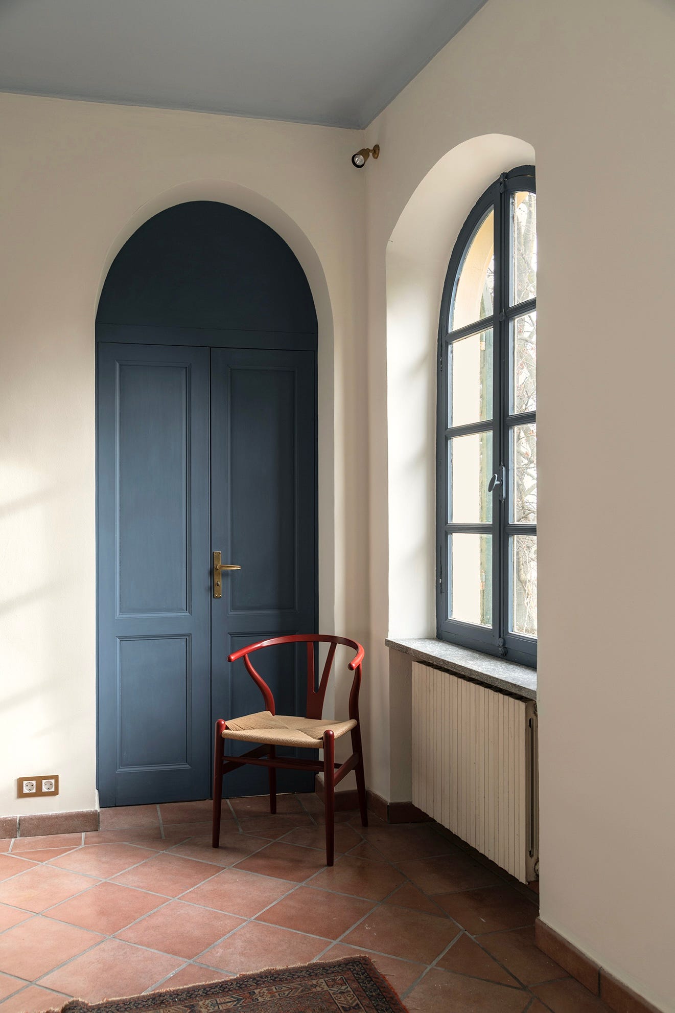
The house has two frescoed ceilings – and we made a point of painting many of the other ceilings in strong colours as a modern decorative echo of that historic device. Also, you know I love a painted ceiling. In the room below, we used Iris on the arched doors and Cielo above.
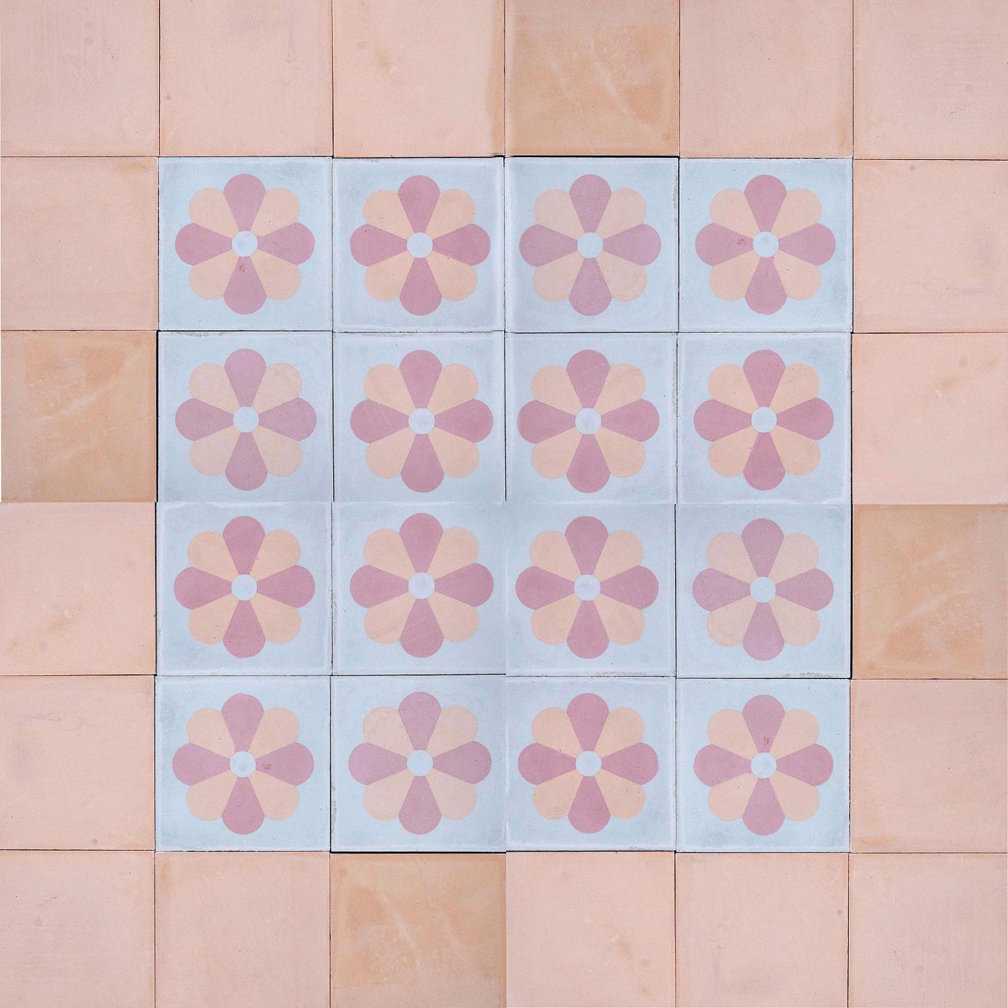
And so the final tile in my collection is called Daisy. I found a version in a reclamation yard just outside Turin and was immediately taken by it as it was so similar to the daisy motif I had recently incorporated into my carpet designs for Alternative Flooring. Sadly there wren’t enough reclaimed ones available for the bathroom – and this is what sparked the whole collection. Maitland & Poate reinterpreted the design – minus the original terrazzo background – to create a daisy in Iris and Sole on a plain Crema background (although it’s now available in the other colourways, too).
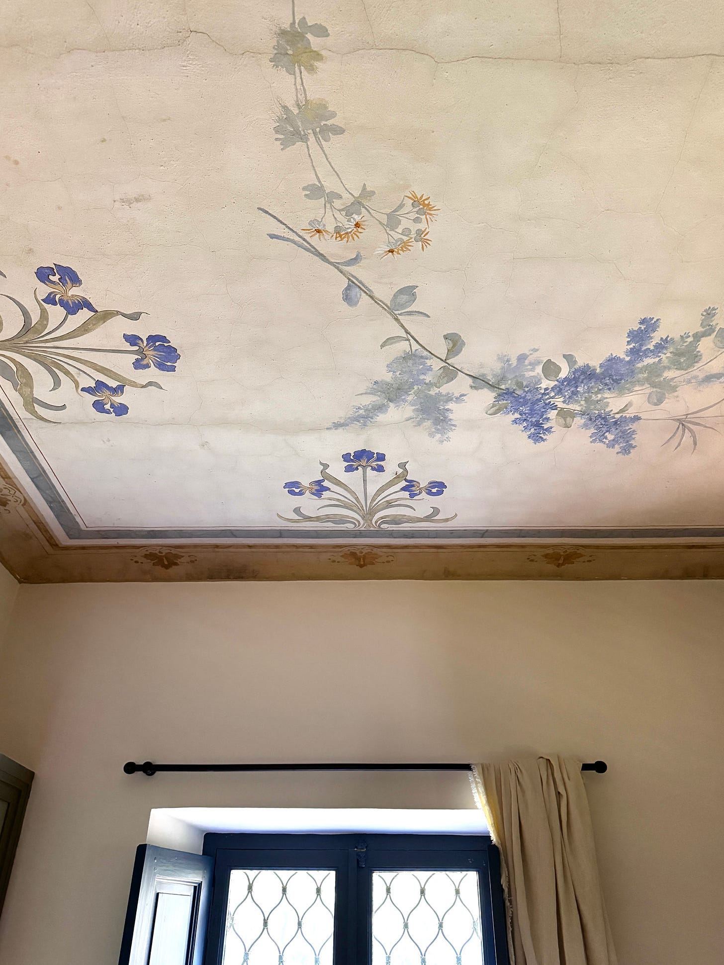
So there you have it – the full range of tiles and paint colours. They all mix and match together really well so you can use them however you wish. This is a close-up of that Iris ceiling which includes both the Iris blue itself, alongside Cielo, Crema, Sole and Oliva.
In the sitting room downstairs – with the other hand-decorated ceiling – we wanted a clean colour for the walls that wouldn’t detract from the fresco above, so these are painted in Crema.
Below is a close up of that ceiling, which includes hints of Lavanda, Cielo, and Barolo, while the Iris ceiling has Sole, Cielo and Oliva.
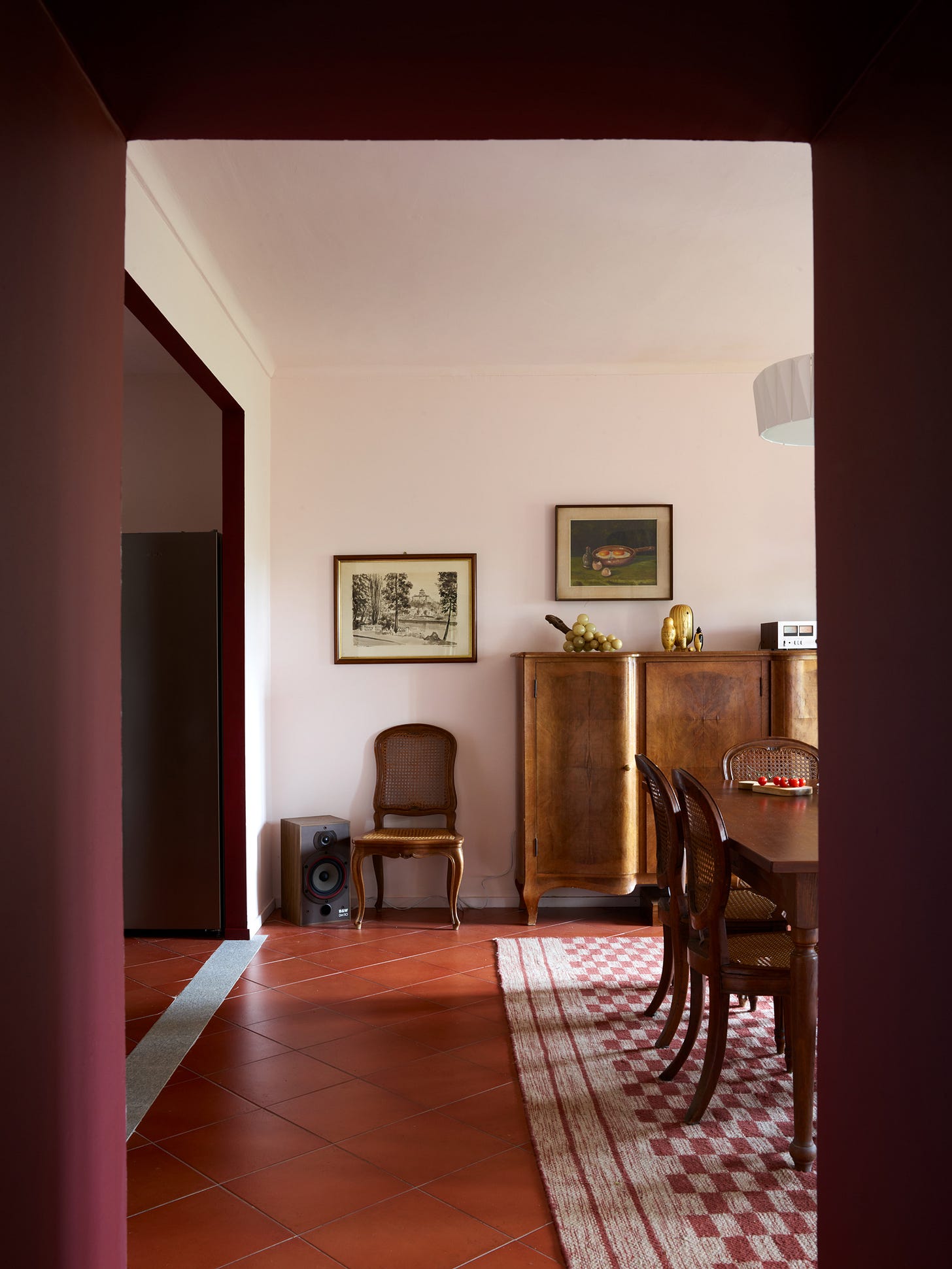
The sitting room leads to the dining room, where we opted for Bianca Italia on the walls, but brought the Barolo of the sitting room shutters to the thick doorway between the two rooms – and again on the entrance to the main kitchen.
There is, of course, so much more to show you in the house, and I will take you on a proper tour over the coming weeks. Those of you coming to my interior design retreats will get to experience these rooms in person and see the first samples of the paint, tiles and wallpapers that were used. There are (as I write) a few places left for the October retreat if anyone wishes to come and join. Do email me for details.
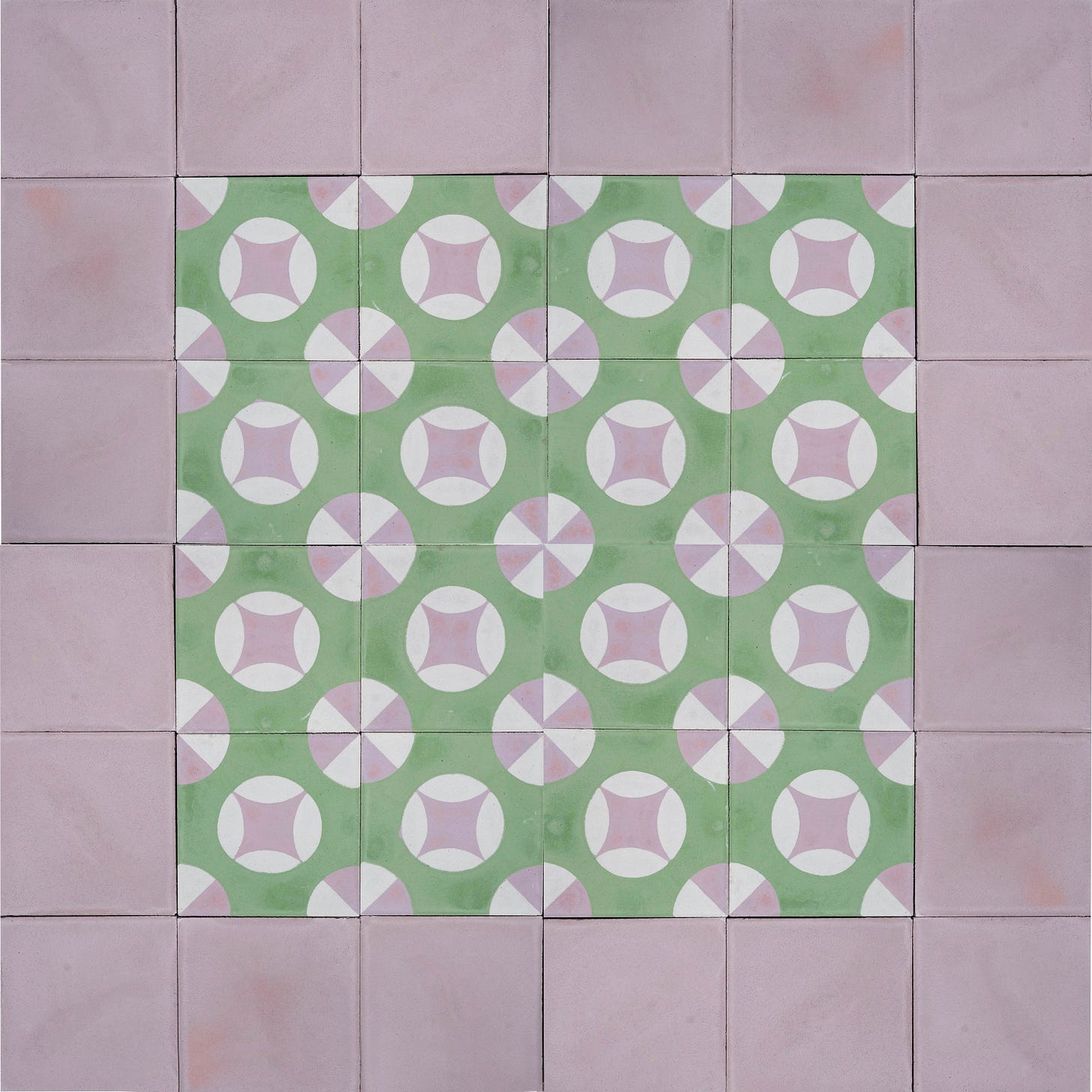
Both the tiles and the paint are available in the UK, the EU and the US – and here are just a couple of images of the tiles in different colours and configurations. I do hope you like them. Please like and share as this is a free post and that massively helps with reach and audience. Thank you so much.
And finally this one. I love them all so much I can’t decide which to leave out. These are the three colourways currently available. In a few weeks the barolo and gelato combination from Lucrezia will be online across all these designs.
If you have enjoyed this post please drop a heart and a share as it helps so much with visibility.






Kate, i have been following you for awhile starting with the great indoors, then through mad about the house and now on substack. My interest peaked when you purchased the home in Turin, as we have spent a good amount of time in Italy and now have acquired a home in Porto Santo Stephano. The recent post of the supermercato photos and inspo made me smile out loud, and now this……its absolutely stunning. The essence of la dolce vita. I have had a dream about meeting you in Italia and although it is farfetched at my time of life (3 kids still at home) ….one day I would be so lucky. The next project we have at home will surely be guided by your design (the melanzane room is my fav , and might be copied exactly 😉) but for now i will settle for living vicariously with you here . 😊
Grazie mille……ci vediamo…. and ciao!!!
Kathryn 😍🇮🇹
Absolutely beautiful paint colours, and as supporters of The Woodland Trust, I love that for every sale they plant a tree. I’ve just ordered yours and Graphenstone’s colour card, which will no doubt occupy me for hours! Thank you for all the great ideas and advice you share on this platform.