My Seven Design Principles
Everyone will have "rules” that are personal to them when it comes to interiors. So don't be swayed by other people's opinions – when you're true to yourself, you won't go far wrong.
There are words that get bandied around in interior design which seem, well, designed, to make the process more intimidating than it needs to be. For most of us the world of interior design belongs to high-falutin’ magazines, to houses we will never enter and to people with budgets we can only dream of. But we are all, in effect, “designing” our homes – it’s just that most of us would call it decorating.
“I’m decorating this room in off-white with some striped curtains” is the more down-to-earth version of a design-led process resulting in ecru walls with co-ordinating woodwork designed to highlight the geometric, thermally lined window dressings.
It’s the same when you browse estate agents’ websites and they talk about “architect-designed” homes. Doesn’t every building start with an architect? And my personal bugbear, “styling”. Most of us put things on a shelf and possibly, if we’re feeling fancy, arrange some books on the coffee table, after which we might lay the dinner table. We do not, as a rule of thumb, “create a tablescape” for our Tuesday night salad.
That said, in among all the fancy words and overblown terms you will either already have established your home style, or be seeking to refine it. This is important because once you know what you like and need, you will make fewer mistakes and therefore spend less money and – if decorating is not your thing – less time thinking about paint swatches and fabric samples and more time (and money) at the pub.
And that is how we get to Design Principles. These are mine. They won’t be the same as yours, but they may overlap. Or they may be the polar opposite – but that’s also important, because knowing what you don’t like as as important as knowing what you do really want.
As I said at the top, if you work out what matters to you and stick to it, you will create a home that works for you and tells your story. The problems start when you listen to others telling you what they think you should do, or what they would do if they were doing your house with your money (or possibly their money if they’ve got more than you have). That results in you not feeling at home at home, as it were. Instead, work out your own design principles and apply them in every room – whether it’s gathering and adapting from others, or working it out for yourself on your own terms. I think it helps to write them down and keep that list to hand when you are planning or buying for a space.
So what are mine? Well I probably have about six or seven that I really stick to, and put together they bring the eighth, without which the space isn’t my own. Some of yours may overlap with mine. Feel free to take the ones you want and add to them. It is, as I so often say, your home your story.
ALWAYS ADD VINTAGE
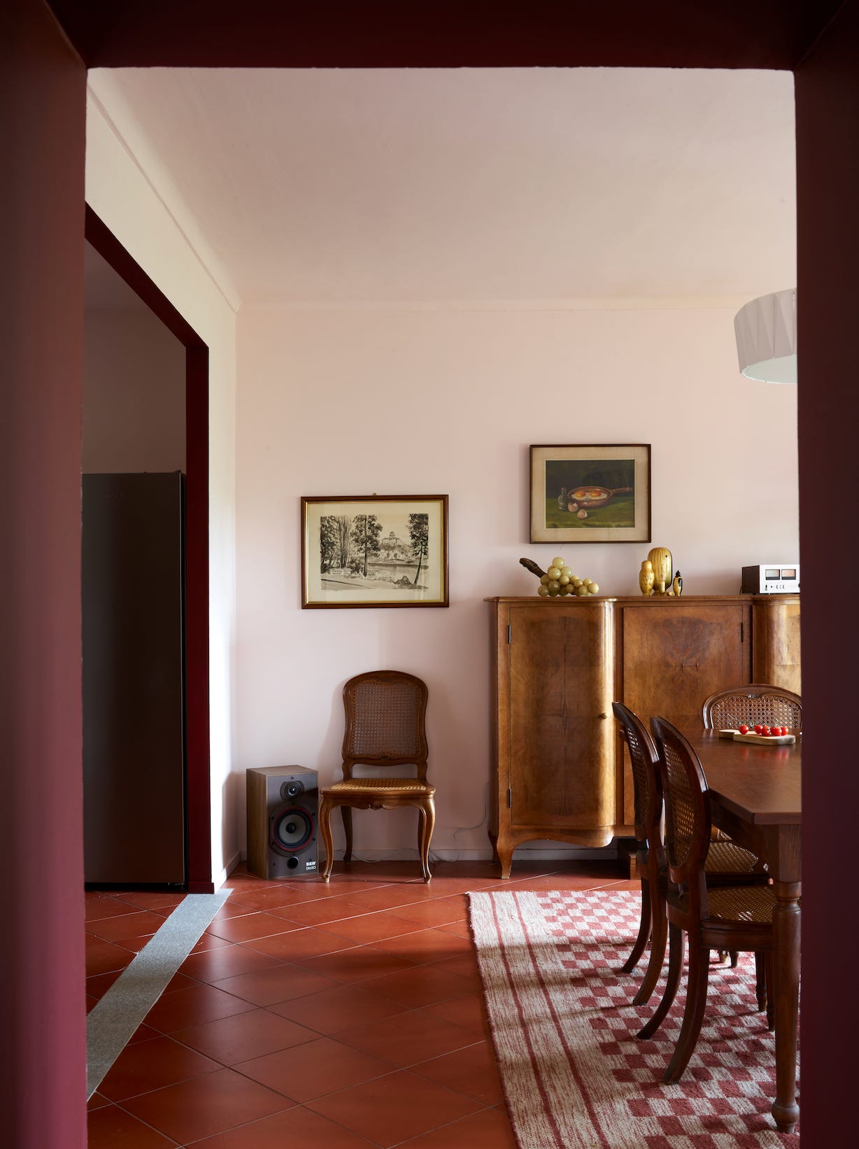
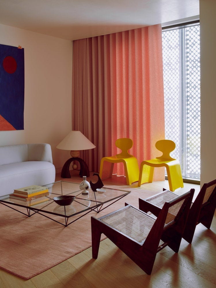
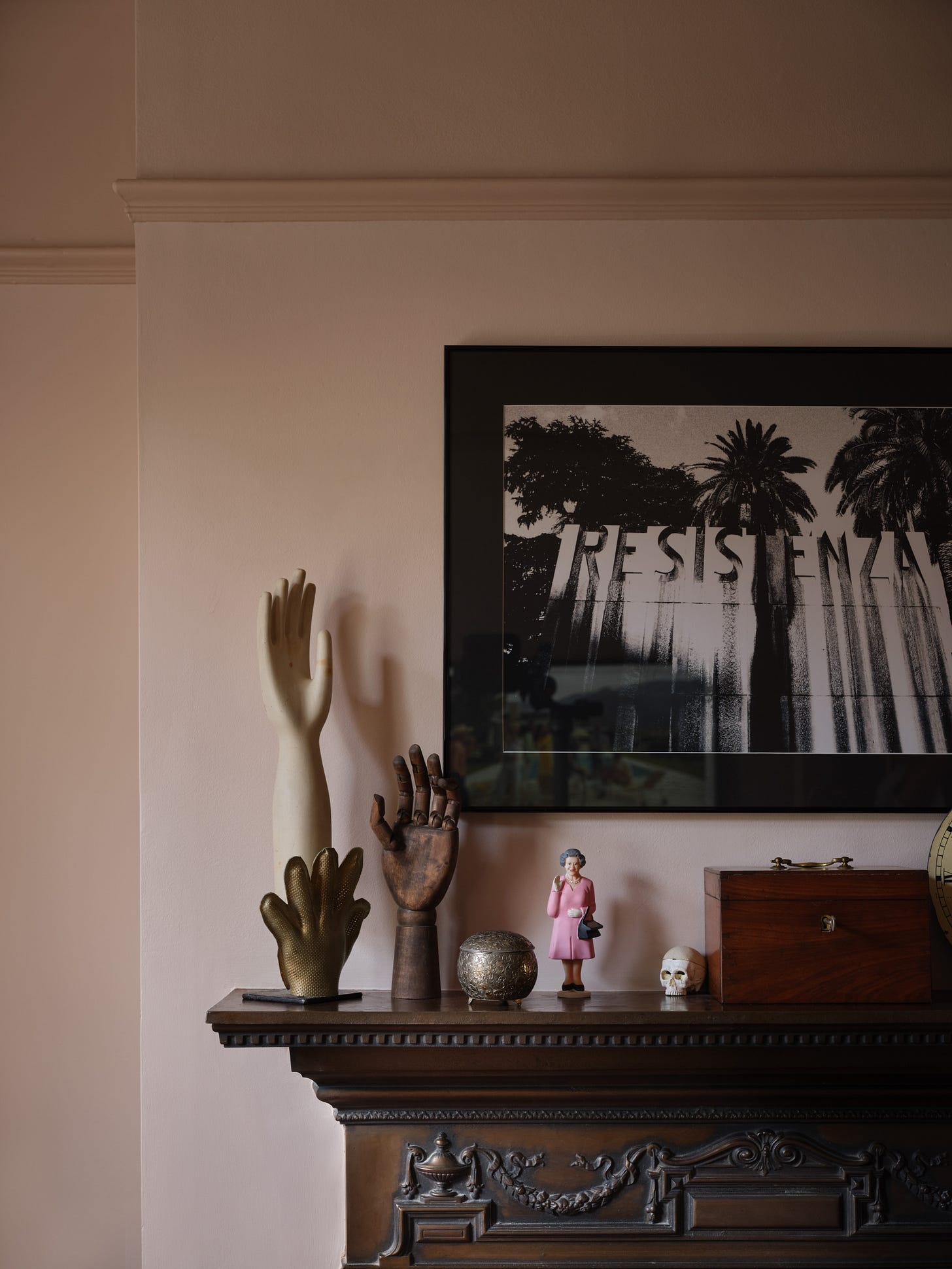
This, like many of my principles, started out as something I did instinctively (and out of necessity) and then it became something that I now firmly believe is crucial to any successful room. Vintage/antique/pre-loved, call it what you will – even one person’s junk being another person’s treasure – your room will never be its best without it. Old brings character, tells stories, grounds a space and adds depth. A modern home filled with shiny new stuff will always be shiny and new and just a bit shallow. If you know the source, anyone can go out and buy the same stuff and make the same space. But stick an old chair in the corner and it instantly makes the space more personal. Without something from another time or place, your room will be bland. At its most basic, vintage might simply mean the pictures on the walls – but the patina of old furniture, not to mention the comfort of something well-made and well-loved, is priceless.
THE IMPORTANCE OF MISMATCHING
Buying furniture in matching sets is another personal bugbear – but remember these are my principles, not yours. For me a three-piece suite smacks a little of “add to cart” and not about taking the time to see what you really want to have in the space. Search instead for the sofa that works for you and what you are doing in the room, as well as the chair – maybe a high back, maybe one that is wide enough to curl up on. Perhaps your room lends itself better to two sofas and no armchairs. But if you have a three piece suite that is serving you well, then perhaps, when you come to re-upholster, consider doing one of the chairs in a different material to the other. Or keep the chairs as a pair and change the sofa. I do own a pair of matching chairs, but they are completely different from everything else in the room. I am also a fan of inverting this principle and covering two different chairs in the same material. Or having two different bedside lamps with the same shade. It all speaks to someone who took the time to create the space they really wanted. And yes I do have six matching dining chairs; there is, to make it more complicated, a fine line between something looking personal, and something contrived. If you have collected six different chairs over the years, that’s personality. Setting out to buy one of each from the shop to deliberately create a mismatched look is contrived.
MIXING PERIODS
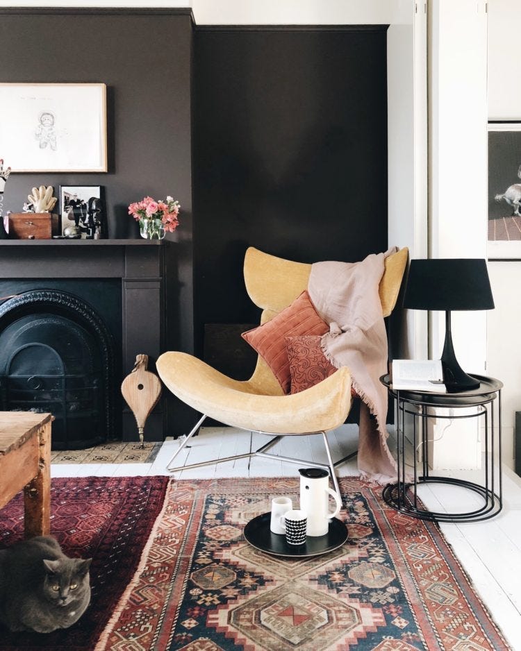
The Bo Concept Immola chair is very modern but covered in retro corduroy here, next to vintage rugs and modern tables. I am asked about this a lot and I think it’s inevitable that most of us will be mixing pieces from different eras in our homes. Very few people start from scratch with a completely empty room, and nothing to put in it. Should that be the case, it’s sufficiently expensive that you might be given or lent something by a family member or friend to start you off. Mixing periods successfully often comes down to practice and eye. As I have said before, mid-century modern likes everyone. If you have an ornate, and possibly, heavy Victorian piece then don’t isolate it or it will look odd. Try and add something else to be its friend – a candlestick in the same colour, a darkly floral cushion, an ornate lamp base (with a plain shade). It’s all about the balance. Remember: no-one likes to be on their own. Same goes for Victorian dressers.
BRING IN THE CONTRAST
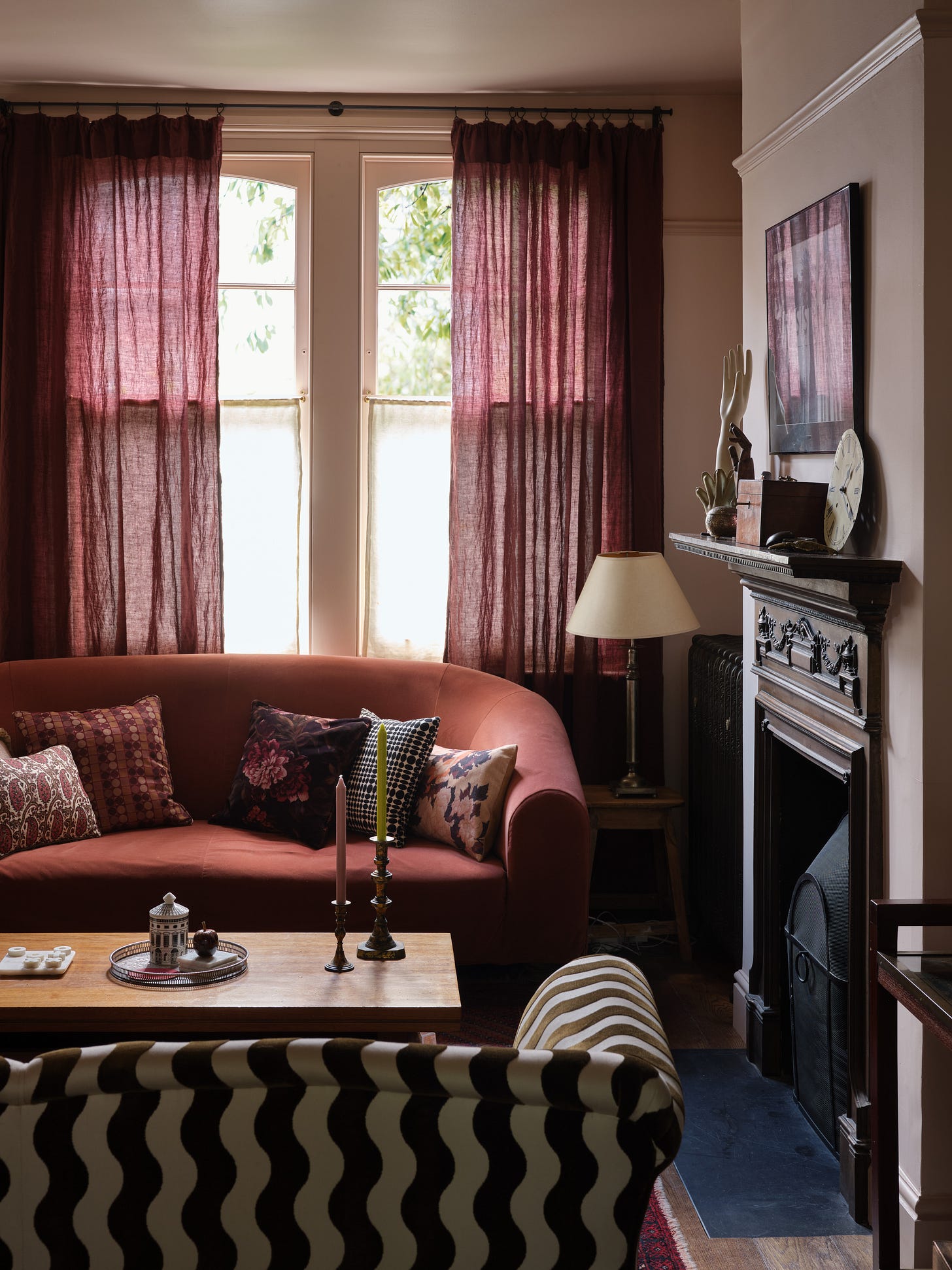
The most successful interiors will use the rule of contrast successfully. Again, you might be doing this instinctively. So, for a busy floral cushion, you might contrast it with a plain, or slice through the froth with a sharp stripe. A sculptural lampstand might have a very simple or even very flowery shade. In its simplest form, contrast might be about colour, but it’s equally important to remember shape and texture. Rooms tend to be straight lines and hard surfaces so you need to mix things up a bit. A round coffee table in front of a rectangle sofa, round cushions, if space is tight, or even making sure there are curves and organic forms in the artwork. Chances are, if something’s not working you can put it right by looking at, and changing the shapes. Don't forget materials; a velvet chair with a linen cushion, old wood with sleek brass. To paraphrase that line, which I never understood when it was about maths, but which makes so much sense when it’s about decorating: For every colour and material there is an equal and opposite shade and texture. It’s Newton’s third law of motion, apparently.
BEWARE OF WHITE
I know you have heard this one before, but that’s because it’s one of my guiding principles in interior design. There’s nothing wrong with white paint if that’s what you truly want or like – but it’s not right for every room. Firstly, white needs natural light to bounce off and give it its brilliance. So if you haven’t got lots of that then step back to the off-whites and softer creams. Secondly, just because white is the default shade beloved of builders and decorators, it’s not necessarily the best for your room. If you’ve spent a small fortune on tester pots for the walls then don’t throw all that effort away with a white ceiling and woodwork. You don’t wear a white top with every outfit, do you? Take a little more time to see if a toning or contrasting shade would work better with the colour palette you are using. Pale walls and dark woodwork is modern and fresh and always looks more considered.
A SENSE OF SCALE
As a basic rule of thumb, when it comes to scale bigger is better. Except for sofas – and we’ll come to those in a minute. But for rugs, curtains, vases, lamps and plants, the bigger the piece the more dramatic the statement and (it’s true), the more expensive and luxurious your room will look. In short, go big on the accessories and scale it back on the furniture. Just because you can fit a mahoosive modular sofa into a room doesn’t mean that’s the best look for the space. Much better to have something slightly smaller that isn’t crammed in, but has room to breathe. It’s called negative space. And just leaving a corner empty, or a small gap between chair and wall will bring that breathing space and make you feel more relaxed. Squashing everything in will instantly create a feeling of tension because it makes you more aware of the boundaries of the room and how everything is fighting to be in there. An emptier room or one with smaller furniture will be more relaxed. But – tying into the contrast principle – keep the furniture smaller and the accessories big.
BAD TASTE IS GOOD; NO TASTE IS BAD
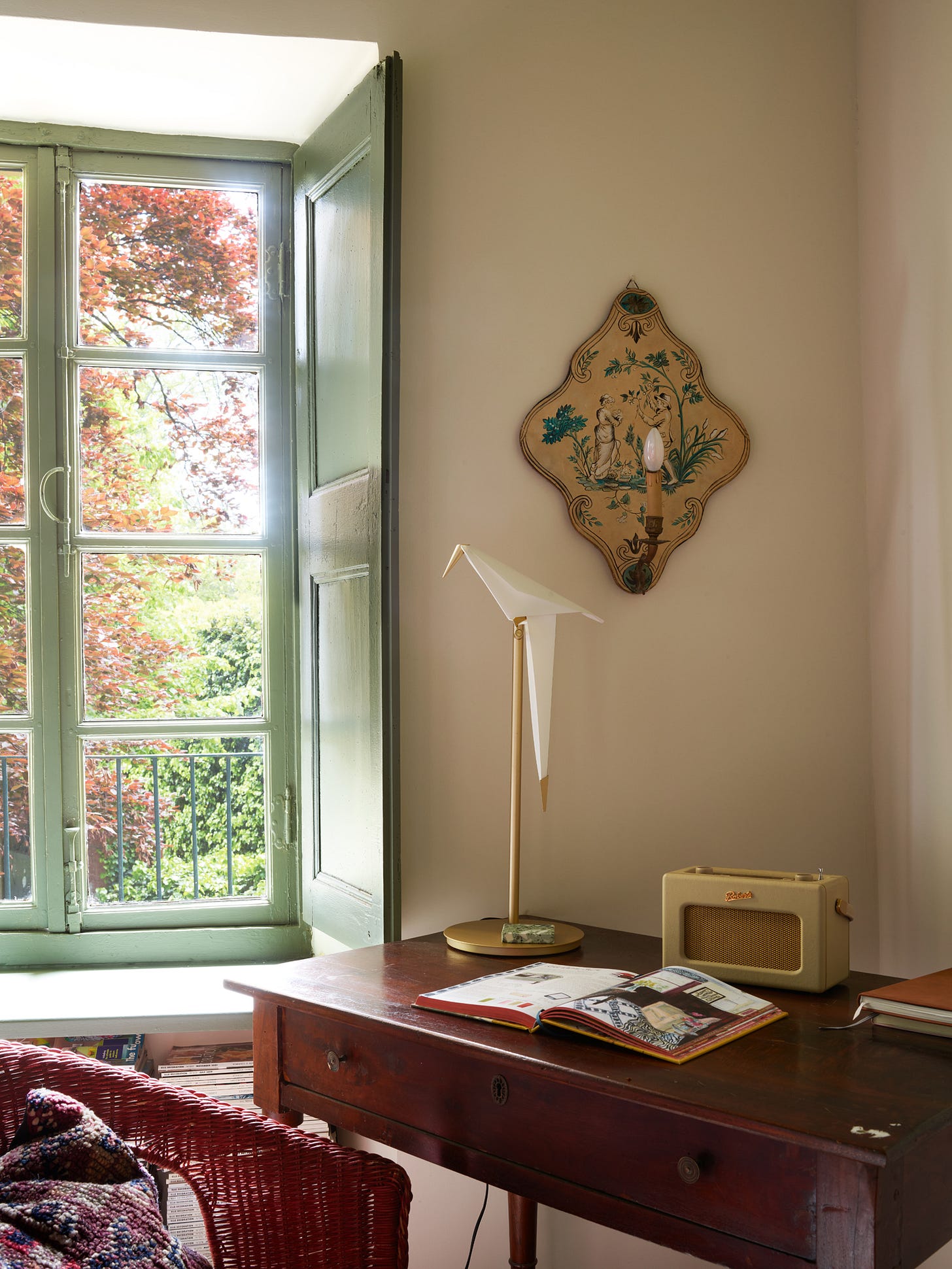
As Diane Vreeland said: "A little bad taste is like a nice splash of paprika... it's hearty, it's healthy, it's physical. I think we could use more of it. No taste is what I'm against." And I couldn't agree more. Put another way, it's about adding something a little unexpected to the mix. Something that might, on paper, jar – but just works like the paprika or a squeeze of lemon, to bring some wow. Clashing colour and pattern can do this, so can adding an outrageous lamp or something that is totally over the top. I have my much loved 6ft tall brass palm tree lamp to which has been added (in my office) a swinging paper bird on a brass perch which was sent over to be photographed and has yet to return to its coop. I have a bouquet of plastic (sustainable) Lego flowers which, to my mind, is more interesting and, yes, tasteful, than a bouquet of dusty dried ones. It's about taking an idea and pushing it just a little, but further than might be comfortable. It's also about adding some humour and eccentricity to a room – and we are often afraid of both of those.
PERSONALITY
Bring all these elements together and you will have lots of personality in your interior design. Which is what you want.
Thank you so much for being a paid subscriber, it means so much to me that you choose to support my writing in this way and that allows me to keep writing for you.



The way you write is so down to earth and makes interior design feel accessible to me. What a revelation to discover that I have permission to put things I like together, in a way that is functional for how I live! Always appreciate the tips and the reminder that I may take what works for me and leave anything that doesn't.
I've realised, reading your writing, that I really want loads of pink in my house. Now I just have to convince my husband. Or sneak it in without him noticing 🩷
This list is worth printing out and tucking away in my day diary! As you point out, I do some of these instinctively. But what you say here reminds me to be bolder and more determined in the process of choosing what I love and works for me/us.