The Househunter: Design Decoded
In which we take a virtual stroll round a beautiful house that's on the market, to learn how its design can inspire our own places and spaces. This week, we're in Whitechapel, east London.
This post might also be subtitled: In which we have a quiet word about spotlights. But we’ll get to that. The house we’re touring is a gorgeous four-bedroom Georgian property, which has been restored under the watchful eye of the Spitalfields Trust.
The colours are soft and tonal. The floorboards original and the sash windows reconditioned. There are fireplaces and original cabinets, panelling and a garden office. It’s on with Inigo for £1,600,000 and I would, I really would.
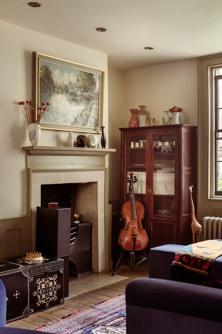
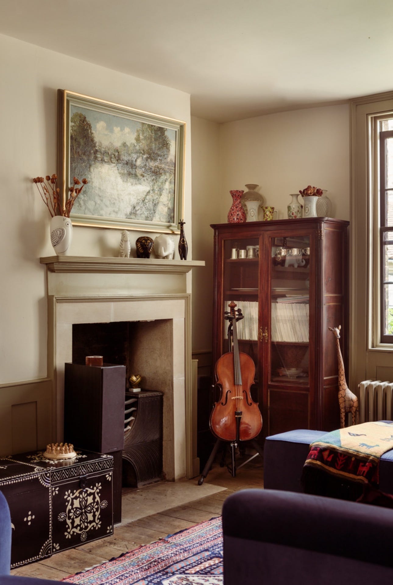
But this is also one of the reasons why I write about real homes rather than those which appear in magazines, for this monthly post on decoding design. Because let me tell you, one of the first things to disappear in an editorial shoot would be the rows of spotlights in the ceiling. Thus: see above and below.
To my mind there’s no question that the image is more beautiful without the very modern chrome lights in the ceiling - it’s less cluttered, it’s less distracting, you can focus more on the furniture and the design of the space. But this picture was taken to sell a house, not to showcase a paint colour or a cabinet or a stylist’s expertise.
Now it’s only fair to point out that this house was redone in 2010, and times have changed. It’s also worth theorising that since this house is Georgian and historic, although not listed, there might have been valid reasons for not installing central (or otherwise) pendant lights in the ceiling. It’s also worth noting that you can buy paintable spots these days which would help them to disappear.
So let’s park all that for this house and have a small chat about lighting. There was, particularly in the early part of the current century, a period when downlights graced every ceiling in every room. Installed by builders, who are usually hired for their technical ability and not necessarily their taste, they were slapped up in grid formation all over ceilings where as the years progressed they fought for space with smoke alarms, built-in sound systems, pendants and even, in large houses, sprinklers.
Not for nothing did they become known as builders’ acne.
Good lighting should illuminate a space without you necessarily being aware of where the source is. That is the first reason for not having symmetrical grid. You can be so busy conforming to a tidy pattern that you don’t stop to think about what actually needs to be lit.
Many years ago I invited a lighting expert to my house – you can attend her masterclasses for free – and she immediately noted that in my kitchen I had a runway of spots between the built-in sideboard and the kitchen island which was doing a grand job of illuminating a path to the back door but left the actual “furniture” in darkness.
That’s the first point. Lighting should be there for a reason - don’t waste it on a pointless patch of bare floor.
Secondly, get rid of the grid. If you want downlights – and they can be brilliant – put them over the kitchen sink, the prep area, the coffee table. Direct a beam of light towards the thing you need to see. Sounds obvious when you put it like that, doesn’t it?But it’s amazing how often it doesn’t happen.
Thirdly, and perhaps most contentiously, think about whether you really need them in every room. Sure they’re easy, and if you have low ceilings you might feel a dangling pendant is going to be intrusive. But might a wall light be softer and prettier?
Let’s look at a basic list of rooms and make a note for each:
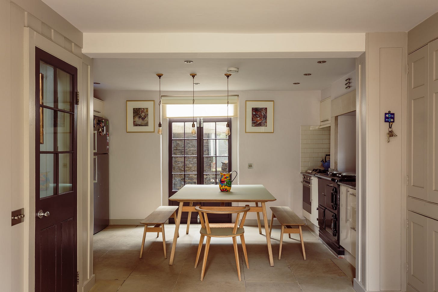
THE KITCHEN: Yes, as long as you place them where they will light the jobs you need to do. A standard worktop is 60cm deep, so put them around 30cm in from the wall and you won’t be standing in your own shadow. Stick them over worktops and prep areas but consider something different over a dining area. If you can’t do that then add a dimmer for varying the ambience.
THE SITTING ROOM: Perhaps over a coffee table to show off an artful arrangement of books and objets (not if it’s last’s night’s dinner and a Lego dinosaur). Possibly over an alcove of books either side of a fireplace and, if dedicated picture lights aren’t your thing, over the artwork. Otherwise use lamps – floor, table and task – with wall lights to gently wash up and down and create soft pools around the room.
THE BEDROOM: I mean why would you? Get the position even slightly wrong and you risk dazzling yourself while you’re lying in bed reading. A task lamp (or the bathroom) is probably better for make-up and if you didn’t sort your black socks from your navy when you brought them back from the washing machine in daylight, then let that be your lesson.
THE BATHROOM: Like the kitchen, downlighters can be the right solution. Stick one over the bath where it will catch the water and create soft shadows and likewise the shower, where it might show off your pretty tiles. Be afraid, very afraid, if you are older than 17, of sticking one over a basin mirror. This strong downlight is un-for-giving. It will not give you confidence to go out and slay the day. Add two wall lights, either side of the mirror, instead. Much more flattering. Remember the bathroom is where you start and end the day, so you owe it to yourself to see yourself in the best and most confidence-boosting way possible – and that, my friends, is lit from the sides.
Right, mini lighting masterclass done. Who’s coming to see the rest of the house? What else can we glean for our own places and spaces? Let’s start with the colour palette.
The rest of this post is for paying subscribers only and we will be looking at colour. If you liked this lighting lesson and want more, you can hit the button below. This will also give you access to my monthly Drop-in Design Clinic, where I will be live to discuss your own decorating dilemmas.


