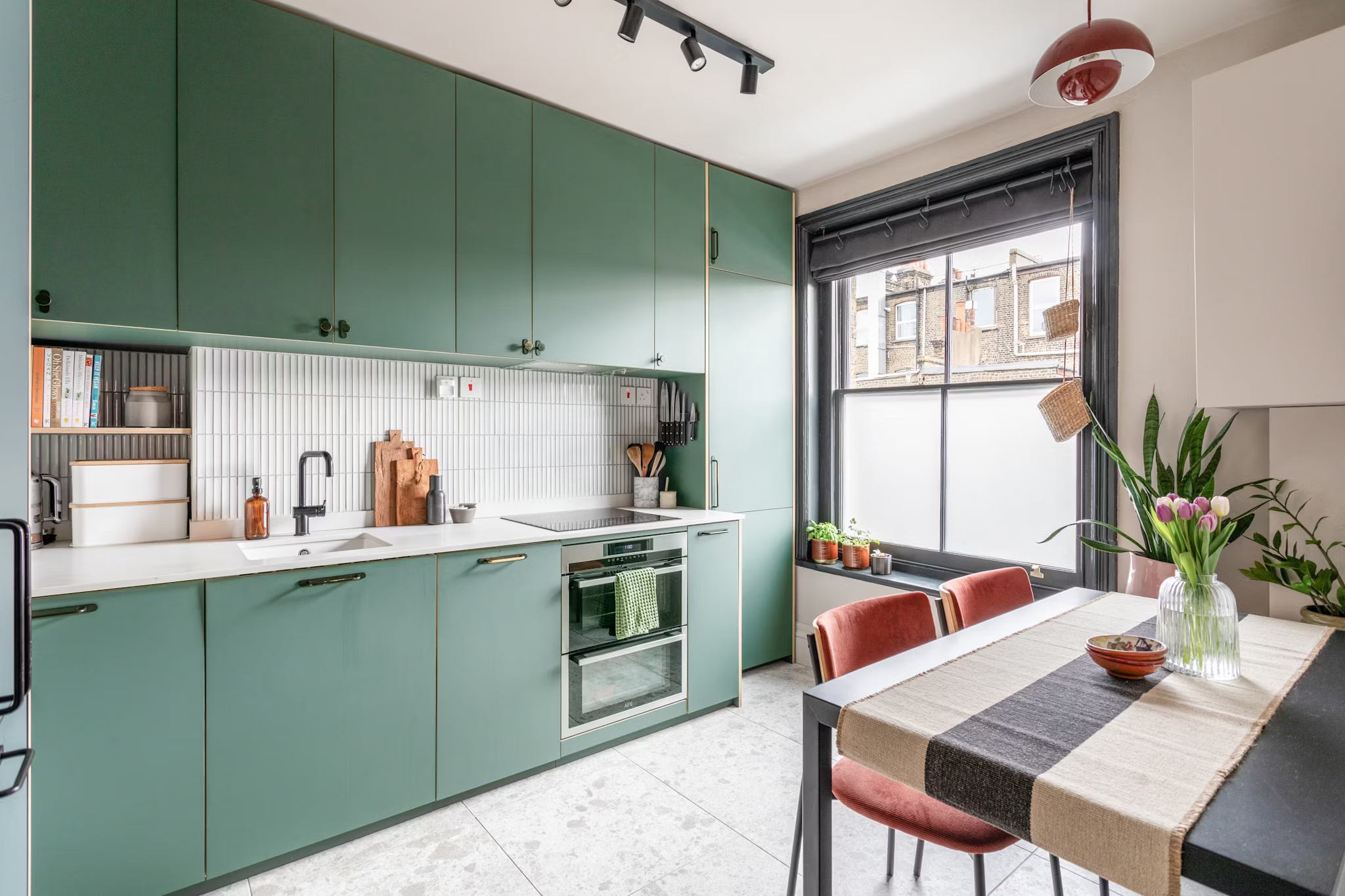
This week we’re off to a two-bedroom flat in the sought-after area of Stoke Newington in north London. Located in a Victorian mansion block, it’s on for £600,000 with Brickworks.
Now I’m going to show you the floor plan here as it’s instructive to see the layout. Firstly, if you are flat hunting, mansion flats like this are brilliant as they were purpose-built and that can make a huge difference when you compare them with a long, narrow Victorian house which has been carved up around a central staircase resulting in small rooms and awkward angles. For this reason, if you can, always consider flat conversions in huge houses: the flat itself may be small, but the ceilings will be higher and the corridors wider, so it will instantly feel more spacious.
As you can see from this floor plan there are basically four square rooms, a bathroom and a generous (by Victorian standards) hall.
The first thing I always do when looking at a floor plan is to see if the doors are taking up too much space and if it would make sense to convert them to sliding, or pocket doors. This is often very useful in a house-to-flat conversion but less so here, as the angled walls mostly mean there’s nowhere for a door to slide to in any event.
One thing you could do – and it’s not necessarily worth it here but may be useful for you one day – is cut that main bedroom door in half and create a set of mini double doors. That means it will take up less space in the room when the doors are open and may make it easier to walk around the bed, for example.
In the bathroom, a sliding door would free up space on that wall but probably at the expense of the storage unit at the end of the bath. Only you can decide what’s the right solution for you. This newsletter is here to help you find the right questions to ask so that you can create the best possible home for yourself, taking into account the available space, your needs and how you live your life.
While we’re in the bathroom, you can see how there are two windows. In a flat conversion that would usually signify that the loo and bathroom were originally separate rooms. What I wanted to point out though, was how using mirrors can make a dark room feel lighter or a small room feel larger. While there may have been some Photoshop involved in the mirror reflection, you can see how it is catching light from the window and bouncing it back out again. The loo has been positioned to hide it as much as possible from an open doorway - that’s also right opposite the main entrance.
I have spoken before about internal views – and if your bathroom is opposite the front door then it’s definitely worth either moving the loo so it’s not the first thing you see when you come in (same applies to en suite bathrooms), or fitting a door that swings closed, although that will cut the available natural light. It’s not always possible and it’s not always necessary – but I’m here to make you aware of possible pitfalls and things to look out for.
Leaving the bathroom and heading to the kitchen, which is large enough for a dining table. Using flat-front cupboards and minimal handles stops the space feeling cluttered, while the strong colour adds personality. If you have cupboards on both sides of a kitchen it might be worth painting the top ones to match the wall, so they disappear as much as possible and don’t bring the room in.
In this flat, as the kitchen is all along one wall, it becomes a feature and also zones the space between cooking and dining. That tall cupboard looks more like a screen that is hiding something than extra storage, and is a reminder that sometimes a property may have architectural features that you can do nothing about. Here it has been styled to look like part of the kitchen.
Finally, the sides of the tall cupboard have been used as knife storage, while the boiler cupboard has been painted to match the wall so it disappears as much as is possible. Dark window frames work to draw the eye away from the boiler which, if you remember, was one of my three techniques for how to make a small room look larger (disguise – paint it the same colour as the wall; distract – make the windows more prominent; or style it out – that’s the tall thin green cupboard above acting as a literal green screen.
A small point in passing here, but it’s an important one that has come up before.
You will notice that this flat is mostly painted in a neutral, warm off-white. The skirting boards match the walls – which makes them look taller and therefore the ceilings (which also appear to match the walls) higher. White skirtings with a coloured wall is like wearing an ankle strap with cropped trousers; it makes your legs look shorter.
The dark windows, as in the bedroom below, create a focal point and draw the eye outwards. Doors have been done in a third colour. Firstly, you need to know that This Is Allowed.
Secondly, you will see that the door and the architrave are one colour and the skirting another. Also Allowed.
We’ll end with another potentially controversial point – and that’s the feature wall. In recent years these have been much derided, but there are ways to get them right. I might address this in a longer post in a few weeks’ time, but in short, if you are going to have a feature wall, you must make it part of the room.
In this case it works at the end of the bed as it can sort of double as a giant headboard so it’s completely justified to be in a different colour. That said, I think I would have kept it on the central part of the wall only and left the alcoves white; that really would have made the bed look grand. I can see that on one side the wall continues over the storage unit and is probably why the decision was taken to wallpaper the whole thing. However, it’s perfectly acceptable to stop wherever you want – and yes, that can be in the middle of a wall, so long as you stick the edge down firmly. I would have taken the paper straight up the central part and painted the rest to create a feeling of symmetry.
The other way to get a feature wall right is to make sure it links to the other walls. Here I might have painted the skirting boards in a colour from the wallpaper – or matched the window (which also goes well with the paper). That would have made it less of a freestanding feature wall and more of a scheme with a feature wall in it. Small difference in words, big difference in impact.
I hope that has given you some ideas for your own places and spaces. The next post on Wednesday will be for paid subscribers, when the award-winning interior designer Nicola Harding will be sharing her tips on how to get lighting right – with plenty of other design advice thrown in. Sign up below if you want to join and have access to the full archive of posts.
Otherwise, if you enjoyed this post, please like and share as it helps enormously with visibility. Thank you so much.
I had opened the kitchen picture and had a really good look at it before I read your comments. When you wrote about the boiler, I thought “wait! What boiler???”. Proof in action that disguise and distract works. On the feature wall, I remember you saying (can’t remember if it was when we met years ago or on the podcast but it was definitely you, Kate!) that, a feature wall that isn’t incorporated into the scheme of the room ends up feeling like an uninvited guest, lingering at the side of the dance floor: no one knows what it’s there for! That’s always stuck with me. When I used your advice to connect such a wall, I used the colour in the skirting, architrave, door and window frame and it looked exactly as you describe it - cohesive and intentional. I’ve done it again in my bedroom where the bed sits in an alcove. I’ve taken the paint up over the ceiling in the alcove colour (Peignoir) and the walls and ceiling are in P&P Library’s Powder II. I got talked into having the pink ceiling in Wimborne White originally (or Wimp-borne as I named it because I wimped out) but then found the courage of my convictions and painted it Powder II after a couple of weeks. So glad I did. All the woodwork is Peignoir. It’s very harmonious. One aside: I used the Dead Flat Matt from F&B for the Peignoir on walls and woodwork. Wonderful on the walls. Pig on the woodwork. Took four coats on top of the recommended F&B undercoat. One to consider…
As usual great tips and advice👌