


Why do beige clothes whisper luxury, while beige interiors shout bland?
Clue: it's not the what but the how.

There’s suddenly a lot of hoo-hah about the colour beige. “How beige became shorthand for everything wrong with the world”, reads a headline in Elle Decor, while a lengthy feature in the New York Times last week asking “What does ultra-wealth look like?” concluded that it’s, well, mostly beige.

Yet even the ultra-wealthy themselves, who undeniably do have a preference for dressing in shades of beige, can be disparaging about matching their interiors to their cashmere coats. A few minutes into Mountainhead, the new TV film by Succession creator Jesse Armstrong, comes the line: “Was your interior designer Ayn Bland?”
Armstrong himself has previously spoken not of the gilded cages, but the beige prisons his multi-billionaire tech moguls live in: “This kind of wealth has an international hotel feel to it.”
And as Jacquline Demeterio, costume designer on Apple TV’s top-rated new series Your Friends and Neighbours – which revolves around the seriously loaded residents of a loosely disguised Westchester County – points out, true one-percenters dress to be discreet but emphatic about their status. Their clothes, she says, are designed to “speak volumes but never scream”.

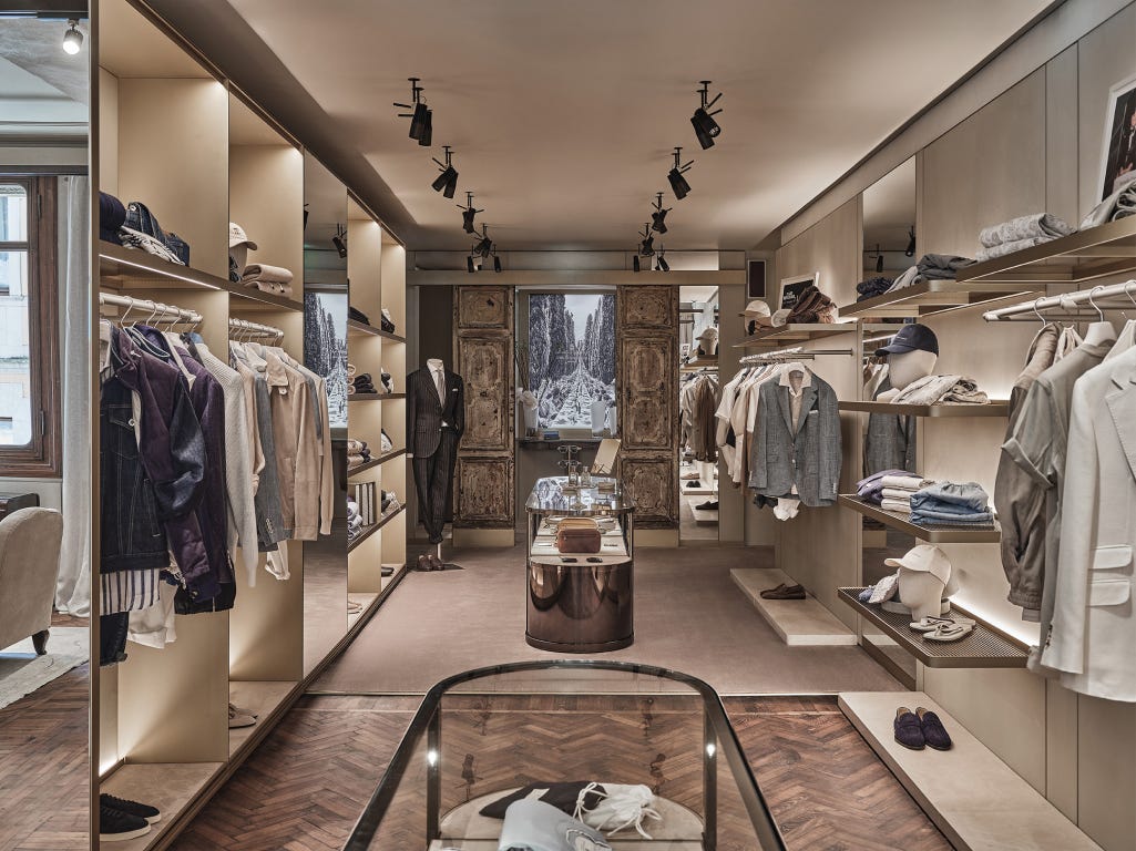
It’s a look widely emulated among the other 99 per cent, who can’t afford to shop at The Row, Loro Piana or Bruno Cucinelli (name-checked in both YFaN and Apple’s other recent hit, The Studio) but find its attainable equivalents in stores like Mango, Cos and Massimo Dutti.
Remember Gwyneth Paltrow attending court in that case brought by Terry Sanderson, the retired optometrist she collided with skiing in Deer Valley in 2016? Her muted yet clearly uber-expensive wardrobe was all quiet confidence and stealth wealth. See also Martha Stewart and the brown Birkin bag she carried during her trial for financial crimes in the 90s, which felt like top-level trolling of the SEC.

Because beige is, indisputably, the colour of money.
The ‘quiet luxury’ look was widely dissected throughout the four-season run of Armstrong’s Succession, where the lead characters wore baseball caps with no logos, and black or navy cashmere alternated with 50 shades of khaki. When Shiv wore a floral Ted Baker dress to her mother’s Tuscan wedding it made column inches worldwide, so out of character did it seem.
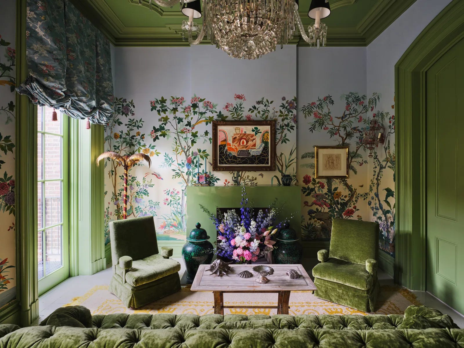
So why is beige regarded as a powerful style statement in clothing, but derided as bland in interiors? While people who dress like the rainbow are regarded as a zany or hippy, and those in neutrals regarded as elegant, it’s the other way round when it comes to their homes. People of taste use colour and pattern, goes the trope. It’s English country house style on steroids – and let’s be honest, the inhabitants of the true English country houses might not always be one-percenters, but they’re definitely in the top five.

When the Kim Kardashian and her then husband Kanye West decorated in minimalist shades of beige, it was loudly derided as dull. Yet when Lily Allen and David Harbour splashed floral wallpaper all over their New York townhouse, the interiors internet pronounced it the most stylish thing since, well, the last most stylish thing.
So what’s the difference?
In the UK Builder’s Beige was for many years a euphemism for Magnolia. That colour, a staple of 1970s interiors, is a warm cream with a peachy yellow undertone. It’s making a comeback, by the way.
Like grey before it – the colour of undercoat and unfinished things – beige can feel like you couldn’t quite be bothered. It takes a lot of work (and money) to make beige look good. For the most part, it defaults to cheap.
But perhaps we do beige a disservice. Done right – and oddly not at all like the one-percenters do it, an interior in shades of coffee, cappuccino, caramel and double cream can be cocooning and cool.
Is that perhaps the problem? Does beige need a new name? A rebrand? Doesn’t cappuccino sound better? Homes & Gardens ran a feature recently on designers’ choices of the 14 best beige paints (not the most enticing of headlines, admittedly) and included Little Greene’s Slaked Lime and Portland Stone – both named after expensive natural materials – alongside other deliberately attractive-sounding shades such as Adobe Dust and Swiss Coffee.
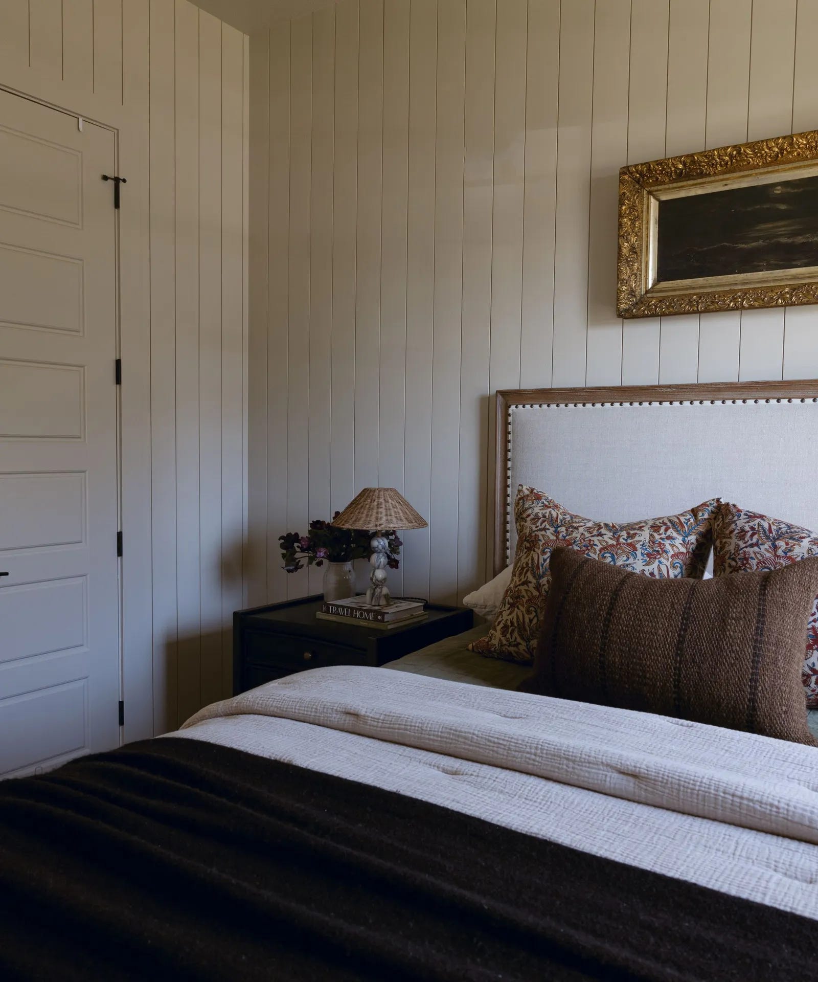
Or what about Accessible Beige by Sherwin Williams? There it is above – and it has been expertly styled, which means it is providing the framework to the room. Just as the understated, labelless cashmere sweater whispers wealth, so the walls here allow the rich chocolate bedding and smaller details to stand out.
The other key element of this room – basically variations on a single colour – is texture. That’s why it works, and that’s why many beige rooms don’t. From the seersucker bedding, to the linen cushions, rattan lampshade and carved gold mirror, the eye is invited to travel around the room and land on all the different details. The beige is the backdrop; not as is often the case with the one-percenters’ interiors, the whole story.
If you lean towards a warm neutral interior, then shades of coffee and cream (with a hint of bitter chocolate) are absolutely your friend. Look for shades with a hint of pink rather than yellow and, in the spirit of the old ‘unexpected red’ theory, add burgundy. Keep the wood dark and lean into vintage. It’s when it’s all pale wood and contemporary furniture that everything starts to look international hotel.
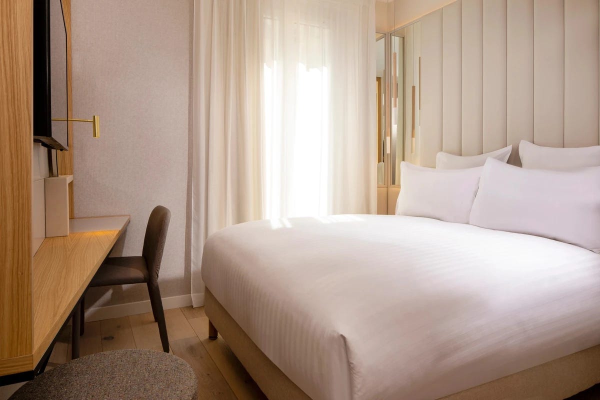
Mind you, there is a hotel in Paris which is deliberately leaning into that vibe. The Hotel Beige (not even joking) claims to offer you a haven that will be “audaciously quiet”. This establishment, says its blurb, offers a “thoughtful welcome amidst a discreet, uniquely Beige mood to provide guests with a refined, custom-made lifestyle”.
There’s one of the guest rooms below. What do you think?
Done right, beige can absolutely be fabulous in interiors. Just not the way the ultra-rich routinely use it. And there’s probably a moral in there somewhere.
Jenni Kayne’s LA home is a good example of the luxe American ‘Beige’ home. It’s designed by Vincent Van Duysen but its scale makes it look rather hotel-like. I think Beige is an American interpretation of Scandinavian minimalism; scaled up and flattened. I think it needs soul- texture, vintage and antique elements to succeed.
Loved this read and the image references. Our term has always been "bachelor beige", the color of a rent-controlled apartment in LA that hasn't been repainted in decades. It was definitely replaced with gray for a long time and now beige is back and I have to admit I'm happy about it.