Your Decorating Dilemmas Solved #3
How to mix and match tiles, a deep dive into colour drenching – and lighting for low ceilings.
Continuing the regular design dilemmas series – this time with some of the questions from the last Drop-In Design Clinic, as well as those I didn’t have time to deal with during the live session. Sometimes it’s useful to revisit a question with time to look for illustrative images and explain ideas in a way that might be more useful to more people.
This is a post for paid subscribers only. To submit your own question or to attend the live session (a full recording is sent out afterwards) you can upgrade at this link.
To give you a flavour of this post the first question comes above the paywall. It is this from Helen Jenkins, who wanted to know about mixing tile patterns. Her question is below, followed by my answer and some general guidelines on mixing it up in the bathroom.
“I’m trying to choose a bathroom floor tile and shower wall tile for a fairly traditional bathroom. The shower is a walk-in, and the shower wall tile will be visible through an archway, so I’d like an impactful contrast. There will be a direct join between the two tiles - no shower tray.
“What do I need to consider in terms of scale when pairing tiles? Any ideas much appreciated!
“Finally - should the floor tiles continue through onto the shower floor, or would it look better if the shower wall tiles start on the floor at the threshold of the shower?
“For context, I was thinking a mid-century blue wall paint for the rest of the bathroom with a bright red freestanding bath and reclaimed teak vanity.”
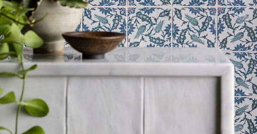
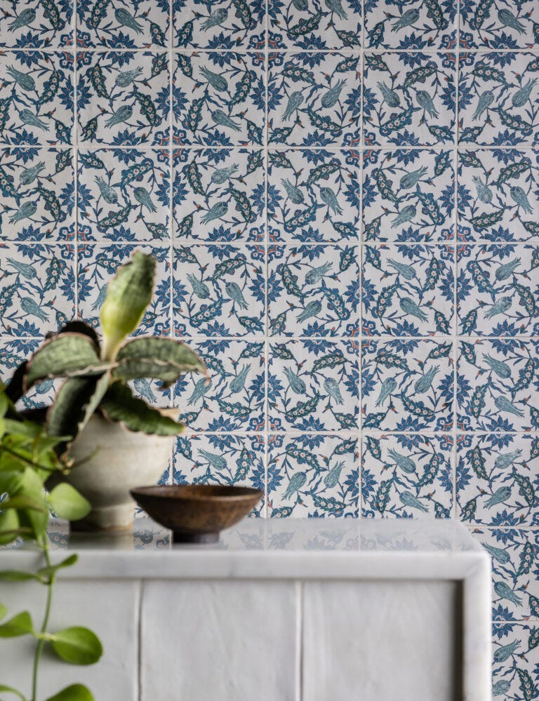
Helen sent over links to some classic black and white tiles but she wanted to use them in triangle form. She also wanted to use this gorgeous floral in the shower.
So, notes:
Black and white floor tiles are a classic and will go with any colour you choose.
However, a triangle pattern can appear quite busy and is harder to mix with a floral. In a large bathroom it might look too bitty and broken up, while in a small one it might be too busy.
A chequerboard layout is an easier starting point. For a floor tile this might be 20cm square – make sure the room is large enough to have an expanse of whole tiles. If you have multiple angles and have to cut lots of tiles you will lessen the impact of the pattern and increase the visual “busyness” of the space. Better to have one plain colour at that point. If you want to create that classic chequerboard pattern, then a 10cm square tile is good in a small bathroom. See mine below.
Helen’s chosen floral pattern is stunning and quite unusual as it looks more like a fabric than the more geometric designs we tend to see on porcelain tiles. As it will be viewed through the arch, I would paint that arch in a strong blue to really draw the eye and frame the tiles.
If you have such a strong pattern, you don’t want to detract from it – so I would consider a blue and white check floor rather than black and white. Both designs are very strong, which means you might want to keep the colours coordinating, so they harmonise rather than contrasting too strongly.
It’s easier in a sitting room, where you might have wallpaper, curtains, cushions and a rug. That’s a lot of opportunities to bring in different patterns and to tie them back together again using a mix of florals, geometrics and plains. But in a bathroom, if you have two very different designs in contrasting colours it can be difficult to unite them, as there just aren’t enough surfaces.
Helen said she was going to paint the bathtub red, which talks to the shower tiles but not to black and white floor tiles. If the towels are blue then, again, they link to the shower and not to the floor. If the taps and shower fittings are black, they link to the floor tiles but not the shower.
Do you see my point? Helen is better off using all the shades of blue in the tiles with the red accent. Then she can mix the flowers with a geometric pattern and it will look amazing.
She mentioned painting the walls blue, too, which I completely agree with – but if that feels too much, she/you could keep the walls paler – the background shade of the tiles – and paint the woodwork in blue.
Here is a little image I knocked up - my skills are basic and I won’t be able to do this for everyone, but I thought this would show you how the room comes together with patterned blue and white floor as opposed to black and white.
By keeping the colour palette tight I have managed to also bring in a striped cafe curtain at the window as well.
Next, a question from Hazel Aitken, who wanted to know about bedroom flooring.


