Your decorating dilemmas solved
What to do about bad lighting? How do I overcome decision paralysis? Is it OK to rip out original features? Can I use strong colour in small rooms? How to hide the TV – and more. Read on for answers.
I thought it might be helpful this month (and next if you fancy) to do a round-up of some of the most common design questions I am asked. In other words, the ten decorating dilemmas that seem to come up again and again which means they must be affecting, and possibly holding up, a lot of your projects. So come on in my door is open.
As you know, I hold a monthly drop-in design clinic to meet you and chat in real life but those questions can often be very site-specific and while I try and widen the answers as much as possible, I’m aware that there are lots of other questions that come up again and again. So here are the 10 questions I am asked most with answers as succinct as I am able to make them. If your issue wasn’t covered then do please add it to the comments and I will make this an occasional series as I gather enough questions.
1 HOW TO OVERCOME DECISION PARALYSIS
Getting bogged down in stuff is one of the most common problems when it comes to decorating. Shall I look at one more tile, call in one more fabric sample, stick one more paint colour on the wall? Eventually we become so overwhelmed that we are convinced we will make the wrong choice so we don’t choose at all and carry on living with the torn, broken, ragged, worn out thing/room/space for a few more months/years so we don’t have to choose at all. Better to live with the old rubbish than spend money on the wrong thing goes the reasoning. Or, if we do manage to make a decision it’s often the first thing we looked at and that’s the first lesson.
Trust your gut: What were you first drawn to? The original colour and shape before you started thinking about the money. Having worked that out can you find a way to achieve that within your budget?
Draw up a shortlist: There comes a point where you are going round in circles. There really isn’t that much difference between all those shades of pink. Are those chairs really so much better than those because the back is 2cm higher? Will you, or anyone, notice the depth of creaminess in those bathroom tiles? STOP RIGHT THERE! Before we go any further… (name that 80s tune) … make a shortlist of three or five and pick one. Yes go on pick one and then move on.
Just choose already: because when you unlock the process by making one decision you can move onto the next and that starts a chain reaction. And you know what? Sometimes it’s only by taking three steps forward that you realise you were walking in the wrong direction and you can go back and correct the first step.
Start from the end: if you have been struggling to move forward because you couldn’t decide on the wall colour why not start in a different place? Try focusing on the biggest piece of furniture - bed, sofa, table and working out from there. Visualise yourself in the finished space - perhaps the mood you want to be in when you use the room and note what colours you have used and what textures. Try to isolate some of those and start building a colour scheme from that.
Give yourself permission: It’s your home, you need to love it and what to be in it. Give yourself permission to have a velvet sofa in a strong colour - you can always keep the walls paler and, if you buy a good quality sofa, you can reupholster it in a few years. Give yourself permission to use the colours you know you love to create the mood you want to be in and don’t decorate for your neighbours, the estate agent, your mother. It’s your home, your budget and your mental health. Do it for you.
2 IS IT EVER OK TO RIP OUT ORIGINAL FEATURES?
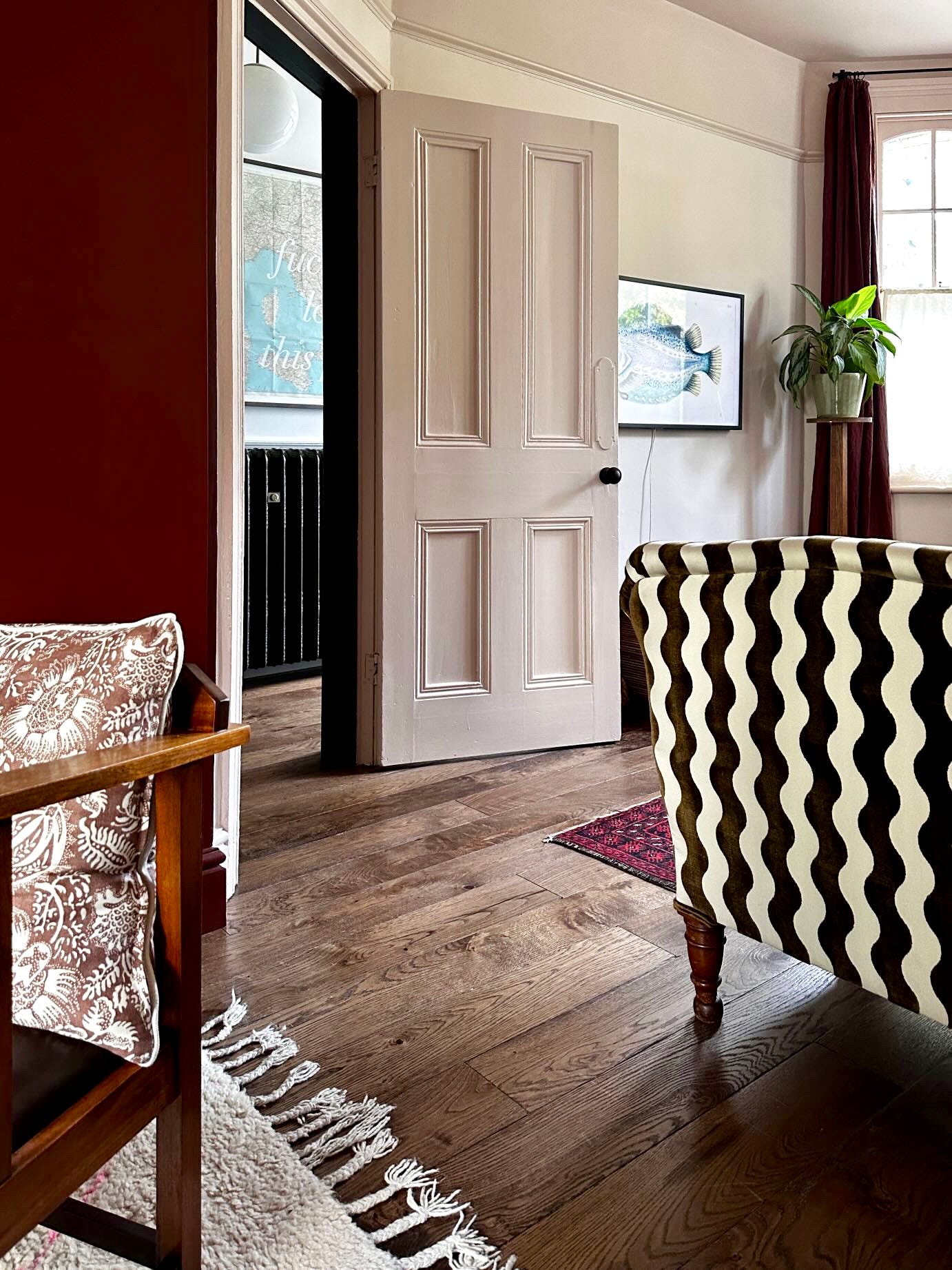
I’m going to say yes. I received a message the other day from someone who had uncovered an original bread oven in her kitchen and wanted to know if she had to design the whole room around it. No! Keep it if you want it and can use it. Cover it up carefully so a future owner can use it if if they want. You must decorate your house for the way you want to live.
I once saw an instagram outcry when someone said they were going to cover up the original Victorian Minton hall tiles. But those tiles are very earthy colours and they’re not for everyone. Nor is it fair to say she shouldn’t have bought the house if she didn’t like that one aspect - there are many things that make up the perfect house and there is always a compromise.
I have seen many a period bedroom suffering from poor layout and lack of storage because there’s a pretty fireplace they don’t dare cover up but remember the Victorians put them there for practical reasons not decoration. One solution is to board over the fireplace and put your bed in front of it. I built a false wall in front of mine with clothes behind and the bed in front.
Finally I am often asked if it’s ok to replace original floorboards. I offer my own house as an example. Built in 1860 with the original boards still in place when we moved in in 2012, many of them were cracked and splitting. The house also had a cellar which meant there were gaps between the boards for them to expand and contract with the weather which meant the house was very draughty and it was hard to keep rooms warm. In my office the draught was so extreme I used to work with a blanket wrapped round my lower legs. In addition that old pitch pine can be very orange when sanded which might not be the look you want.
We painted them off-white and kept repairing them as we went along. When we moved to this house I was DONE. We bought engineered boards from Broadleaf timber in a gorgeous dark colour that matched the floors we found under an upstairs carpet and we live in a warm, draught-free and creak-free home. I’m also pretty sure that the new owners of the old house will have had to replace more boards and landings as the house nears its 200th birthday.
I’m all for sensitive restoration but I also need to make my house fit for my purpose.
3 QUICK FIXES FOR BAD LIGHTING
Sometimes if you rent or if you have spent the money on a new roof there just isn’t much left over to move lights around or change sockets. But there are things you can do.
Change all bulbs to a warm white.
Use lamps. Try not to use the big light unless you really need it. Instead lamps at different heights dotted around a room will make for more atmosphere. Don’t forget a task - desk lamp - in places where you might need to see to read for example.
Make sure lights are at different heights. Use floor or standard lamps, tall table lamps and short fat ones. Mix up the shade to add colour and pattern.
Remember that pale shades will diffuse the light all around, dark and metal ones will issue a direct beam up and or down.
If you have a grid of spotlights that you can’t change sometimes you just have to remove some of the bulbs. It’s imperfect but remember most people don’t look up at the ceiling unless it’s to see why they can’t see. Keep the bulbs in strategic places and remove those that are creating a runway effect on bare floor.
4 HOW TO HIDE THE TV
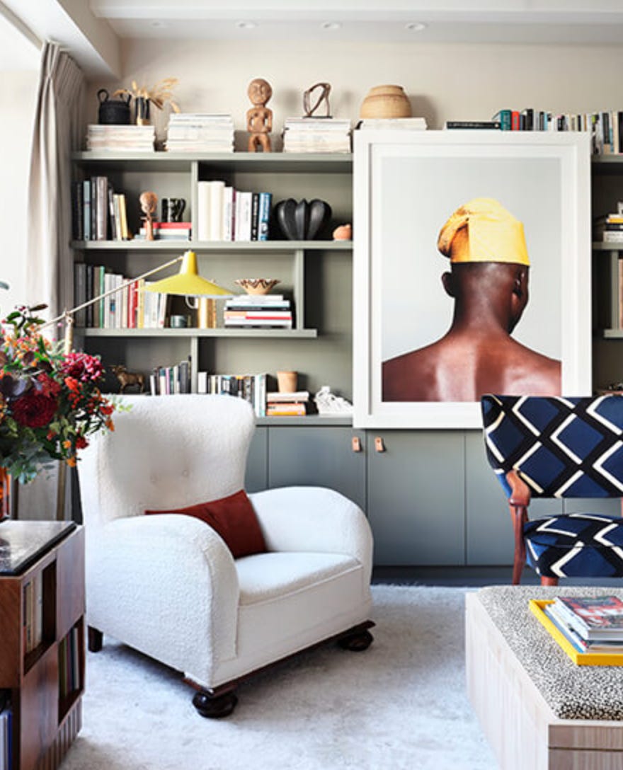
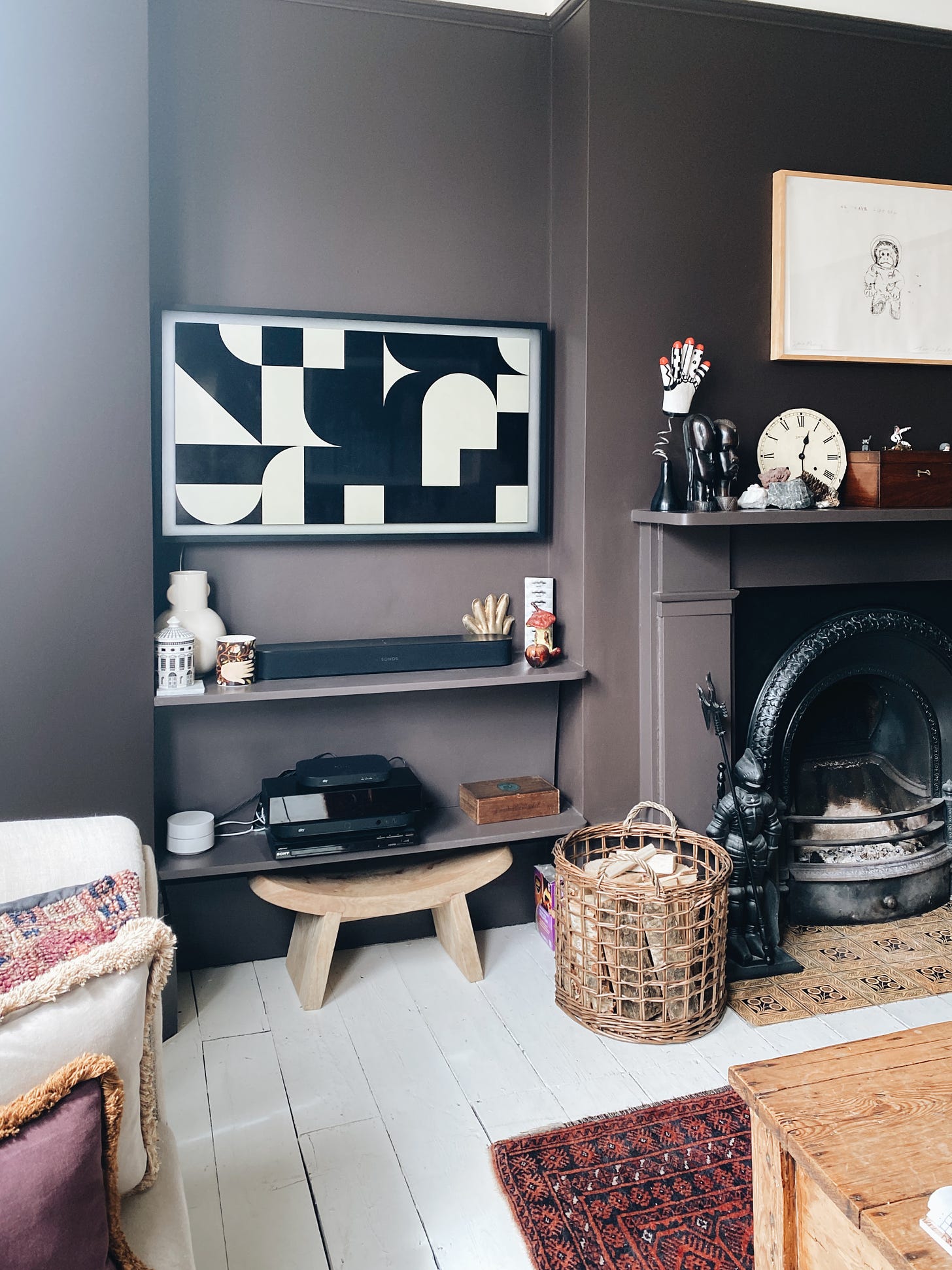
1 Buy a Frame TV by Samsung. They’re expensive but they work.
2 Buy a lightweight canvas that’s bigger than your TV. Paint a picture/pattern on it and hook it over the top of the television when it’s not in use. Simply remove and prop by against the wall when you are watching. This is what Theresa Gromski did in her living room.
3 If you have a wall of shelves with the tv in a larger “cupboard” in the middle then fix a sliding door to hide it. You can also fix a painting to a rail that you can slide across as Sophie Ashby did in the top image.
4 Paint the wall dark so it disappears.
5 It’s a TV in a room where you watch TV. Own it and move on.
5 WHERE TO SPEND AND WHAT TO SAVE
Generally speaking you should buy the best you can afford especially when it comes to appliances. I have lost count of how many cheap dishwashers I have repaired and replaced over the years while my friend Hannah, who received a Miele for her wedding some 22 years is still going strong.
Invest in your mattress. The frame can be cheap. The headboard can be homemade. I have done this in Italy. We put expensive mattresses on cheap metal frames from Maisons du Monde and created headboards from either quilts hung on hooks or vintage headboards. The metal frame legs are hidden by linen valences from La Redoute.
Buy a good sofa as it can be reupholstered for years.
Dining tables change depending on the size of the room they are in. Better to spend money on dining chairs that you will love forever.
Invest in things with moving parts - taps being a very good example. A good tap can either be mended or it won’t break in the first place. The basins and baths can be cheaper.
6 HOW BIG SHOULD THE RUG BE
Buy the biggest rug you can fit and afford. Make sure the doors will open over the top of it and fill the room. We do not want rug island in the middle of the room. This breaks the space up and makes it look bitty and disjointed.
As a rule of thumb the front legs of a piece of furniture should be on the rug to bring it all together. Ideally the whole sofa but if that isn’t possible aim for the front.
If the budget won’t stretch to large rugs look at La Redoute, which does affordable big sizes, and then consider buying a piece of carpet and having the edges hemmed.
If your rug is too small you can buy a larger sisal rug and lay your patterned one over the top.
7 HOW TO ZONE A SPACE
If you don’t have walls then you have to use flooring and paint colours to zone spaces.
For a seating area in a large open plan room you can paint two corner walls in a different colour. Add a rug (see above) that is roughly the size of the seating area you want to create.
Use an architectural features - alcoves, pillars, fireplaces, as natural breaks to change colour or purpose within the larger area.
Don’t be tempted to keep the furniture round the edges. Put a sofa in the middle with its back to the kitchen. Buy a low unit and put it at right angles to the wall to create a natural break between dining and relaxing.
Use tall plants as screens or bookshelves. Ikea do bookshelves that are a series of cubes so you can leave some empty for the light to pass through, put books facing in both directions in others and add ornaments to the final ones.
8 CAN I USE BOLD COLOURS IN SMALL ROOMS?
Always. But consider the point of the room first. A small dark room that is used for watching tv is practically begging to be colour drenched (walls, woodwork and ceiling) in a jewel-like shade. But if that room is your office you need to think about how you might feel spending all day in a cave. If that’s you perhaps you can do a dark ceiling and paint the walls the same colour but in a much paler version. That will be cohesive and considered but also, literally, workable.
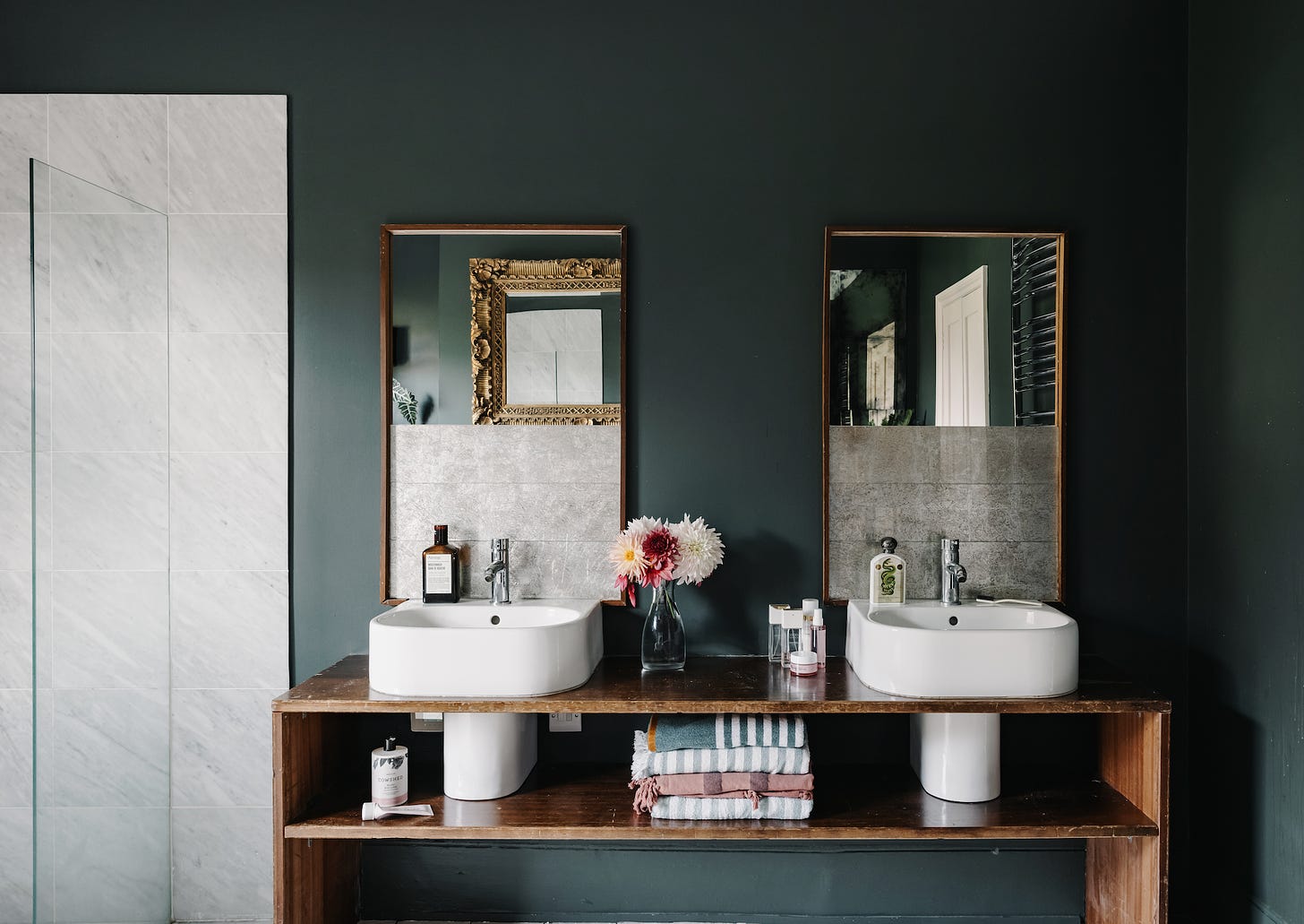
If it’s your bathroom then you probably want a paler colour so you can tell if you’ve taken your make-up off/removed the spinach from between your teeth. If there’s room for a bath then paint the outside of that in your chosen bold shade. Or add strong towels and a bathmat. A patterned tile floor with paler walls can be a good way to make a statement in a small dark bathroom and don’t forget the joys of coloured sanitaryware. Burlington do mint, pink and two shades of blue while v+a baths offered a gazillion different shades of matt and gloss for the outside of your bath. Broken Bogs has a huge range of vintage and custom made colours basins, loos and baths while Kast do beautiful concrete basins in dozens of beautiful colours.
9 HOW TO FIND THE RIGHT SHADE OF WHITE PAINT
I’m afraid there’s no substitute for a tester pot but most neutrals have a base of either grey, red, green or yellow. Knowing which is which will help you narrow down the choices. In a cool north-facing room a grey or green undertone is going to make the room feel colder, In a room in the countryside surrounded by trees any neutral will already have a green cast to it from outside so beware of adding a green based white on top of that. A warm white with a red or yellow undertone is often the easiest.
Farrow & Ball do a brilliant advisory page here to get you started.
Finally use the names - they are there for a reason: ice, snow, diamond and coconut are clearly going to be cooler than ecru, milk, pannacotta and linen.
10 HOW TO MIX COLOUR AND PATTERN
Whole books have been written on this so I’m going to give you a short version that works as a jumping off point. You can build on this basic formula as you feel more confident or want to push it futher.
Pick a colour palette - use a wallpaper or favourite dress as inspiration - say three five or seven colours.
Select two or three plains
Pick a couple of stripes - one is fine but you can have a wide, a thin and a wavy if you fancy.
Add a big floral pattern
And a small floral pattern.
Layer them up until you feel happy. Lots of florals need a slice of stripe to cut through them do don’t forget that element.
Keep the colour palette tight so there is a relationship between each design.
You can add more florals but you will need to play around to see what works for you.
If in doubt keep it simple to start and build.
Thank you so much to all my paid subscribers. Your support is what allows me to continue writing here. Please like, restack and share as it really helps with visibility.


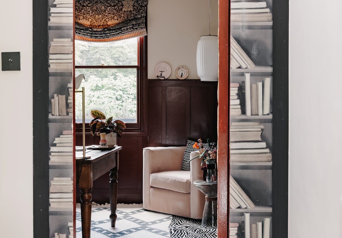
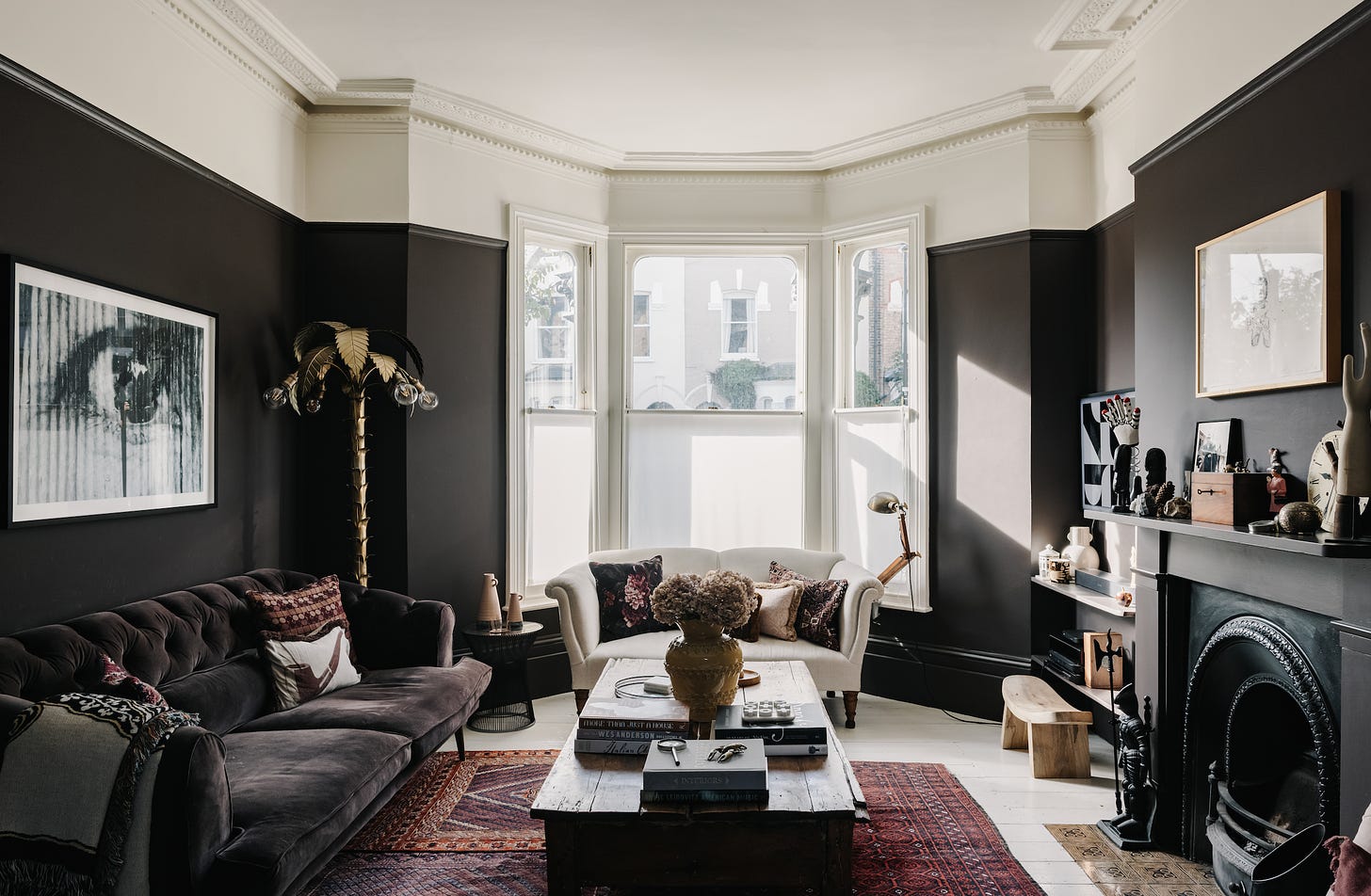
Some of the latest designer collabortions with High Strret stores can be found here
https://www.theguardian.com/lifeandstyle/2024/sep/18/come-together-14-of-the-best-homeware-collabs-for-autumn
Including Kate's selection of paints!
I would love a piece on the last point about patterns, with lots of pictures of the good, the bad and the just plain wrong, deconstructed by you. I always work better in pictures with these ideas. I’ll see an example and suddenly, there’s a cognitive “click” between the theory and the practice. I’d also love a “I started in the wrong place (paint) - again- and I have no idea how to tackle choosing curtain fabric…”. So many choices and I freeze with overwhelm! Oh yes, that was item one on your list…