

The Househunter
The Househunter
A fully restored and extended end of terrace Victorian house in east London.

This room will already be familiar to many of you who stalk the corridors of Instagram, as it was used extensively to illustrate the Unexpected Red Theory (click the link for my thoughts on that) but I wanted to explore the rest of the house, which is for sale via Inigo for £2.5m. Ignore the price (unless you’re looking for a fully restored, extra wide, end of terrace with a two-floor extensio,n including a full-footprint basement in east London). We’re just here for the inspiration.

These doors caught my eye as soon as I saw them, not for the colour but because when we moved into this house I spent several weeks trying to find a way to create a similar set of doors, at an affordable price, to sit between the two halves of our sitting room. With the lowest price at around £5,000 excluding hinges and fitting, I conceded defeat.
But, as a fan of rooms rather than open-plan living, this is a great way to be able to organise large spaces. And having a double set that takes the eye right through the house to the room at the end is a clever visual device. They have to be painted in a statement colour, though. Traditional white will look a little old fashioned and won’t do anything for your views. Paint them strong and use them as a decorative feature.
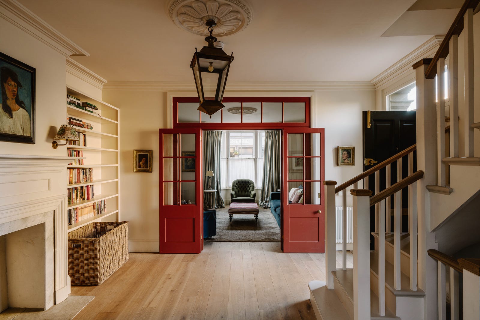
Here’s the view from the hall – and it means that essentially this central space is book-ended by two sets of folding red doors, which instantly makes a statement when you come in.
Before we walk forward into that sitting from for a look around can I remind that I have just launched a second, shorter Interior Design Retreat for the weekend of October 11-13. Places are filling up fast but if you would like to know more the details are at the button below or you can just comment below or email me.
Now, back to this house. I wrote about the calming effect of symmetry before, and you can see here a pair of small tables with matching lamps either side of the bay window. The paintings, while not part of a pair, perform the same trick. And while we’re on that, note how low they are hung. They can be seen from a sitting position and can be examined if you are standing in front and are minded to look closely. One of the most common mistakes is hanging pictures too high. As a rough guide, the middle of a picture should be about 57 inches or 4ft 9ins (144cm) from the floor. This is so an average height person can see it well. You can, obviously, tweak this to suit your personal height requirements. (Paid subscribers can read this guide to curating and collecting art that I wrote back in November, which is now part of my archived posts.)
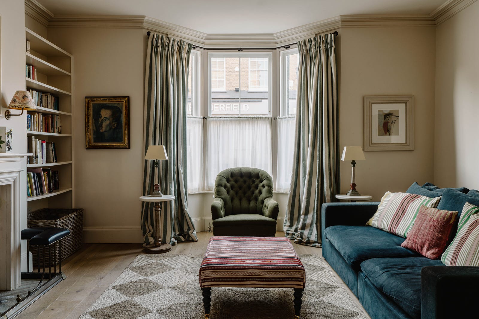
The stripes on the ottoman (above) echo the red doors and, of course, the stripes on the curtains. Curtains for bay windows can be very expensive, as are poles to hang them on – but try Jim Lawrence who, I think, are well priced and super helpful if you need to chat to them on the phone.
One trick, if you are buying ready-made, is to use two sets, i.e. two curtains on each side. This will immediately make them look fuller and more luxurious. If you have a sewing machine you can join them together, but it’s fine if you don’t. La Redoute make extra long curtains (350cm drop) if you need them – and you could even sew on pom-poms and trims by hand to make them look even more bespoke.
That’s probably a whole post in its own right, but moving on…
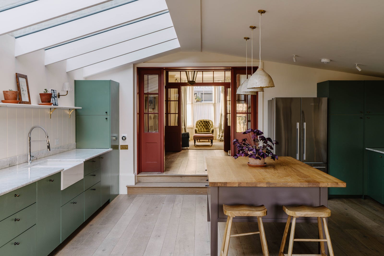
Let’s go to the kitchen, and you can see how those red doors are an integral part of the downstairs scheme. So from that point of view worth the investment. Note also how the armchair is framed in the light and within the structure of the door. It’s really important to consider the views between rooms when renovating. I once stayed in a hotel where the door to the en suite was next to the bed and the loo was positioned right in front of it. It was an old building and perhaps plumbing was tricky, but if you can position a basin or a good picture or, basically anything slightly more attractive than a loo then you should.
Now, a word about trends. The general advice is you should ignore them unless they make sense to you or you can afford to indulge in a moment’s pleasure and not worry when you tire of it. However, sometimes trends come along that just make sense. Often it’s a classic that’s just having its moment in the sun - brass taps was one such item, this leggy kitchen island is another.
There is a school of thought that kitchen islands are over for the truly fashionable. That’s the sort of nonsense statement that goes with a list of trends. However, what I think is the point is that kitchen islands can be bulky and dominate the space. This one, a chunky version of a butler’s table – which is itself currently having a bit of a fashion moment – is more like a piece of furniture. And because you can see the floor underneath and the air flowing through, it keeps the space feeling more open and less cluttered.
Admittedly you’ll need to be able to house your oven or additional storage elsewhere in the room, but the extension at the end turns this type of island into a breakfast bar as well, and it does provide a large area of useful prep space.

We, ok I, speak a lot about the red thread of colour but it also works for materials and textures and here you can see that both ends of this house are have stripy curtains. The striped table lamp on the worktop is a really good way to make this room feel more like a space in which you prepare food rather than simply a functional kitchen and it brings the stripes forward into the room and turns it from a set of curtains into a “scheme”.
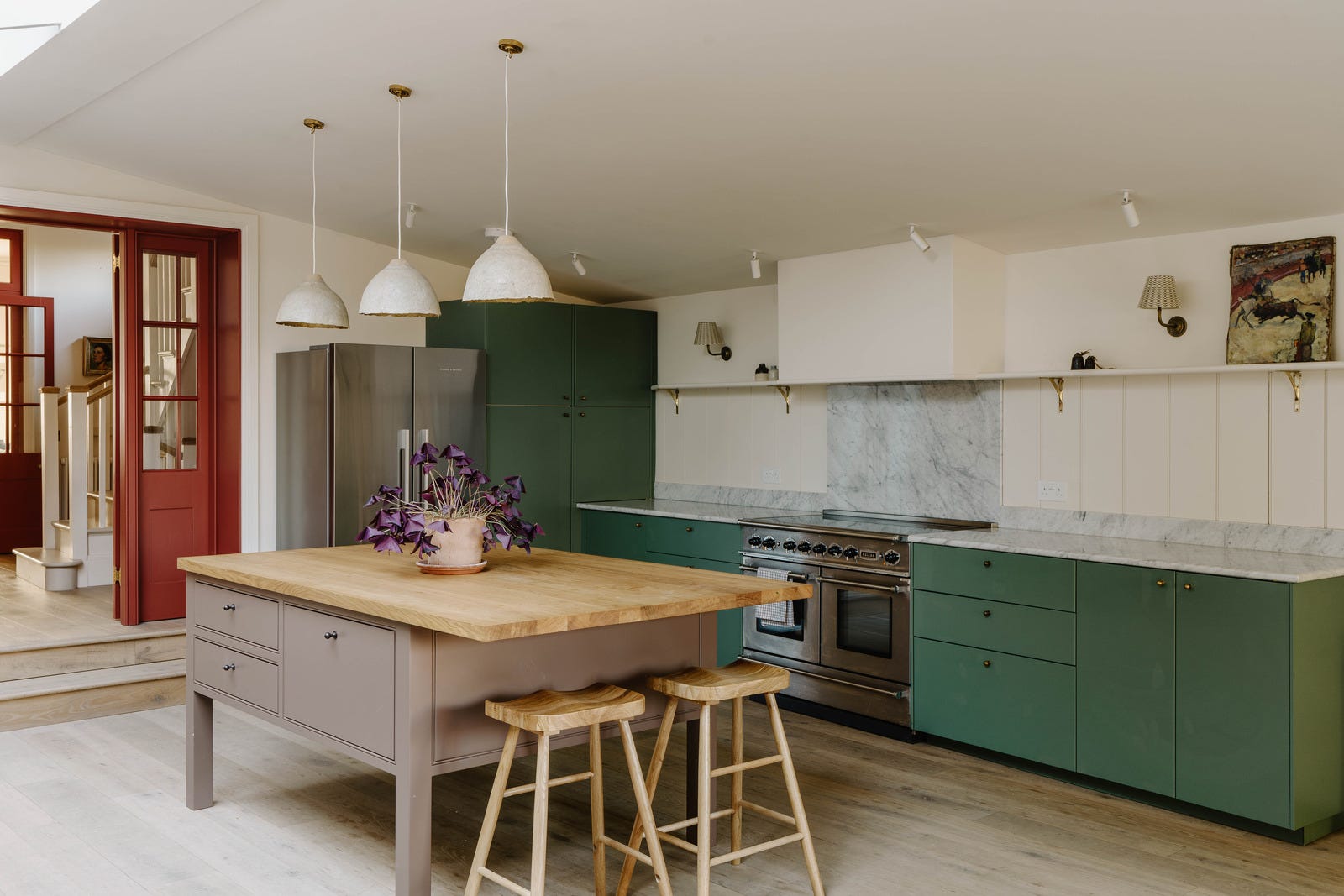
The kitchen has been built into the side return and it’s likely the dining area is also an extension, but instead of covering it with a glass roof – which can be a bit “conservatory” and not cosy in winter, the architects have mirrored the shape of the the rest of the room by adding beams and thus making the extension feel less like a box that has been stuck onto the back of the house and more like an integral part of the building.
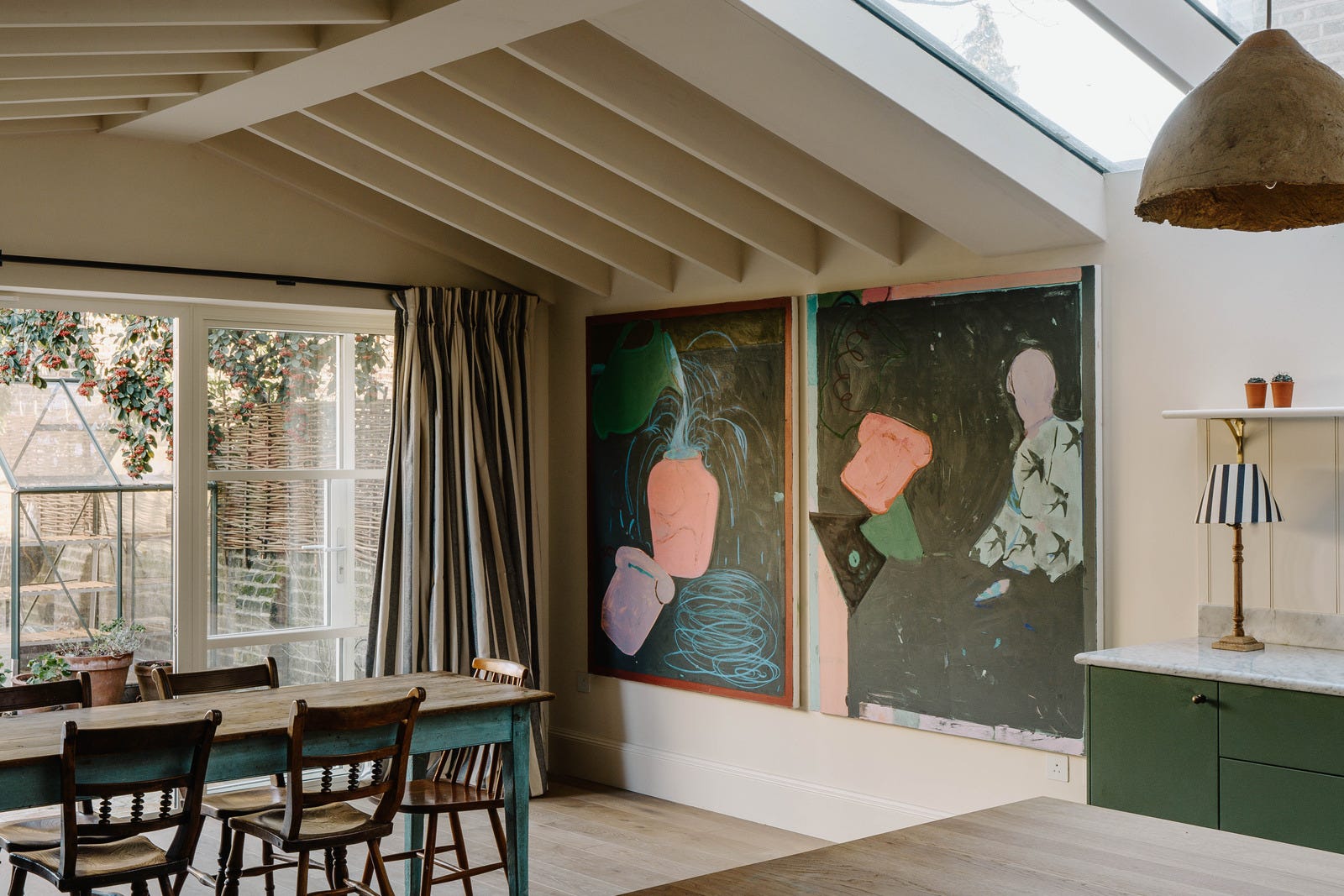
A closer look and you can see a subtle use of the red thread - the table legs just draw the eye to a similar colour in the artwork. It’s a small thing and you don’t want to make things too matchy-matchy, but every now and then it’s a nice touch that looks like you thought about what you were doing. For example; a set of blue chairs or a tablecloth would be too much. The legs of a table mean you could casually say: “What? Really? I hadn’t even noticed. I just picked it up from the salvage yard like that,” is a nice touch. Even if nobody actually believes you and knows you spent three days and a hundred quid holding tester pots up to the painting to find the right colour. Or did you - ‘fess up now - buy the table and choose the artwork to match?

Just taking a small breather in this room before we go upstairs. What are your opinions on these shelves? Do they need ornaments between the books to fill the spaces and create a more “styled” look, or is it an invitation to buy more books and fill them with stories?
Below is another reminder to consider the views between the rooms. Here, the curtains match the chair in the foreground. This is the en suite and it’s a nice way to link the two spaces. I grant you most of us don’t have room for an armchair in the bathroom, but we can dream.

My guess is that this bathroom was created from a bedroom. Here in the UK bathrooms tend to be tiny and we are relatively new to the en suite. The biggest bathrooms tend to be created from bedrooms and, while estate agents will tell you not to lose a bedroom to a bathroom, you do also have to think about how you want to live and how long you plan to stay in a property. Once you’re over three bedrooms I think it’s OK to lose one to a bathroom/dressing room.
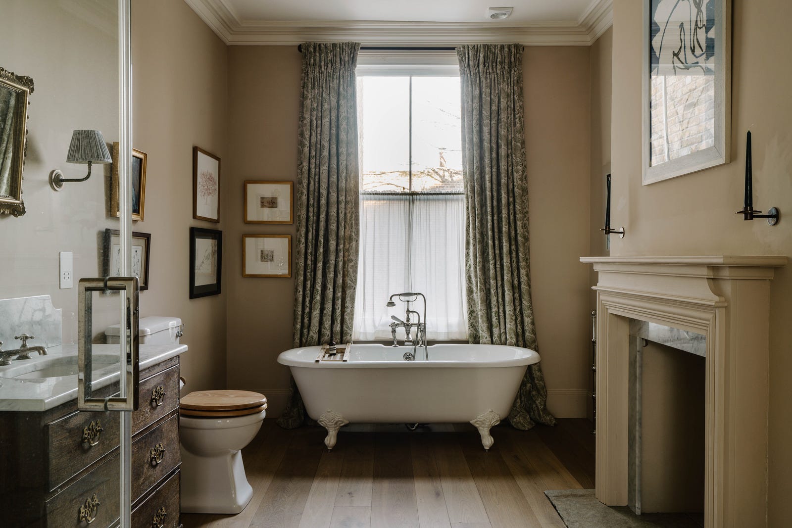
And because this house gives good bathroom, here’s another. The overriding feature here is that, like the kitchen, both of these spaces have been decorated like any other room in the house. The function doesn’t come second – but they are rooms in which you wash rather than bathrooms filled with functional units and lots of tiles.
To explain further, if that bath above was a sofa, the basin a console table and the loo a small chair, that room would still work. It’s the pictures on the wall and the wall lamps that turn it from purely functional space to cosy room. Now that might not be your style, but if it is don’t panic that because it’s a bathroom it must all be clean lines and modern storage. It’s another room; albeit one with a specific function. Now decorate it how you want it to look, in a way that links to the rest of your home.
It sounds obvious but sometimes we get so tangled up in function we forget the form.

The other day someone asked me if there was a rule about painting the inside of the front door and I said only that it should be a colour she loved. She replied that she was so busy worrying about style and rules that she had forgotten that simple point. So I merely point it out for anyone who is deep in renovations and perhaps can’t see the wood for the trees. I have tried to think of a better analogy and failed, so we’ll go with the cliché on this occasion.
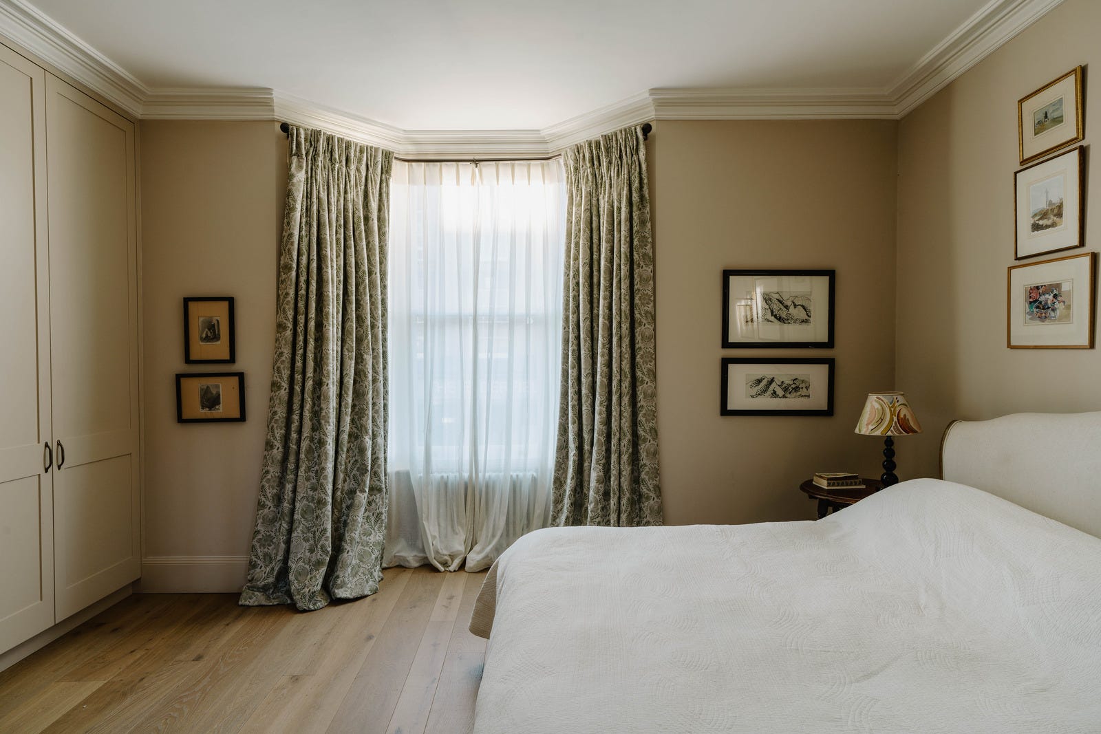
And with that, it’s time for a lie down. Before I go, note the low-hanging pictures. And how, if you are going to photograph a bed, you should add some colour and cushions.
It needs an injection of bad taste. It’s a lovely house but it’s very subdued.
I like most of this house yet it leaves me cold, and I’m not sure why. I like soft, muted colours, I love the doors and that fantastic front-to-back sightline.. .what’s wrong with me?? Having said that, the curtain fabric in the bathroom with the clawfoot bath is lovely. If anyone recognises it, I’d be delighted to know what it is. Not sure about the Pooky lampshade, but I have seen similar. If I find it, I’ll post again.