Design Postcards: decoding Chequers
A peek inside the UK Prime Minister's official country residence – which is, frankly, a decorative disaster.
Let’s step into Chequers, where Prime Minister Keir Starmer welcomed German Chancellor Olaf Scholz for talks the other day. I am indebted to Sophia Money-Coutts (her Substack is a joy, do subscribe) for finding this photograph, which she headlined:
“Extremely shocking picture of the week”.
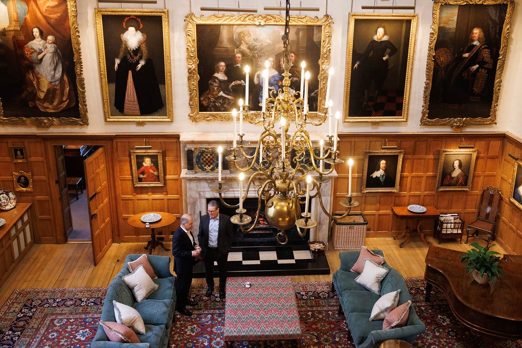
Sophia wrote: “This is the Prime Minister’s big posh country house in Buckinghamshire where he (or she) entertains world leaders and conducts important business. This is the grace and favour 10-bedroom house from where Churchill broadcast during the war, and which has been visited by American presidents including Nixon, both Bushes and Clinton. ‘I do not think anyone has stayed long at Chequers without falling in love with it,’ said Margaret Thatcher.”
Warming to her theme, she continues: “And yet how on EARTH could you possibly conduct important business when you’re in a room where that ottoman has been paired with that carpet? Why have they got sixth form common room sofas and those very nasty, insipid cushions? If I was staying at Chequers to talk about something serious like war or trade tariffs, I would walk into that room, take one look at it and say ‘I’m so sorry, Prime Minister, but I simply cannot be expected to negotiate with a country that has such abysmal taste in soft furnishings.’”
I completely understand what she means. In our subsequent conversation she said she had stared at it for 10 minutes like it was a Magic Eye painting (you know, the ones where you gaze at a mash of colour and pattern and eventually it resolves itself into a 3D picture?) to see if it would make sense. I said I thought perhaps disastrous décor was the idea – 10 minutes in there, and you’d agree to anything just to get out again.
But there is a more serious point to be made (and it’s not about gold wallpaper at 840 quid a roll, or having a grace-and-favour budget), it’s about how to decorate when your house is full of original features, like panelling and huge chandeliers, that dominate. We’ll assume you don’t have to contend with giant artworks of dead rellies in gold frames, although it’s also fair to say that a black and white print saying “Live Love Laugh” in a Perspex frame isn’t going to cut it either.
If you live in a cottage with lots of beams and low ceilings, or a timber-frame house, or even, perhaps, a grand country house or listed building, what can you do to bring your own self to a space which already has a somewhat domineering personality? Read on to find out…
This is a one-room example of my monthly Design Decoded posts for paid subscribers. We take a virtual walk around a house that’s on the market and look at each room to see what the owners have done and why it works. The reason we do it with a sale property is that other than a general tidying (usually) the house has to appear how it really is. So you can see real spaces rather than rooms that have been professionally styled (and Photoshopped). If you would like to learn from these posts and get inspiration for your own places and spaces, you can sign up at the link below. Now back to Chequers….
Firstly, do not be intimidated by your architecture (or your architect come to that – but that’s another post). Most period properties provide a great backdrop for modern furniture – by which I do not mean newly made for the high street, but anything from the early 20th Century up to and including the 1960s. After that, the term contemporary tends to be used.
The clean lines and pared-back shapes of mid-century modernism and the Danish aesthetic of that period can provide a perfect foil for ornate plasterwork and panelling. Tall legs and wooden arms allow light to pass through and can make low-ceilinged cottages full of dark beams feel a little lighter.
But you also need to introduce different materials so that there isn’t one thing dominating. at Chequers, the panelling is shading towards orange, as is the floor – and neither, I suspect, can be changed. So the first thing you would need to do is knock that back. In an ideal world the woodwork would be dark, which would look so much better with everything. But it’s not. It’s orange and we must work with that.
In your own home you are able to change things. So if you have dark beams on the ceiling, paint them white to increase the height and make them disappear. If your Victorian pine floorboards have turned orange under the varnish, sand and stain, or paint, or even lime-wash them.
Here we have a giant Persian rug, which is great as they work brilliantly with all periods and styles and they also hide all manner of sins and spills, while the fact that they contain so many different colours gives you plenty of directions to go in.
But aside from that, things start to go downhill.
A grand room such as this needs some symmetry, which tends to feel calming and relaxing, and also more grown-up (works in small rooms as well). Adding a pair of tables on either side of a fireplace as here is good – but they do need to be in a different type of wood so they don’t start a fight with the panelled wall. Also the key word here is “pair”. In a smaller, more informal, room you can have two tables that don’t match – an eclectic and relaxed look. That’s not what we need here. There’s also a lorra, lorra wood already. So how about two half-moon marble tables, on iron legs, which would talk to the fireplace? They could be black, if you wanted to contrast with the fireplace itself and also link to all that black in the artworks above. That, in turn, would work to bring the eye – and possibly the eyebrow – down to the living space. They must have lamps on them. At the time of writing there are a pair of black lacquer tables here on 1stDibs. (If you want similar, try the words “demi-lune” which is of course just a translation of half-moon but you will throw up extra results if you use both terms.)
There should be a club fender around the fireplace. The Times ran a piece recently reporting that they are back in fashion, and they are brilliant for grand rooms. I used one in the design scheme for a Listed apartment I worked on a few years ago (see below). They are also upholstered – we did ours in a jolly ticking stripe, which would tone and contrast well with the rug. A more traditional approach would be an oxblood leather.
I can’t even with the log basket – which looks like a laundry hamper that has been hurriedly brought down from the bedroom – or the magazine rack. In your house, if you want a magazine rack, then at least put a chair that looks inviting and comfy next to it. What’s the point of creating a reading spot if you’re inviting someone to sit on a hard, straight-backed armless chair, with no visible means of illumination either?
OK, we’ve danced round the edges (literally) and we must now face up to the ottoman in the room. Frankly an elephant would look better. At least the colour wouldn’t argue with the carpet. And it could reach for the peanuts with its trunk and hand them round to passing dignitaries, which might break the ice quite well.
Look, I’m all for mixing pattern and colour. I’ve written about it a lot. And the reason for that is that it’s not quite as easy as it looks. Clearly the colours here are all very similar, but that pattern does not like the rug. Both rug and ottoman are quite detailed, with designs made up of small elements. Together with the sofas, it’s bringing a lot of blue into the room which, despite what the colour wheel may tell you about blue and orange, is not working.
Now, listen carefully, because here comes the science bit:
If you have an intricate pattern in one place, you need something simple and more graphic or generally bolder in the other.
When mixing colours and patterns, they need to be quite distinct from each other – or you get the aforementioned Magic Eye sludge effect. Generally speaking, a stripe or geometric will cut through an intricate floral very well, but the stripe needs to be a simple. This one is made up of small zigs creating bigger zags and the colours are blending into the carpet, and it’s all slid into one and lost definition. It’s the equivalent of that new pack of plasticine with all the distinct lines and colours that quickly end up as a ball of brown mud. The blue sofas, which are supposed to work with the ottoman, look insipid and lost on the rug. Also, that damask pattern is very dated, and while I appreciate that now is not the moment to spaff the public purse on décor (we’ve been there and done that) if reupholstering a couple of sofas is beyond our national means, we’re in even more trouble than Rachel Reeves is letting on.
So here’s what we’re going to do. We’re going to recover the ottoman in a simple three-way stripe. We’re going to recover the sofas – probably navy – a classic velvet would be good (you might want corduroy for a more relaxed feel in your own house) and add better cushions – not shiny (never shiny) – but cotton and velvet and possibly a moire silk with its delicate watermark pattern.
Here is a perfect example of striped ottoman vs Persian rug. They aren’t necessarily best friends, but they are polite and cordial towards each other, which is what you need in a state room.
![](https://substackcdn.com/image/fetch/w_1456,c_limit,f_auto,q_auto:good,fl_progressive:steep/https%3A%2F%2Fsubstack-post-media.s3.amazonaws.com%2Fpublic%2Fimages%2F1e68a230-b8fb-4ae5-ba4f-92393e7bffdc_1315x1575.jpeg)
We’re going to add photos in silver frames to the piano top. It’s a cliché but a) it will bounce the light around and bring the overhead chandelier to the party and b) it will give nervous guests something to look at while they wait to strategise world peace or the price of eggs. While we’re on the subject, a few books on the ottoman will make it look friendly and inviting and human – and since it’s a country retreat it really should feel a bit like it could be a home when the distinguished guests have gone.
And that’s it. That’s how a few tweaks to a room can make a huge difference. And in fact I’ve written on that topic previously (below). It’s a piece from the archive, so it’s for paid subs only – but you can of course sign up here for £7.
For more detailed posts like this do sign up via the link. I hope you have found it useful/entertaining. I’ll be back on Wednesday with a full-house version of Design Decoded.
This was one of the best things you’ve written. Great analysis, loads of transferable tips, really witty. ❤️
Wouldn’t it be great if they read your comments and took it on board?! And we all saw a photo in 6 month’s time. But then, of course, there’d be an uproar over spending money etc etc..