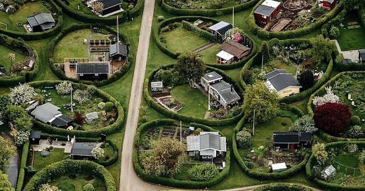
Design Postcards: the round gardens of Copenhagen.
How architecture and design can make us better neighbours.
I came across this on Instagram the other day and have been thinking about it ever since. It’s funny how we all complain about that place (me more than most!), but then it does show you things it thinks you might like, and do you know what? Sometimes it’s right.
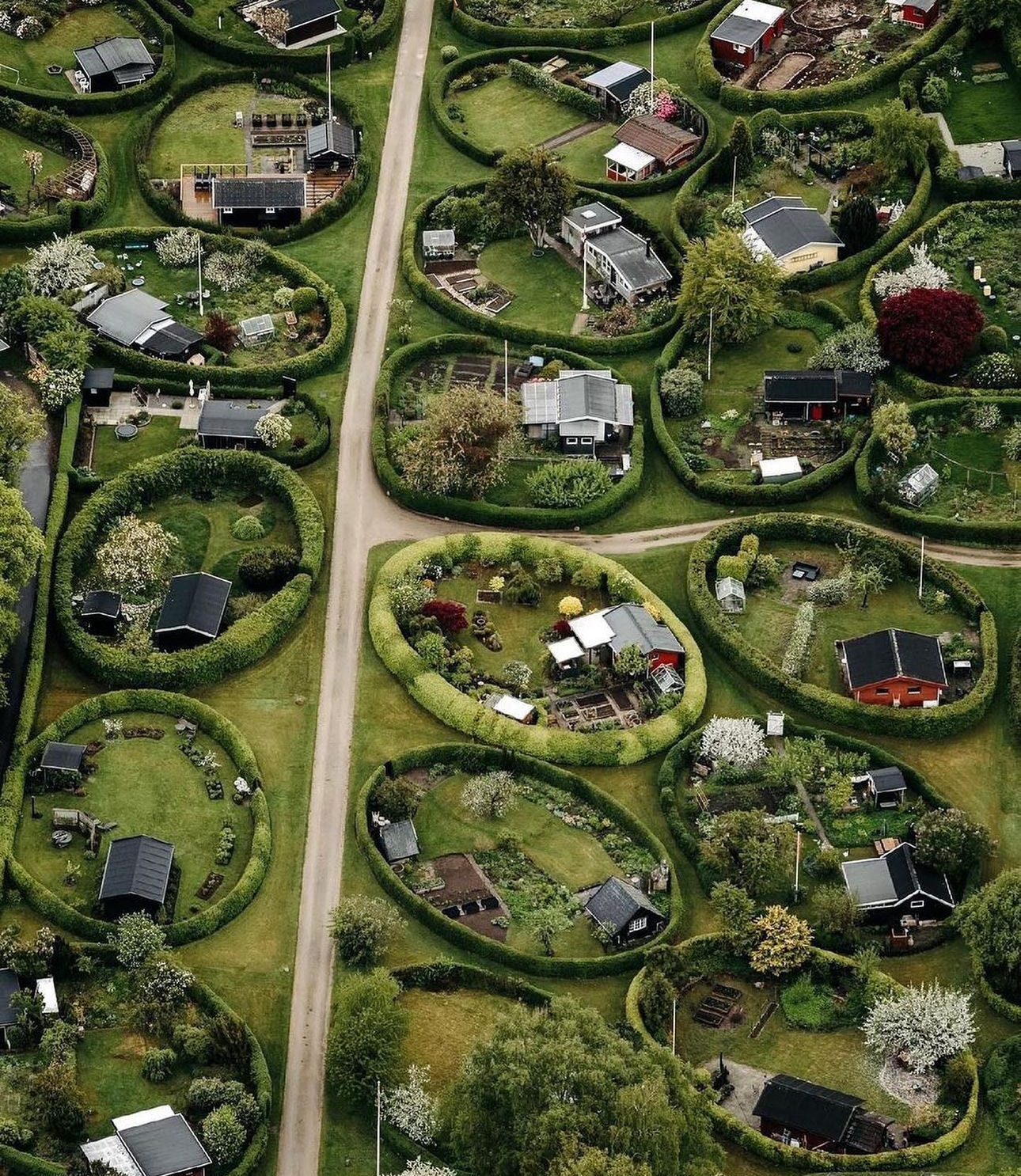
The round gardens were created to encourage a type of behaviour – more walking in the fresh air and talking to your neighbours. And while I write all the time about the importance of interior design to our mental health, I’m also fascinated how exterior architecture can also steer us to act in certain ways.
Of course, we had a go at that here in London, but it all went a bit Pete Tong which, for those who are not familiar with rhyming slang means to go wrong. (My son’s girlfriend was at a party once and unwittingly used the phrase to, er, Pete’s son, Nat. But I digress.)
Here in London, from the rubble of WWII emerged Brutalism – a style of architecture created from affordable concrete and characterised by its angular forms. The architects behind it thought they were building a new Utopia, with one of the key features of Brutalist housing estates their elevated walkways or “streets in the sky”. These were designed to connect apartment blocks to each other so neighbours could chat while their children played out of the way of the passing cars. In practice they often became squalid, dimly lit spaces where residents were afraid to set foot after dark.
In Denmark, meanwhile, the landscape architect Søren Carl Theodor Marius Sørensen took the idea of community in a different direction, creating a series of round gardens in 1948. Located on a flat site in Naerum, each of the 40 gardens measures around 25m by 15m and is surrounded by a hedge. Their owners were allowed to decide where on their plot they wanted to place a garden house and given design guidelines, rather than rules, so while they look similar from the air, they are actually all quite individual.
Access roads were deliberately placed around the edges of the gardens to encourage the community to chat to each other as they came and went, to spend more time walking in the fresh air and to get to know each other.
As you can imagine, the waiting list for these plots, which are rented below market rates, is long.
Some 20 years or so later, in 1964, Erik Mygind created the garden city of Brondby where houses are built on wedge-shaped plots within a large circle, with space at the centre for everyone to meet and chat. There are 24 circles – each with 12 homes, and a total of 284 garden plots. The houses can be bought only by people living within a 20km radius – they are designed as weekend cottages and can only be inhabited for part of the year. The gardens are all rented but again, the waiting lists are long.
Isn’t that just a brilliant example of how design can help us live better? As I say, I know this to be true for interiors and write about it all the time, but I hope reading about this example lifts your heart a little, as it did mine.
Talking of hearts, do please leave one and restack if you like this post as it helps massively with visibility on this increasingly crowded platform, where Home and Interior Design is yet to receive its own category.
Thought provoking for a Monday morning.
I’d love to hear from the people who live there , I wonder what the reality is .
Lovely gardens