

HOUSE NOTES #16
My regular round-up – including news of an upcoming event, a bit of shopping, design tips, and Room of the Month.

Welcome to House Notes, the most newslettery part of this online interiors magazine. In this monthly post, which is mostly free to read, I bring you news of events both in review and upcoming, keep you posted on new product launches and discoveries, and throw in a few design tips as well as my Room of the Month. I hope it’s both a jolly read with some useful information and, since it’s long, is designed for you to dip in and out of. So grab a cup of coffee or a glass of wine, depending at which end of the day you are reading, and let’s dive in. Also, unlike every other post on Substack at the moment I’m posting this between T and C (Thanksgiving and Christmas) and that is the only time I shall mention either of those words so if you’re looking for a bit of tinsel respite then welcome.
HOUSEKEEPING: My Month This Month
First up – sorry, this one’s for Londoners, or at least UK residents only (although someone did once schedule a trip from Canada to visit her daughter around a talk I was doing, so who I am to say who this is for?)
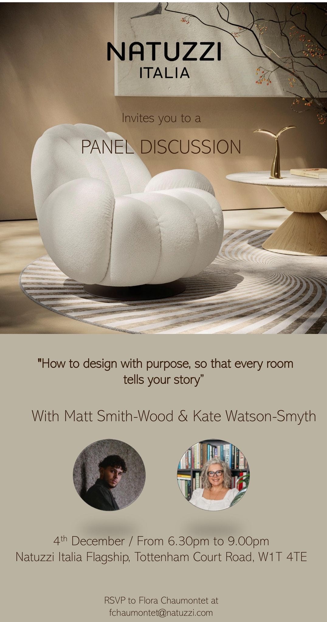
On Thursday 4 December, I will be in conversation with the designer, and BBC Interior Design Masters runner-up Matt Smith-Wood at the Natuzzi showroom in Tottenham Court Road. The evening starts at 6.30pm and Matt and I will be chatting about how to design a home with purpose and making sure that every room tells your story. Places are limited, so if you would like to come along please RSVP to Flora Chaumontet at fchaumontet@natuzzi.com.

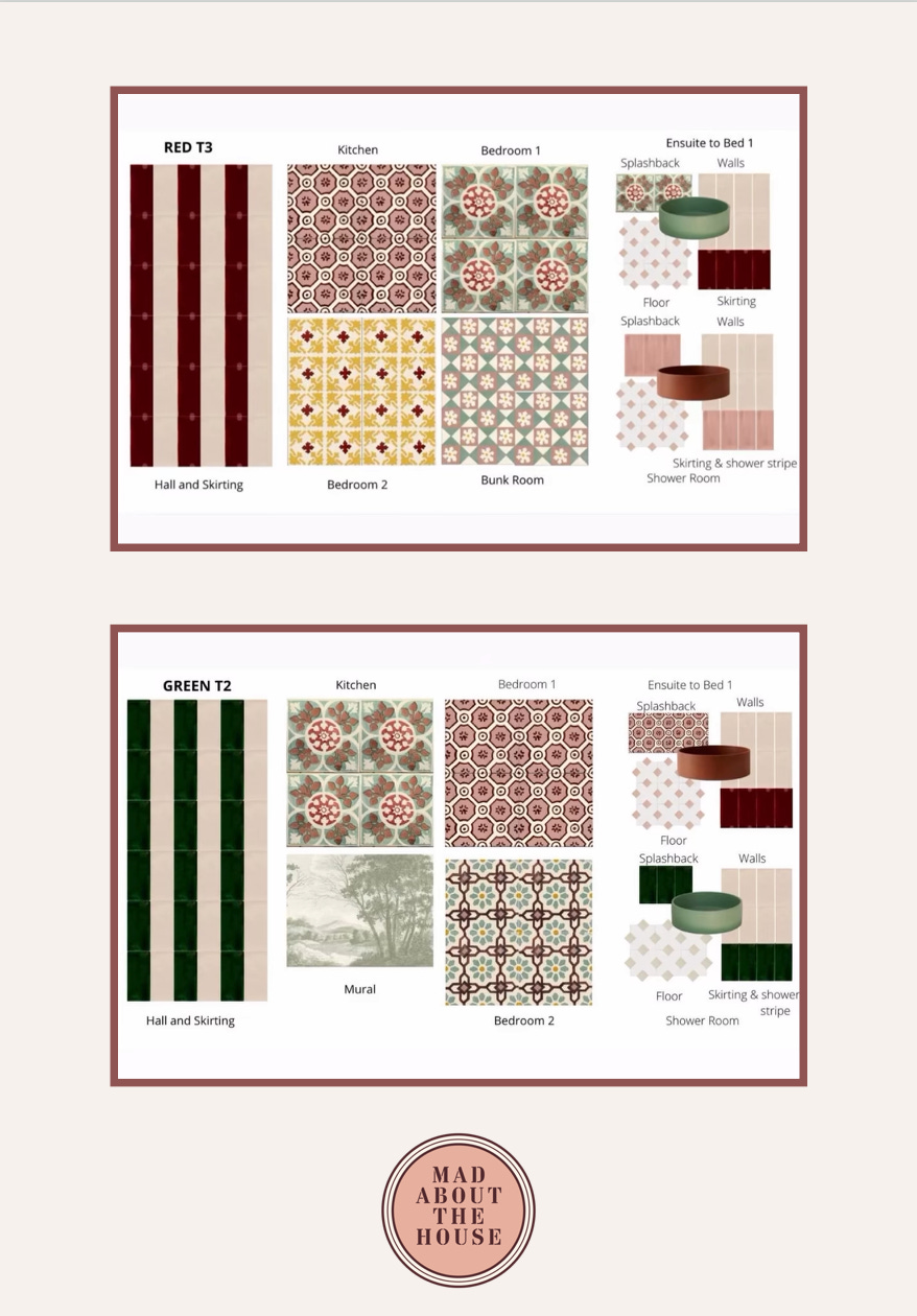
Progress at the hotel I’ve been working on in Mallorca continues apace, with some rooms ready for cleaning and artwork coming back from the framers. As that project draws to a close – it’s due to open in February – we have begun work on a pair of apartments in Lisbon. They are mirror images of each other so we have slightly mirrored the decor in each one. Here are the moodboards:
A couple of weeks ago I hosted a day-long workshop and masterclass at Henry’s Townhouse in London (the former home of Jane Austen’s brother) which was really great fun. Guests were given a tour of the boutique hotel by the co-owner and designer Jane Collins, who then took part in a Q&A with her husband Steven before we sat down to lunch in Mr Halivant’s pantry. Monsieur Halivant was Henry Austen’s chef, and their sister Cassandra wrote in one of her many letters to Jane, that he was the "finest chef in the area”.
In the afternoon I led a workshop on finding your style and designing with vintage before everyone had a glass of fizz and some of the guests headed off to Jane’s boutique for a spot of clothes shopping. We’re planning to run this event again next February, so if you fancy coming along do send an email to henrys@thecollinscollection.co.uk
If you enjoy the free version of Mad About The House, which gives you a monthly Design Postcard, this newsletter and my On The House video chat with Lisa Dawson, you might want to consider upgrading to a paid subscription. This gives your more detailed interior design know-how with weekly posts on trends, how to’s, expert advice and guest posts, as well as members-only access to my Drop-in Design Clinic: every month, I host a live video hour where you can bring your toughest design questions – Should I knock down this wall? Which sofa works for my space? How do I deal with this awkward corner? – and I will help you solve them in real time. This is the closest thing to hiring me as your personal design consultant, and it’s included in your subscription.
This month’s paid subscriber posts have included: colour capping – the latest paint technique for elevated interiors, decorating advice from interior designer Alice Gaskell, 10 questions to ask a builder/decorator before you hire them, and a beginner’s guide to laying tiles.
And don’t forget that paid subscribers also have access to my Interiors Black Book of the best places to shop for lighting, flooring, ceramics, furniture and more. I’ve just added a table of contents with quick links so that rather than scrolling you can jump straight to the section you want. I will be updating this regularly, too, so keep an eye on it.

Finally in this Housekeeping section, it’s time to remind you that the dates for my 2026 interior design retreats in Italy are now live. We will be hosting three long weekends next year – one in September and two in October. It’s a chance to dive into all things interiors, eat like an Italian - from Michelin-listed restaurants to my local trattoria – make new friends (you will be hanging out with lovely, like-minded people) and participate in workshops based around colour, styling and design, with a morning devoted to browsing around one of the country’s biggest and most famous vintage markets. All the details including dates and costs can be found at kwsdesignretreats.com and the prices will rise in January, so now’s the time to book, as places are already filling up. To make it easier to plan your budget, payment is spread over the next year º so what are you waiting for? Friends, food, drinks and decor. We’ve got it all.

DESIGN TIP: Tension
Tension is one of the key tricks to creating a successful interior design scheme, but we’re not talking atmosphere here. This is about bringing opposites into the mix so your room feels interesting and the eye wants to travel around it. Just as a sprinkle of black pepper brings out the taste of a strawberry (try it), adding some contrasts to your room will have the same effect; old and new, shiny and matt, curvy and straight, florals and stripes, antique wood and painted metal. You’re probably already doing it in some places.
DESIGN DISCOVERY: Schplendid
A new sofa breand launched this month and while I really can’t get beyond the name, the sofas do look lovely. The company is Schplendid – I know, what’s in a name/schname? But even so. I also asked them what they were thinking and the founder, who was behind the late lamented sofa.com (they made great sofas) said:
“It’s poetic, has a lovely resonance and ssccchhhhh to it, and is a marker for all things beautiful and comfortable. It’s exactly the sort of word that you express when you sink into a deep downy sofa. So much more Schplendid than Splendid.”
I can hardly articulate how much I don’t get any of that from the name. But moving on, here’s what you do get from the company. Twenty years after sofa.com, Rohan Blacker is keen to educate consumers about what’s really inside their sofa and offering a more eco-friendly solution.
His splendid (not doing it) sofas are made from 100% natural, plastic-free materials with eight-way coiled springs, goose down fillings and coconut husk to replace foam wherever possible. You can read more about that here.
Plus, you know, the sofas look great. And I’m in favour of there being only six shapes – sometimes the number of choices can be overwhelming.
ROOM OF THE MONTH: A small manifesto for 2026
I am consulting on a project in Massachusetts with a lovely client who came to my September Design Retreat in Italy. We are discussing her kitchen, which she has already designed in terms of layout, and we are looking at colours, lighting and flooring. In the course of researching her preferred colour palette of green and yellow and finding a way to bring it all together in a way that doesn’t feel too Lego (this has a lot to do with the shades of each particular colour) I was reminded of this kitchen below, designed by Karen Knox of Making Spaces, who is based in the north of England and who is ridiculously talented. I adore this kitchen and although at first sight I’m not sure I would choose the same green, I love the way she has put it together with the yellow and the almost pink walls. It’s a triumph. If you’re based in the area hire her.
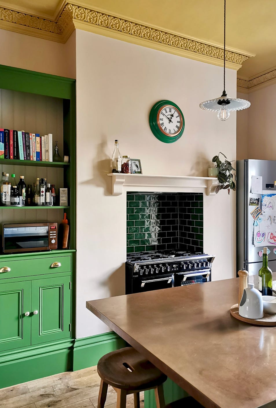
There are many reasons this kitchen can be used as inspiration for your own, and it goes beyond the bold choice of colour.
But the point about the colour is that this kitchen has been created to be part of the rest of the house. It is a room with a function, of course, but just because that function is clearly defined and requires specific furniture doesn’t mean you can’t bring your own personality to it. Let’s normalise not choosing safe neutral units and white walls in the name of practicality and aim instead to make our kitchens reflect who we are and the way we live.
Another great decorating tip that everyone should get behind in 2026 is the painting of the ceiling. Regular readers will know I bang this drum regularly, but it’s important. Let’s put an end to white ceilings and pick colours with personality, or ones that fit tonally. In short, rather than sticking a white lid on the top of your painstakingly chosen wall colour/paper, think about what other colours would complement the room better and really make the most of that huge empty space.
The ceiling is also a brilliant way to add a colour that you might find a little overwhelming if you had to stare at it all the time. If you look at the kitchen above and scroll so the ceiling is cut off you are looking at a classic pink and green room. It’s a strong green but you can flex that to your own taste – more olive, less bold, whatever works for you. The walls are a soft, pale plaster that brings warmth rather than overwhelming pinkness. The fireplace tiles are a darker green, the clock matches. Then there is that hit of strong mustard yellow on the ceiling that brings a wow moment, will definitely make it feel like the sun is shining all year round and – more important than both of those things – makes it feel like it’s a room that belongs to a real person and not just another kitchen.
The other great design detail is the aged copper worktop on the island. I have this in my own kitchen. It’s warmer than stainless steel, just as practical, and a little bit outside the conventional. Another thing to normalise for 2026: choosing what makes you happy and not what the builder, neighbour, or your nan thinks would be better.
A final word on the metals in this room. I know I, and many others, have said that you should try and stick to two metals in a room otherwise it can get too busy. That’s not a hard and fast rule, but if you want more you need to come up with a system.
So, in this room the appliances are stainless steel (often hard to avoid) but as long as all your appliances – small and large – follow that rule, you can move on. The handles are brass and so is the tap (I’ve seen other images) so that’s the small architectural details, to which I would include window handles and light fittings (if they’re not black). So that’s a second metal. The third is the worktop, and that’s classed as a piece of furniture so it’s entirely separate from the other two.
In my kitchen I have a copper worktop, bronze handles (so dark they are almost black), a black tap and brass door fittings. Just make sure there is one finish per job and it will all make sense. You can slide taps between appliances and details, and you could even avoid metal completely in the light fittings if you can find glass or ceramic ones, which might make the decision making easier.
So for 2026, in short, we are going to:
Think about what we want from a room and just do it.
Forget about the neighbours.
Mix metals if we want (according to a mildly strict, rules-based system).
Make sure our homes tell our stories, because ultimately that will improve our well-being and mental health and that is what a home is for.
NOW FOR A BIT OF SHOPPING…
I have, of course, left it too late for a comprehensive gift guide, but there are already 57 billion out there so you don’t need me to add to the mountain of lists you have already no doubt bookmarked and glanced at. I will be posting a guide on HOW to buy presents rather than WHAT to buy, on the basis that if you understand how to focus in on what people like, the whole business of what becomes easier and then all you need to think about is your budget.
However, I did find this:
I bought this scarf in a museum shop the other day (Tate Modern, since you ask) and it’s made of recycled plastic bottles and it’s supersoft and it cost £38. My husband was in Cos the other day and saw this other scarf (mohair) for £85. If you go to the Arctic Fox website you can zoom in on the softness. Plus bonus points for smugness on the fact that it’s not high street and it is recycled.

Right, I’m aware this is a long post - but hey, it’s packed with stuff. It’s all free, too, but if you want weekly interior design tips, know-how, interviews and advice you can sign up here. I have so much great content planned for next year including – and here’s a heads up – January Transformations. The whole month will be dedicated to transforming your home, room by room. We’re not talking builders and expensive renovations, but rather small changes that will have a big impact. And, if you sign up now, you will get all my December content as well, including: Design Decoded on that cottage from The Holiday, my failsafe method for buying Christmas presents (not just a list of suggestions), and how to spot when a trend has become a cliché and what to do instead. Plus lots more.
And if you want to give someone the gift of interiors knowledge then you can do that here:

Brilliant. I love reading your posts Kate, informative and witty, I grin all the way through!
Great and very interesting post