The third annual Wow!house is a showcase for the imagination to run wild.
Interior designers have been given free rein to decorate one of the 19 rooms – and the results are dramatic, wild and always inspiring. Come in for a tour...
If you’ve ever wondered what an interior designer would do if they didn’t have to keep clients happy and stick to budgets, then you need to take a trip to Chelsea Harbour. The third annual Wow!house is a set of 19 spaces, each created by a different designer whose only brief is to use materials provided by the sponsor. The full-size rooms - all with ceilings (unusual for sets) – are spread over 500 sq m and are not only a real-life showcase of their work, but a huge source of inspiration.
Most of us won’t get to go inside the actual homes these designers create – past exhibitors have included Nicky Haslam and Tim Gosling, while this year it’s Ken Fulk, Veere Grenny and Alidad – so a trip to Wow!house is a great way to have a look at what they do and see their processes and ideas in action.
I have written about this unique event each year – and every time there are comments saying it’s too over the top, too overwhelming, and not real. Well it’s not meant to be real. Each room is not meant to lead to the next and, of course, it’s a lot; everyone is trying to cram lots of ideas into one space. But if you put all that aside, there will be at least one thing in each part (sometimes more) that you can take away and adapt for your own places and spaces. Viewed in that light, it’s a wonderful trip to make – both literally and metaphorically.
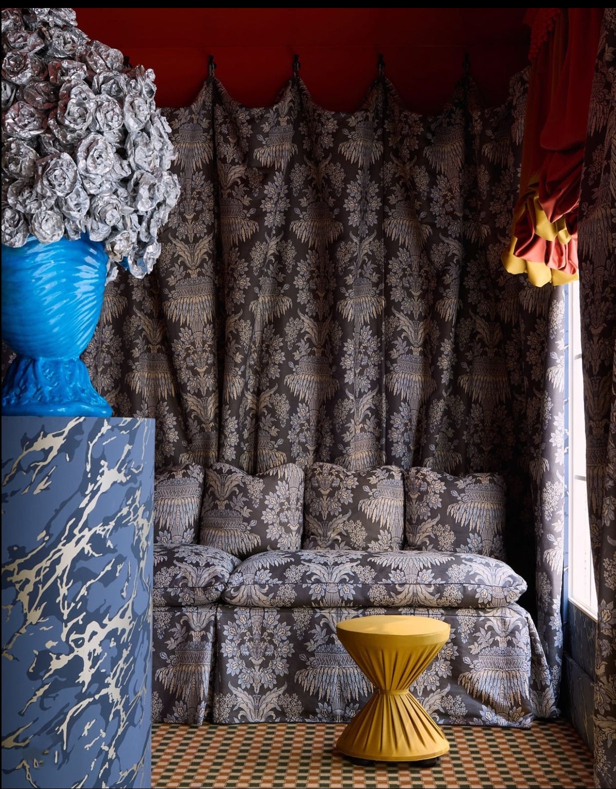
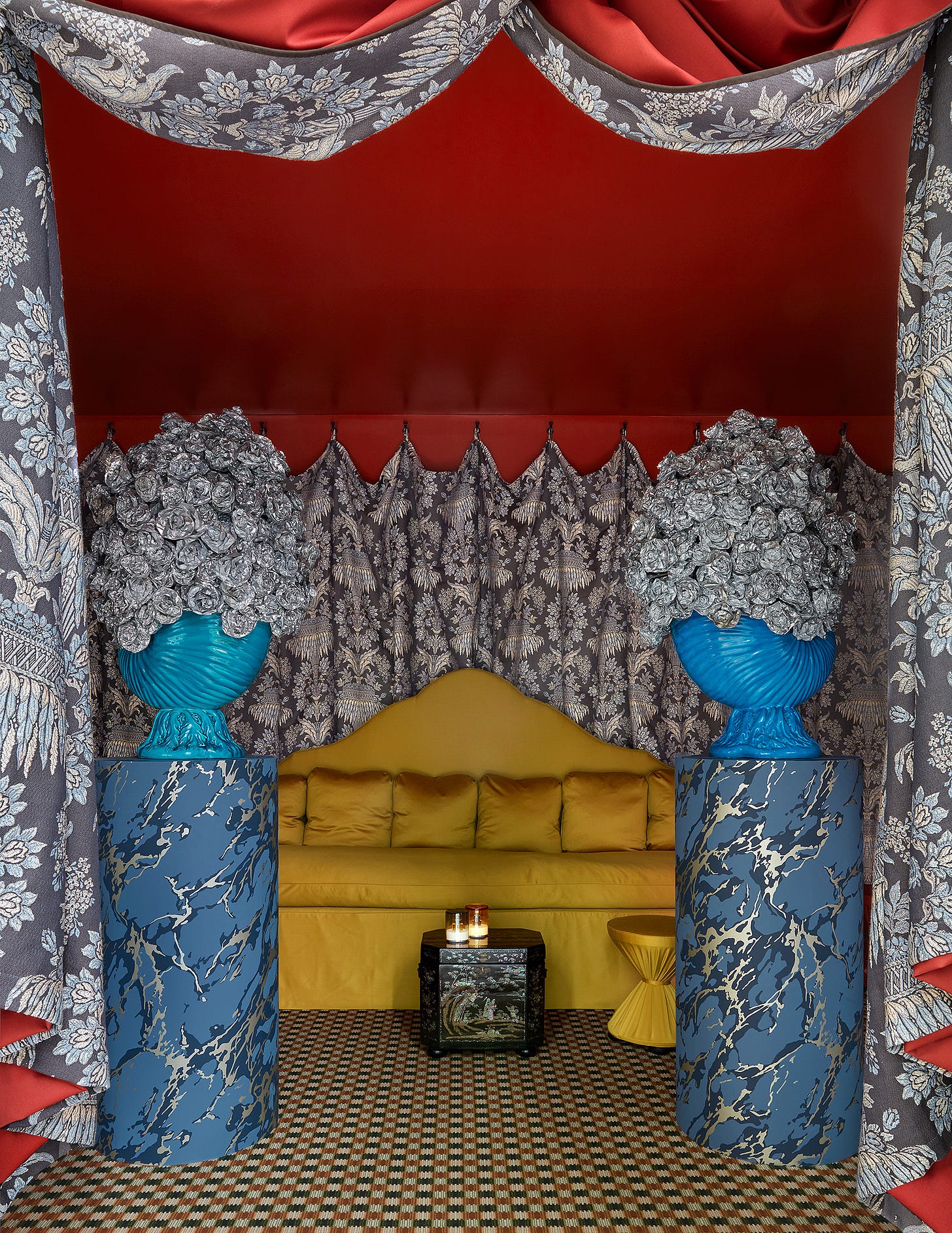
I’m going to start with the entrance hall by Benedict Foley with Zoffany. It was inspired by a scene in Visconti’s 1963 film The Leopard where the walls are covered in damask dresses. Foley took that and ran with it. But it’s also based on the medieval technique of draping walls in fabric for warmth.
Recent shows - Milan and Paris - have seen a lot of fabric-covered walls and, indeed, there’s no shortage of them here. But it’s an expensive technique that’s out of reach for most of us. Instead, you can create panels of fabric, hang them on hooks and take them down to reveal the wall behind when you fancy. This is a great idea for a headboard in a bedroom - remove the vases below and imagine the yellow sofa as a bed and you get the idea. It is definitely an idea I’ll be using. I have patterned wallpaper in the house in Italy and I need a headboard, so I think a plain drape like this would work brilliantly.
Next up is the Legend Room by Alidad and Watts 1874, which is described as the journey from a Sicilian palazzo to an English Gothic castle, by generations of the same family. Alidad raised the ceiling, which took five days to paint, before filling this room with layers of colour and texture and detail. It’s a room to visit and get lost in and even if we can’t hope to recreate it, it’s a masterclass in mixing pattern and colour.
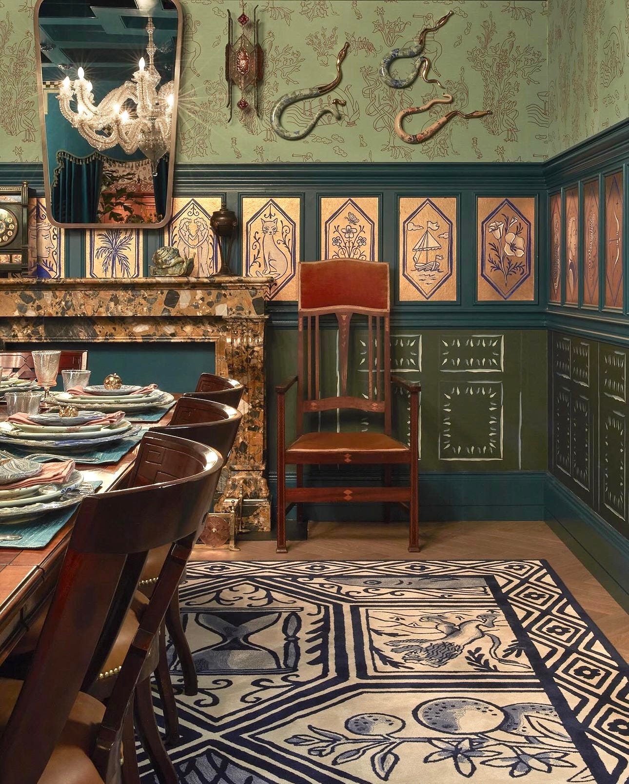
Staying with the dreams of the nobility, Ken Fulk, whose clients include Pharrell Williams and Dolce & Gabbana, designed a dining room for a Countess and her entourage of artists – so probably not that far off of normal day’s work, then. Another painted ceiling included pictures of his dog, along with painted wall tiles and a rug that took inspiration from Delft, and the tradition of weaving stories into carpets that has been going on for thousands of years.
“I’d always imagined my life as a movie, but it turns out rugs are an excellent storytelling vehicle, too,” he said.
Passing through the drawing room with (another) ornate painted ceiling, we come to the primary bedroom by Jamb London. Here the walls were lined with pink silk, the four-poster bed fringed with green tassels. Designers Charlotte Freemantle and Will Fisher were inspired by the extravagant drapery of Renaissance and Baroque paintings by Velazquez and Rembrandt. You probably don’t have a bedroom like this – but you can have a colour palette like this. Start with a patterned rug and build up from there in shades of soft pink, warm green and dark green. Add a raspberry lampshade for emphasis and if you have ruffles and drapes then keep the lines of the furniture simple and straight.
This is one of two free posts a month. Upgrading to paid gives you three more posts full of inspiration, how to’s as well as access to my secret address book, the archive of over 12 years of interiors writing and a ticket to my monthly drop-in design clinic where you can ask me anything.
Moving into the bathroom by Michaelis Boyd for House of Rohl. It was so crowded with people on the day I visited that I saw only the round bath – but it’s this basin arrangement (below) that caught my eye in the photographs. Of course we haven’t got room for a sofa in front of the basins but look at the lighting, the pair of mirrors, the simple check floor and curtain to hide the storage. These are ideas we see on Instagram every day, in every type of home, recreated here with the highest of high-end materials. And can we just take a moment for the olive green marble – Carrara be gone – it’s all about the earthy colours now.
After your bath you might retire to the morning room for a spot of correspondence and this, created by Lucy Hammond Giles for Colefax & Fowler, was inspired by Virginia Woolf and her desire for a room of one’s own. You might sit a while on the chaise and ponder your next move. And that move might be to wonder if yellow is a colour that would uplift and inspire. This shade was taken from the Yellow Room at 39 Brooke Street, where the company was based in the 1950s and which Fowler described as a “lively yellow” – and which was built up from so many shades it was never accurately reproduced.
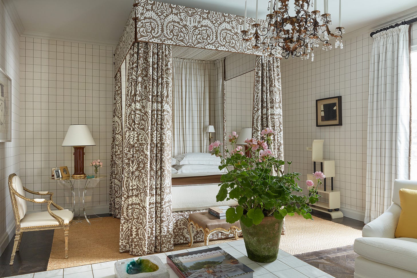
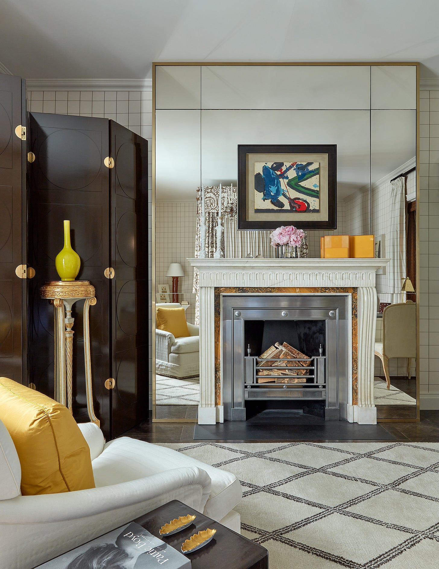
Crossing the courtyard we come to another bedroom and this was so understated and so modern in comparison to the others that it felt immediately relatable, even if it did contain a dramatic four-poster bed draped in Schumacher fabric. It was designed by Veere Grenney, who trained under David Hicks and is widely regarded as an arbiter of taste.
The walls are covered in fabric (Grenney’s own design) and the square shape looks incredibly modern - we’ve seen it in bathroom tiles but not so much in fabric or wallpaper. Yet. This is then contrasted with the ornate floral curtains around the bed but it works because there are essentially only two colours.
But for those who are scared of brown and feel it might look drab, look at how it loves that neon citrine vase in front of the lacquered screen. Chocolate loves neon, and burnt orange, cobalt blue and raspberry. It’s so much more versatile than you might think.
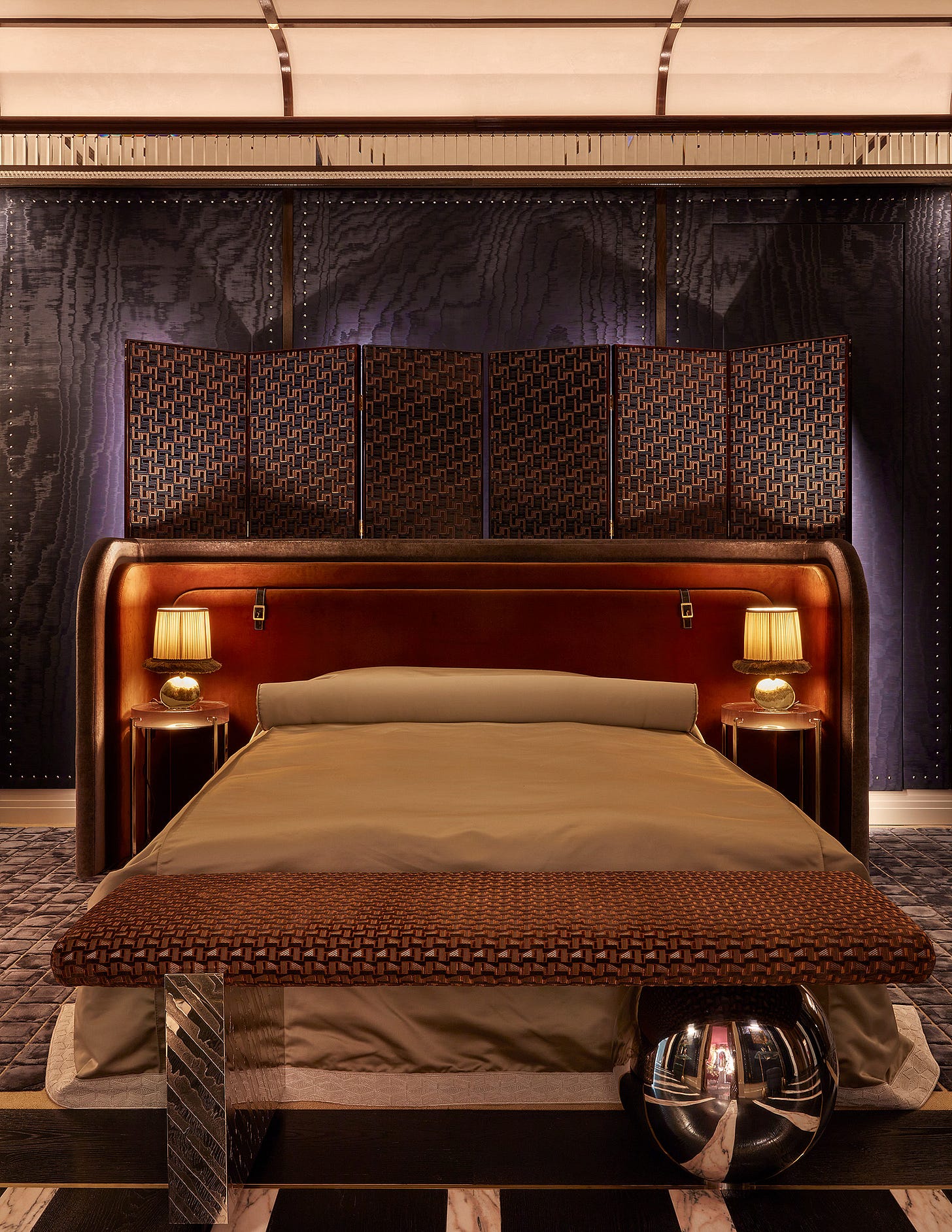
Another bedroom, this time inspired by the glory days of the Orient Express and created by Tolu Adeko for Zimmer + Rhode. Note the leather luggage handles on the headboard and the sumptuous curves. If only travel was still this glamorous.
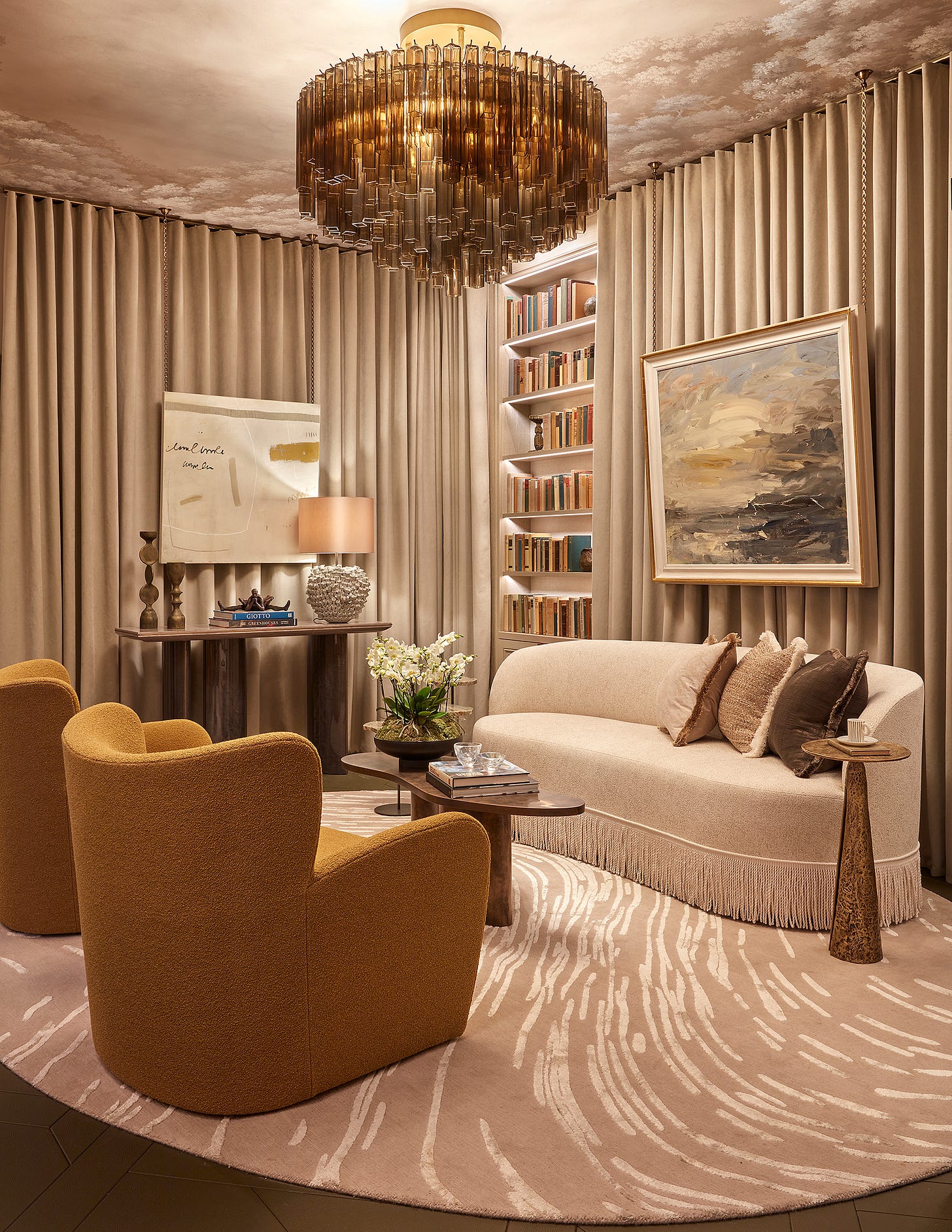
The next room was the library by Andrea Benedettini for Chase & Erwin and, at first, I thought it was simply a calm contrast to the bedroom that came before it. But this deceptively simple room tells a story and that is what all our spaces should do. Based around Swan Lake (Benedettini attended the English National Ballet at the age of 17) the lamp is the forest, while the ripples in the rug below are the lake. The dramatic curtain – made from plant-based faux suede – is the theatre and all the vintage books are about ballet and opera. The yellow chairs went through 15 revisions before Benedettini was happy with them. He’s tall, they are small and yet, he demonstrated, he fits perfectly into their swivelling comfort. A masterclass in detail and story-telling.
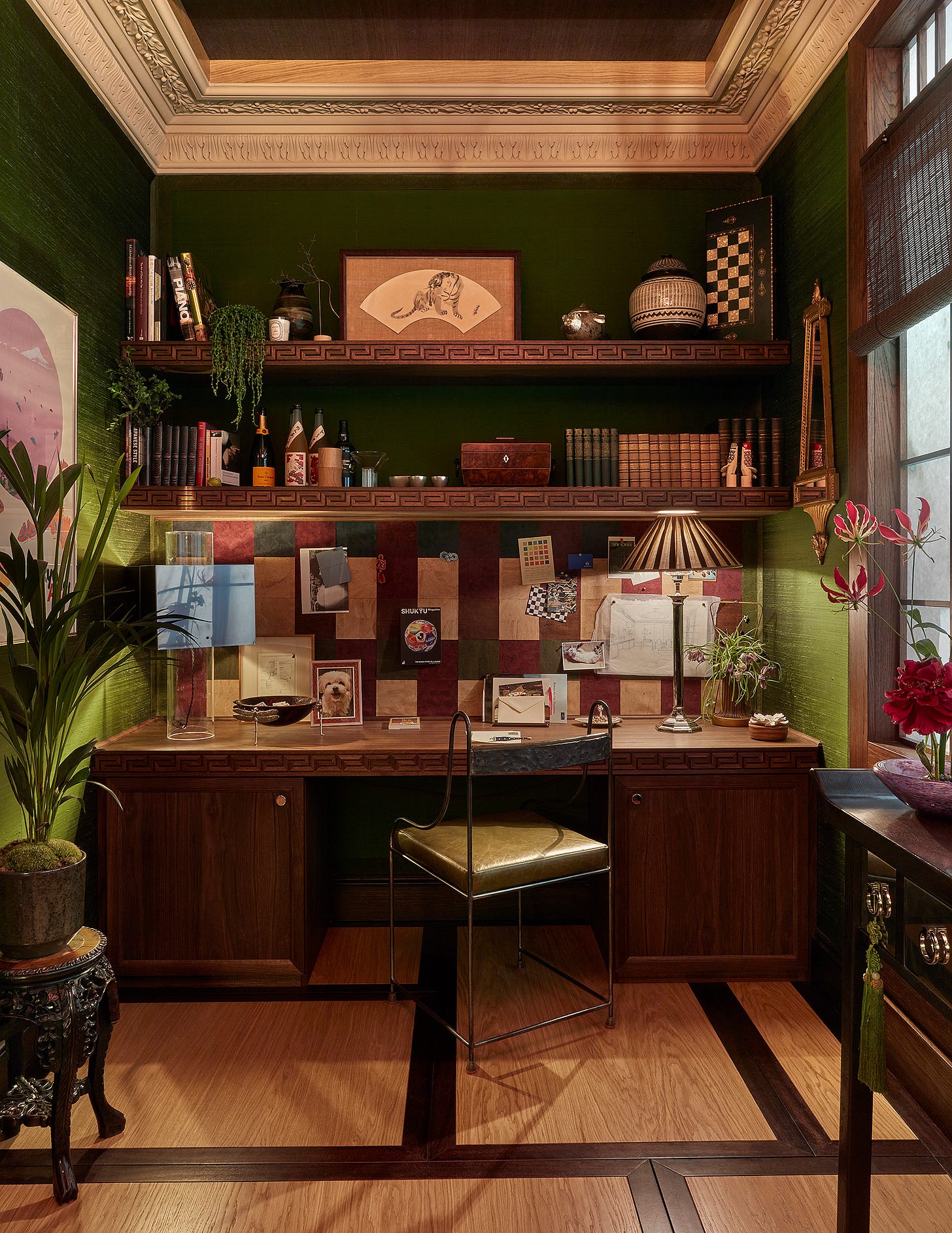
The study leading off this room, by Anahita Rigby, was dark and filled with stories, as all good studies should be. More fabric-covered walls – this time in green silk – with a long desk and a noticeboard behind it, pinned with paint samples and pictures, photographs and ideas.
It was, she said: “A place to read and a place of refuge to share a martini over a little secret with an old friend.”
Here’s the other end of it. It’s not big but it IS clever. Definitely one of my favourite rooms.
The penultimate space (that we are visiting today) is the sitting room by Sophie Ashby for United in Design, the organisation she co-founded with fellow designer Alexandria Dauley to address the lack of diversity in the interior design industry. This was the starting point for a sumptuous space, described by Sophie as “calm but high energy”.
The colours are warm and rich and the furnishings and accessories were provided by people who UID felt would “inspire the aspiring designers who we seek to offer opportunities to.”
Finally, for this tour, we arrive at the dining room created by Suzy Hoodless. Based around the trees and flowers near her home in Cornwall, it’s a rich, earthy palette that feels cosy and comfortable. In addition to fabric walls, murals are also increasing in popularity at the moment as we look to wrap the decor around us and create cocooning spaces that feel far removed from the outside world.
The rattan side table is by Louise Roe for Sharland England and is one of those great pieces that will always look good wherever you place it.
That was a lot, wasn’t it? But this is one of those posts to digest bit by bit. Have a look. Put it down. Come back later. This house does Wow but it also has lessons throughout if you know how to look. It’s on until 4 July, if you fancy seeing for yourself. You can get two for one tickets for £25 on Saturdays.
If you enjoyed this and found inspiration, please do like and share as that massively increases visibility on these free posts. Thank you for doing so and thank you to all of you who subscribe both paid and free. After 12 years of writing on the blog, always for free, I am hugely thrilled and motivated to have found this community and to be able to earn something for writing once again. I will never not be grateful for your support.





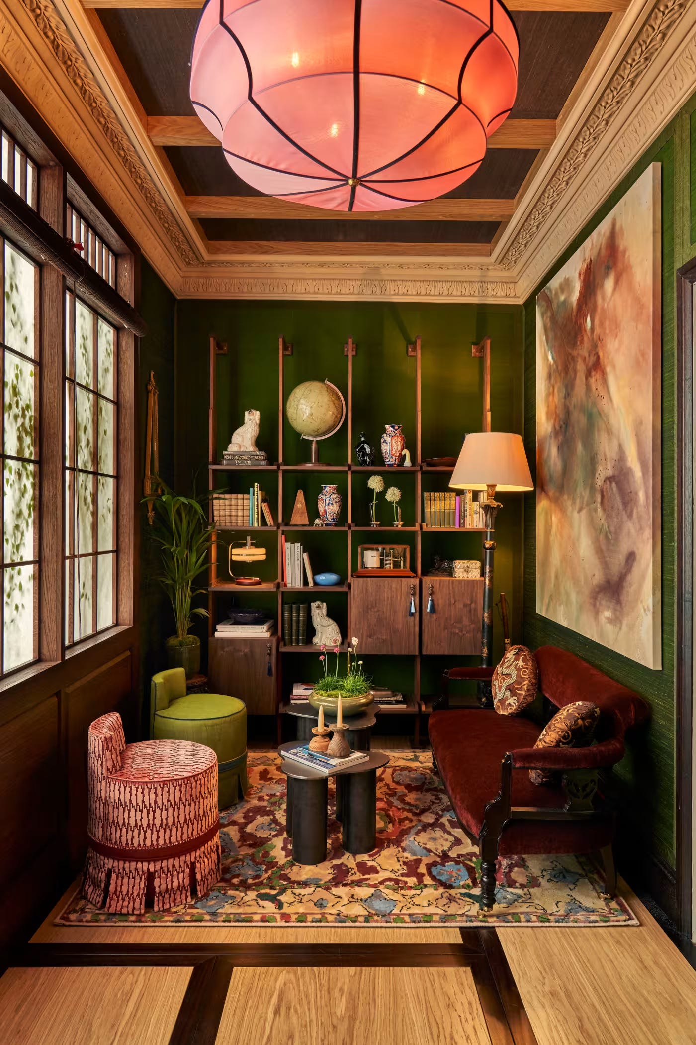


Wow, indeed. That study…
I’m so intrigued by all the rooms (UID one left me cold. There was something of the Sixth-Form Common Room about it.), but I would never have been able to deconstruct it to see what is transferable, so thanks for that as always, Kate.
And that study. Gulp. I want it. ALL of it, especially the…everything!
Loving the whole vibe of colour and luxury and the emergence of a few colours we’ve not seen for a while - pinks, chocolate and yellow but I love it.
I’ve just done one bedroom in pink and my bathroom is brass, chocolate and sage so I’m happy to see I’m accidentally right in the mix!