

The truth about that Unexpected Red Theory
The truth about that Unexpected Red Theory
Other colours are available...

By now, everyone has commented on the idea that adding a drop of red to any room will improve it, even in places that it wouldn’t seem to make sense. There have been countless shopping posts on what to buy, where to buy it and how to incorporate it. Every magazine, Instagrammer, and a fair few Substackers have unpacked this idea and examined it from every angle.
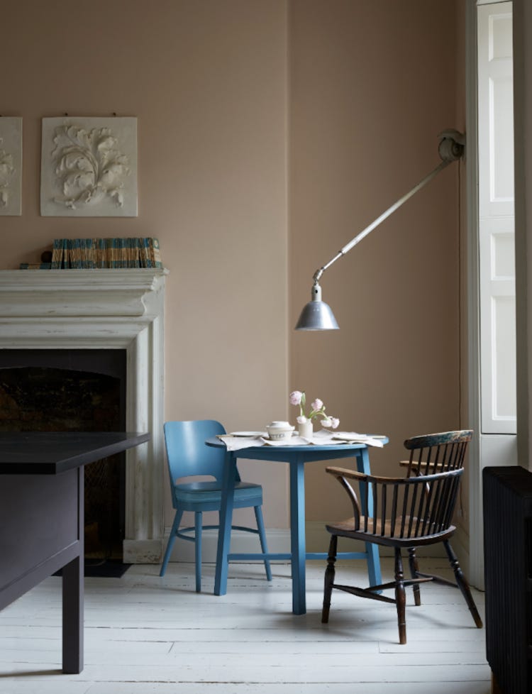
And now it’s my turn to weigh in. Because the truth is that it doesn’t have to be red. Other colours are available. I first wrote about this on my blog five years ago (which is about 50 social media years) in relation to the image below: “The unexpected addition of the blue table and chair in the corner is wonderful and I think that should be a rule in all rooms: work out the scheme – the tonal colours and the overall feel – and then add something totally unexpected in another colour or style to disrupt it all.”
It became known to my readers, who often wrote to me asking for advice on their own schemes, as the disruptor colour.
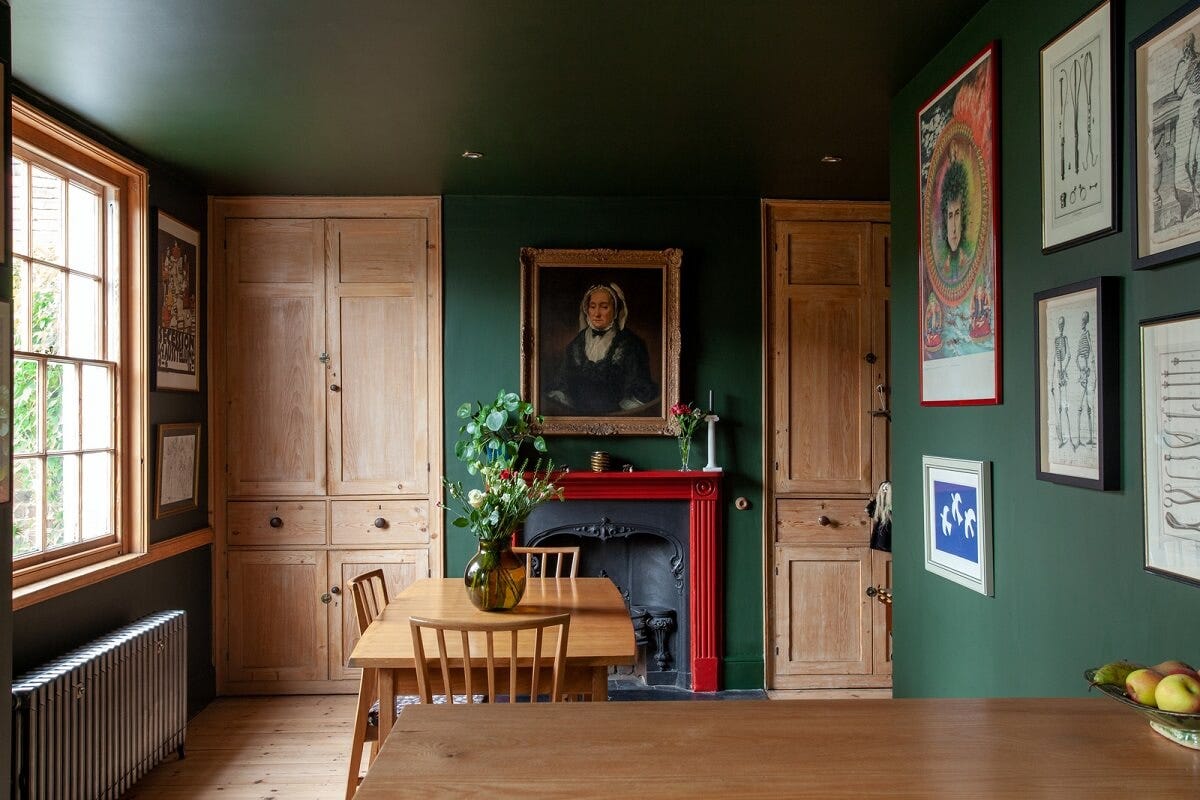
The theory of adding something unexpected holds true. The point is that it doesn’t have to be red. My own house is mostly decorated in shades of pink, terracotta, rust and chocolate. Ain’t nothing unexpected or disruptive about adding a pop of red in there.
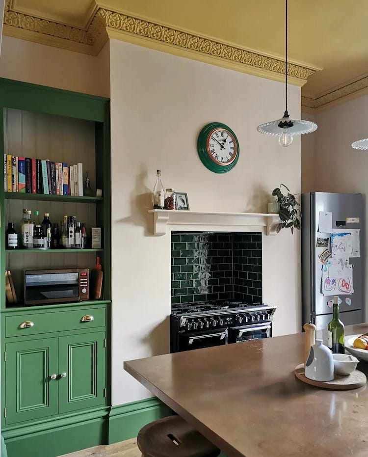
Instead, what this house needs is splashes of bright green (I have plants) or cobalt blue (still working on that) or a strong mustard yellow (building it up).
I wonder if what we are seeing is in fact a case of that other decorating theory, which is that where the catwalk leads, the cushions will follow. Towards the end of last year I started noticing a lot of outfits with red socks. I have a pair of red trainers, which, when I wore them with an all black outfit, received many compliments. Several years ago my agent, a wonderful woman in her late 60s, told me she had bought a red bag and couldn’t get over how many outfits it enhanced. Suddenly, after all the fashion posts, it popped up on TikTok as the key to creating a successful design scheme.
Interior designers like to talk about a “considered” scheme which is basically just a posh way of saying that you have thought about how you are putting the room together and have taken care of the details.
But too much care over toning colours and matching elements can result in everything looking, well, a bit flat. There is such a thing as too much good taste; you can just end up with something rather bland.
As Nancy Lancaster, the American heiress who took over Colefax & Fowler and who was regarded as having the finest taste of anyone in the world, said: “If every piece is perfect the room becomes a museum and lifeless.”
So the key is to throw in something that teeters on the edge of what is regarded as bad taste, something unexpected that pulls the viewer up short and forces to them to consider what they are looking at. It doesn’t have to be a colour – but let’s be honest, a primary red will have that effect.
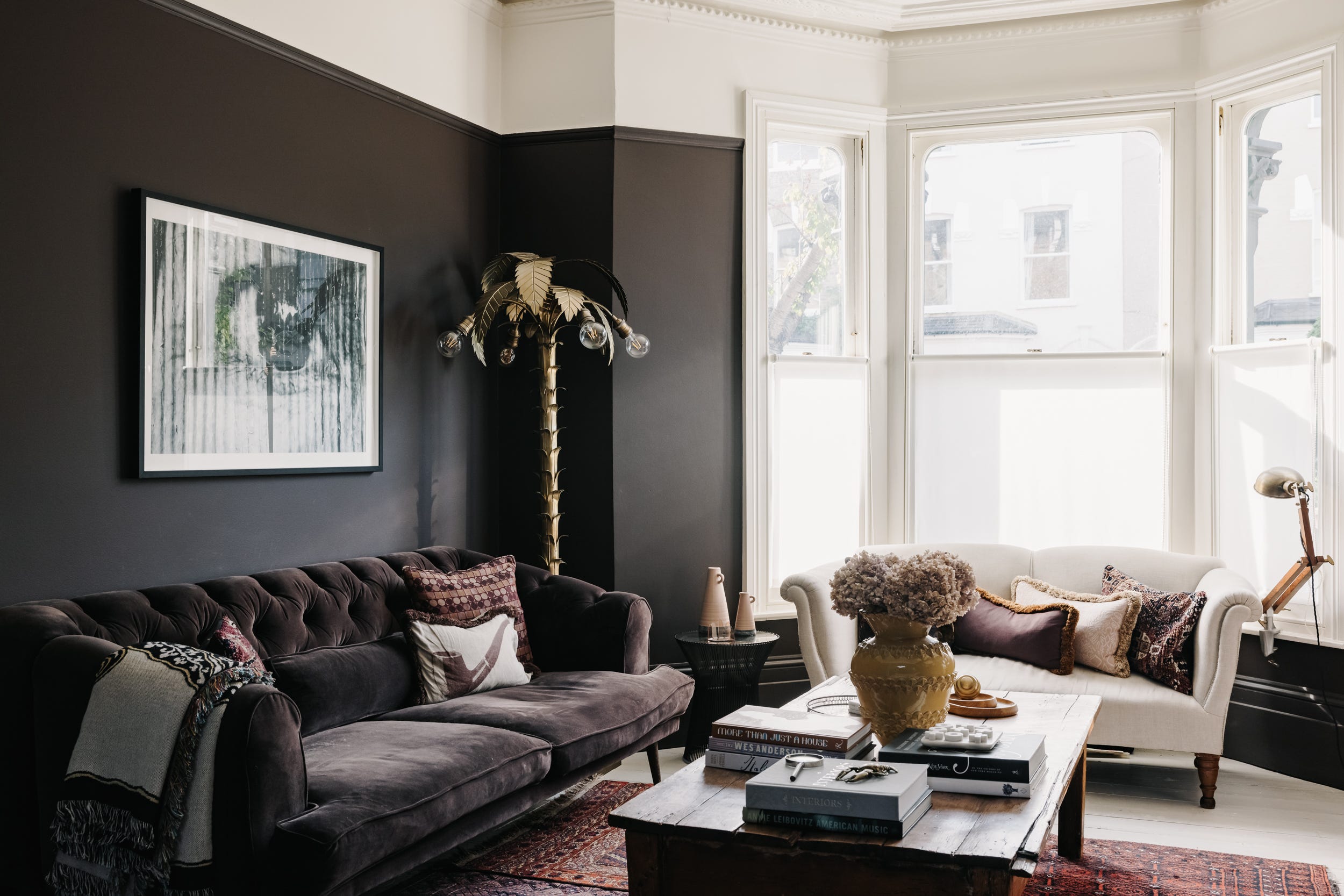
Rather than just a colour, try to add at least one thing in every room that upends the design a little. In my last sitting room I had a 6ft tall floor lamp in the shape of a palm tree.
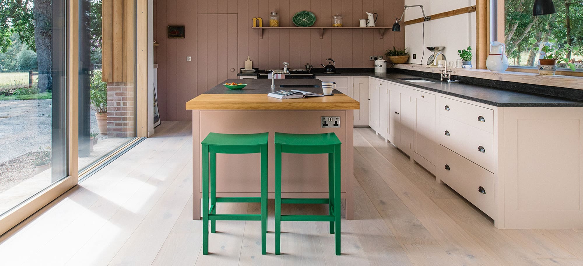
For you it might just be about adding a dash of colour that appears to clash but actually spices everything up. This disruptor colour can be a bright red stool in a pale pink and neutral room, a metallic blue lampshade in a room of soft calming shades, or a dramatic black and white rug layered together with a vintage Persian one.
Think of it as adding a squeeze of lemon to a dish. It tastes perfectly fine without it but when you add it the flavour really takes off.
“A little bad taste is like a nice splash of paprika,” said Diana Vreeland, the former editor of US Vogue. “We all need a splash of bad taste – it’s hearty, it’s healthy, it’s physical. I think we could use more if it. No taste is what I’m against.”
So, you can do it with colour but also with style – an antique chintz armchair in a room full of industrial style furniture, a modernist vase in a room full of antiques. It might even be as simple as painting the ceiling in a bold colour and leaving the walls pale, so the drama comes only when you look up. Or perhaps you might add some wallpaper to the back of a glass fronted cupboard.
Even a patterned sofa with plain cushions will make more of a statement than the more traditional reverse. So, loosen the ties of good taste that bind and set your décor free with something unexpected.
Going to go for it in my palace of neutrals!
“We all need splash of bad taste”……..Brilliant!! You gotta shock ‘em!